Red and Green Paint Make What Color? Complete Mixing Guide
Have you ever squeezed a little red into a puddle of green and wondered exactly what red and green paint make what color before it turns into something you didn’t expect on your palette? It’s one of the most common questions beginner painters ask, mostly because red and green sit on opposite sides of the color wheel, and opposite colors rarely behave the way people assume.
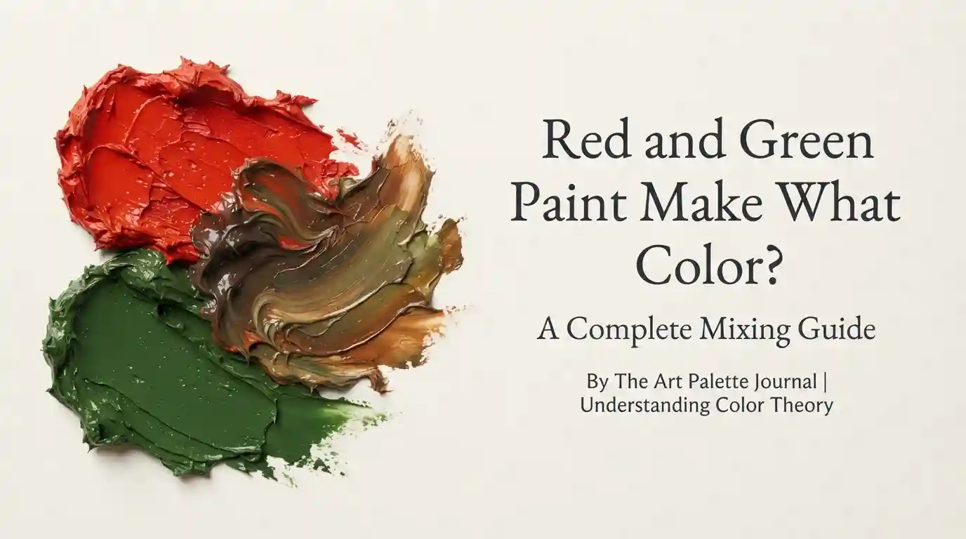
Main takeaway: When you mix red and green paint, you get a brown or muddy olive-brown color, not a bright new hue. This happens because red and green are complementary colors, and complementary pairs cancel each other out in pigment mixing rather than blending into something vibrant. The exact shade of brown depends heavily on the ratio you use and the specific red and green pigments involved.
This guide walks through exactly what happens when red and green make what color when mixed, how the ratio changes the result, what happens with light instead of paint, and how to avoid the muddy, lifeless brown that trips up so many beginners.
Understanding Red and Green as Colors
Before mixing anything, it helps to understand why this particular pairing behaves so differently from most other color combinations. Red is a primary color, meaning it can’t be created by mixing any other colors. Green, on the other hand, is a secondary color, made by mixing blue and yellow.
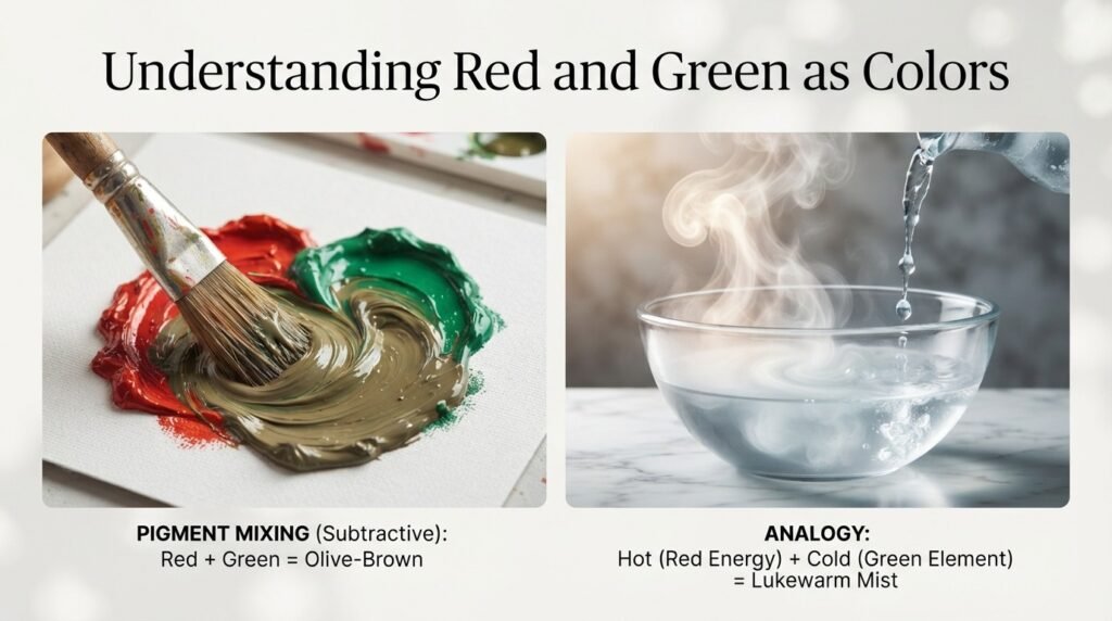
That relationship matters more than it seems. Green already contains yellow and blue inside it, so when you add red, you’re technically combining all three primary colors at once — red, yellow, and blue. Mixing all three primaries is exactly what produces brown or gray tones instead of a clean, saturated color.
Red typically reads as a warm color, associated with energy and intensity. Green usually reads as a cool color, tied to nature and calm. Pairing a warm primary with a cool secondary is part of why red and green paint make what color is such a popular search — the two feel like they should clash into something dramatic, but they actually neutralize each other instead.
“Mixing red and green is a bit like mixing hot and cold water — you don’t get boiling or freezing, you get something lukewarm and unremarkable in between.”
What Color Do You Get When You Mix Red and Green Paint?
The short answer is brown, but the exact shade shifts depending on how much red versus green you use. Here are three common ratios and what each one produces.
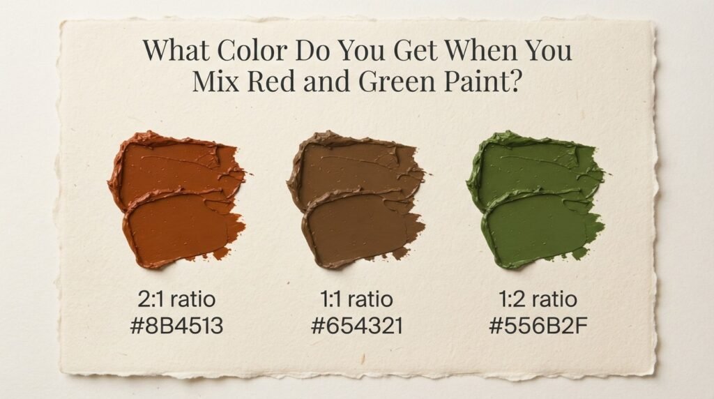
1:1 Ratio (Equal Parts Red and Green)
Mixing equal parts red and green produces a neutral, muddy brown with a slightly grayish cast. This shade sits around hex code #6B4226 and works well as a base for shadow tones or tree bark in landscape painting.
2:1 Ratio (More Red Than Green)
Using twice as much red as green shifts the mix toward a reddish-brown or terracotta tone, closer to hex code #7A3B2E. This ratio is popular for painting rust, clay pottery, or warm autumn foliage.
1:2 Ratio (More Green Than Red)
Flipping the ratio so green dominates produces an olive-brown or khaki shade, closer to hex code #5C5A32. Painters often reach for this version when depicting military uniforms, dried grass, or camouflage patterns.
Full Mixing Chart: Red and Green Pigment Combinations
Different brands and pigment types shift the final result even when the ratio stays the same, which is worth knowing before you commit paint to canvas. The table below lists common pigment pairings artists actually use, along with the resulting color name and an approximate hex code for reference.
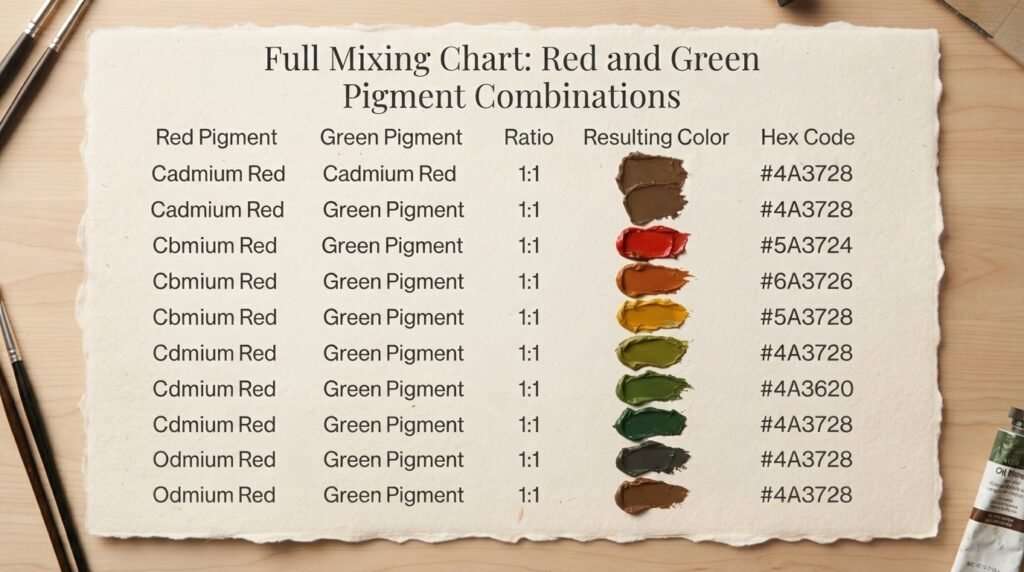
| Red Pigment | Green Pigment | Ratio | Resulting Color | Hex Code |
| Cadmium Red | Phthalo Green | 1:1 | Deep muddy brown | #4A3728 |
| Alizarin Crimson | Sap Green | 1:1 | Warm chocolate brown | #5C3A2E |
| Cadmium Red | Viridian Green | 2:1 | Rust brown | #7A3B2E |
| Alizarin Crimson | Hooker’s Green | 1:2 | Olive brown | #5C5A32 |
| Vermillion | Emerald Green | 1:1 | Burnt sienna brown | #6B4226 |
| Naphthol Red | Permanent Green | 1:1 | Neutral gray-brown | #5A4A3F |
| Cadmium Red | Chromium Oxide Green | 1:1 | Earthy umber | #4E3B2A |
| Indian Red | Sap Green | 2:1 | Dark terracotta | #6E3A2C |
| Pyrrole Red | Phthalo Green | 1:3 | Deep khaki | #4B4A2E |
| Quinacridone Red | Viridian Green | 1:1 | Muted plum-brown | #5B3F3A |
| Cadmium Red Light | Sap Green | 3:1 | Warm brick brown | #7C3F2A |
A few rows stand out as especially useful references. Cadmium Red mixed with Phthalo Green at equal parts produces one of the darkest, richest browns on this list, ideal for deep shadow work. Pyrrole Red combined with Phthalo Green at a lighter red ratio swings the result toward khaki, which comes in handy for landscape and military-themed paintings. Notice how every single row lands somewhere in the brown or olive family — no combination of red and green pigment produces anything close to a bright or saturated color.
What Color Does Red and Green Light Make?
Paint and light behave completely differently, which is why red and green light make what color has a totally different answer than the paint version. Paint uses subtractive mixing, where pigments absorb light and reflect only certain wavelengths to your eyes. Light uses additive mixing, where colors combine by literally adding wavelengths together.
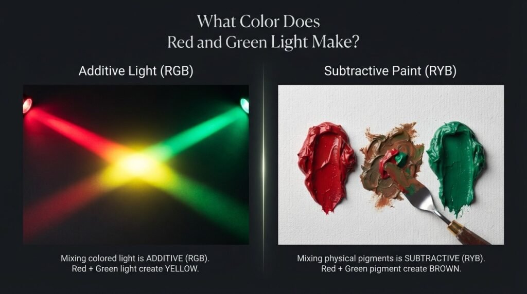
When you mix red and green light, the result is yellow. This is the same principle used in televisions, computer monitors, and stage lighting, where red and green LED elements combine to produce a bright yellow glow rather than a muddy brown.
This additive version of red and green paint make what color shows up constantly in everyday technology. Digital screens rely on red, green, and blue light combining in different amounts to create every color you see, and red-plus-green landing on yellow is a foundational part of that system. Stage lighting designers use the same trick, layering red and green gels to wash a stage in warm yellow light without needing a dedicated yellow bulb.
Subtractive vs. Additive Mixing Comparison
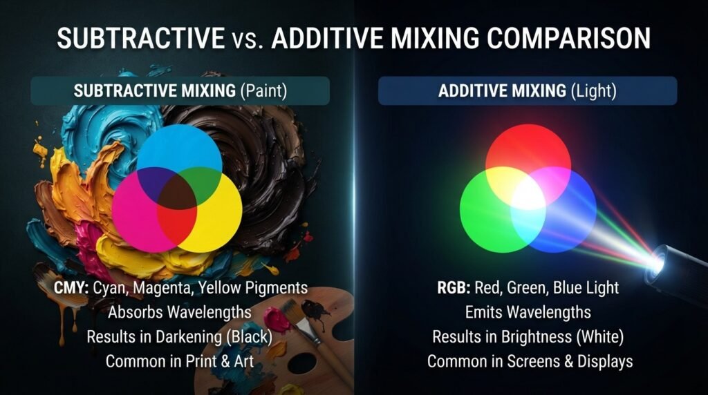
| Feature | Paint (Subtractive) | Light (Additive) |
| Base Colors | Red, Yellow, Blue (or CMY) | Red, Green, Blue |
| Red + Green Result | Brown/Olive | Yellow |
| How It Works | Pigments absorb wavelengths | Wavelengths combine directly |
| Adding More Colors | Darkens the mix | Brightens the mix |
| All Colors Combined | Black or dark brown | White |
| Common Use | Painting, printing | Screens, stage lighting, LEDs |
The core takeaway from this comparison is that “more color” means opposite things in each system. In paint, adding more pigment removes more light, pushing the mix toward black. In light, adding more color adds more brightness, pushing the mix toward white. That single difference explains why red and green produce such dramatically different results depending on whether you’re holding a paintbrush or looking at a screen.
How Ratio Affects the Final Color
The exact proportion of red to green has a bigger impact on the final shade than most beginners expect. The table below breaks down how shifting the ratio changes both the resulting color and where it’s typically used.
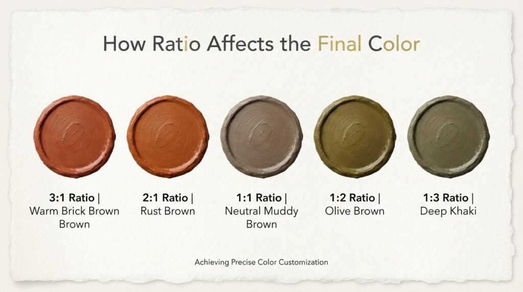
| Ratio (Red: Green) | Resulting Color | Common Use Case |
| 3:1 | Warm brick brown | Terracotta pottery, brick walls |
| 2:1 | Rust brown | Autumn foliage, clay tones |
| 1:1 | Neutral muddy brown | Shadow tones, tree bark |
| 1:2 | Olive brown | Military uniforms, dried grass |
| 1:3 | Deep khaki | Camouflage, forest floor shadows |
As the table shows, red-dominant ratios lean warmer and closer to terracotta or brick, while green-dominant ratios shift toward khaki and olive. Painters working on autumn landscapes tend to favor the red-heavy end of this scale, while anyone painting military or nature scenes usually reaches for the green-heavy ratios instead.
Why Your Mix Looks Muddy — And How to Fix It
Muddy color is the single most common complaint beginners have once they discover that red and green make what color when mixed is “brown” rather than something more exciting. A few specific habits usually cause it.
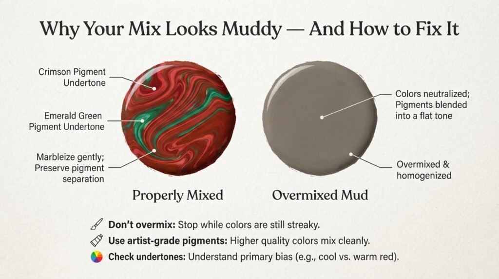
Problem: Overmixing. Stirring red and green together for too long blends every particle evenly, which flattens the color into a dull, lifeless brown with no visual interest. Fix: Mix only until the colors are just combined, and stop before the swirls disappear completely.
Problem: Using Low-Quality Pigments. Cheap student-grade paints often contain filler ingredients that dull colors faster than professional-grade pigments. Fix: Switch to artist-quality paint, especially for the red, since a strong red pigment holds up better in a mix.
Problem: Ignoring Undertones Every red and green has a hidden undertone — some reds lean orange, others lean blue-violet, and the same goes for greens leaning yellow or blue. Fix: Check the undertone before mixing. A blue-leaning red with a yellow-leaning green tends to produce a cleaner, less gray-toned brown.
Problem: Adding Too Much of Both Colors. Piling on more red and more green to “fix” a bad mix almost always makes the mud worse instead of better. Fix: Start over with a small amount of fresh pigment rather than trying to rescue an overmixed puddle.
Best Pigments to Mix for Clean Results
Not every red-and-green pairing produces the same quality of brown, and choosing the right pigments in advance saves a lot of frustration. The table below lists pigment pairs known for producing cleaner, more controllable results.
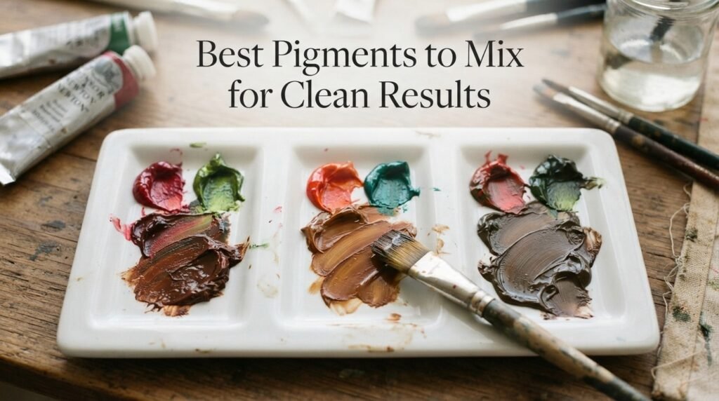
| Red Pigment | Green Pigment | Result Description |
| Alizarin Crimson | Sap Green | Warm, controllable chocolate brown |
| Cadmium Red | Viridian | Rich, slightly cool brown |
| Quinacridone Red | Hooker’s Green | Soft, muted plum-brown |
| Pyrrole Red | Chromium Oxide Green | Earthy, stable umber tone |
Beyond pigment choice, a few habits make a real difference in the final result. Mixing on a clean, white palette makes it far easier to judge the true color as it develops, since a stained palette can trick your eye. Testing a small dab on scrap paper before committing to canvas also helps, since wet paint often looks darker or more saturated than it will once fully dry.
Beginner Tip: Add green to red a tiny bit at a time rather than the other way around. Green pigment tends to be more concentrated, so a small amount can shift the whole mix further than expected.
Real-Life Examples of Red and Green Mixed

The brown that results when red and green paint make what color question gets answered shows up constantly in real-world art and design, even when people don’t realize where the shade came from. Traditional oil painters use this exact mix to build realistic tree bark, shadowed soil, and aged wood textures without buying a separate brown pigment. Interior designers occasionally reference the muted olive-brown version of this mix when developing earthy, nature-inspired color palettes for living rooms and study spaces. In digital media, the additive red-and-green-make-yellow principle plays out every time a screen displays a warm sunset gradient, since yellow tones on digital displays are frequently built from red and green light values working together.
What Happens When You Add White, Yellow, or Black
Modifying a red-and-green brown with a third color opens up a much wider range of usable tones.
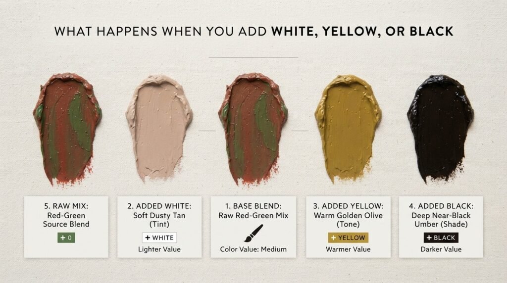
Adding Whit:e White lightens the muddy brown into a soft, dusty tan, landing around hex code #B79E88. This version works well for skin-tone underpainting or light wood textures.
Adding Yellow:w A touch of yellow pushes the mix toward a warmer, more golden olive, closer to hex code #7A6B3A. This shift is popular for autumn foliage and desert landscape work.
Adding Black deepens the brown into a near-black umber, closer to hex code #2E251C. This darker version is useful for deep shadow areas or aged, weathered wood.
Paint vs. Digital Media Comparison
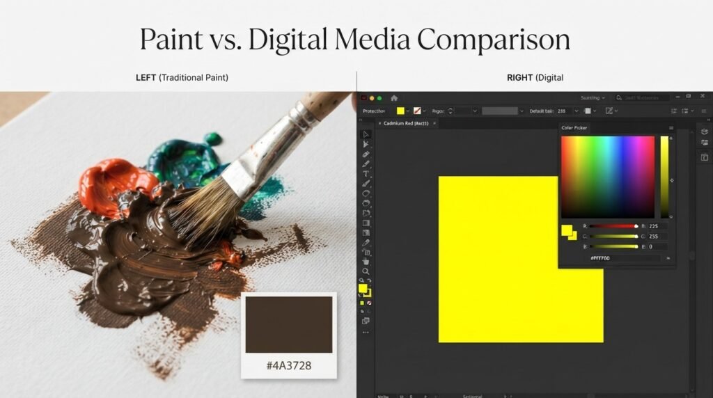
The difference between paint and digital mixing becomes especially clear when you compare specific examples side by side. In traditional paint, mixing Cadmium Red with Phthalo Green produces a deep brown around hex #4A3728, since the pigments absorb most of the light spectrum and reflect only a narrow, dark range back. In digital design software, entering RGB values of 255 red and 255 green produces a bright yellow at hex #FFFF00, since both light channels are combining at full intensity rather than absorbing anything.
This contrast is exactly why what color does red and green make when mixed needs two separate answers depending on context. A painter mixing pigments on a palette and a designer adjusting RGB sliders in Photoshop are working with fundamentally opposite systems, even though both are technically “mixing red and green.”
Tips for Artists Mixing Red and Green
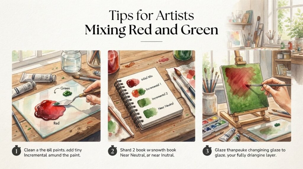
A few practical habits make the difference between a muddy accident and an intentional, well-controlled brown. Start with warm-leaning reds if you want the final brown to lean toward terracotta, and cool-leaning greens if you want it to lean toward olive. Keep a dedicated white on your palette for lightening test swatches quickly, since guessing at the final shade from wet, undiluted paint is unreliable. Layering thin glazes of red over dried green (or vice versa) instead of physically mixing them on the palette can also produce a more luminous, less flat brown than direct mixing ever will.
Olive-Brown in Fashion and Interior Design

The muted olive-brown that comes from a green-dominant red-and-green mix has found a steady home in both fashion and interior design over the past several seasons. In fashion, this earthy tone shows up in fall outerwear, boots, and accessories, often paired with cream or rust for a grounded, natural palette. In interior design, the same shade works well on accent walls, upholstery, and ceramics, especially in spaces going for a warm, organic feel rather than a bright, saturated look. If you’re building out a room or wardrobe around this tone, testing physical paint or fabric swatches under your actual lighting is far more reliable than trusting a screen preview, since undertones can shift noticeably between daylight and indoor bulbs.
Where This Brown Sits on the Color Wheel
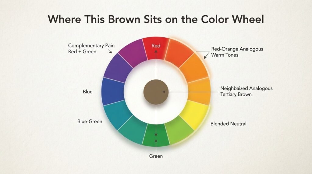
The brown produced when red and green paint make what color question is answered doesn’t sit on the traditional 12-color wheel at all, since it’s a tertiary neutral rather than a pure hue. It forms specifically because red and green are direct complementary colors, positioned opposite each other on the wheel, and complementary pairs always neutralize toward brown or gray in pigment mixing.
This brown pairs naturally with warm neutrals like cream, tan, and rust, since those tones share similar warmth without competing for visual attention. It also works as a grounding neutral against brighter accent colors like teal or mustard yellow, giving a palette an earthy anchor point.
Conclusion
So, red and green paint make what color when mixed? The answer is a muddy brown or olive tone, shifting warmer or cooler depending on your exact ratio and pigment choice. Under light instead of paint, the same two colors combine into a completely different result: a bright yellow. Watch out for overmixing and low-quality pigments, since both are the fastest way to end up with a flat, lifeless mud instead of a rich, controllable brown. With the right ratio and a little practice, red and green can become one of the most useful earth-tone mixes on your palette.
Frequently Asked Questions
What color do red and green make when mixed?
Red and green paint make a muddy brown or olive-brown color when mixed. The exact shade depends on the ratio of red to green used.
Do red and green make brown or gray?
Red and green typically make brown rather than pure gray. A near-perfect 1:1 ratio can lean slightly grayish, but most mixes read as brown.
What color does red and green light make?
Red and green light combine to make yellow. This happens because light mixing is additive, unlike the subtractive mixing used in paint.
Why do red and green make brown instead of a bright color?
Red and green are complementary colors, sitting opposite each other on the color wheel. Complementary pairs cancel each other out in pigment mixing, producing brown instead of a vibrant new hue.
Can you lighten the brown from mixing red and green?
Yes, adding white to the red-and-green brown mix creates a lighter, dustier tan tone. Small amounts of yellow can also warm the shade without fully lightening it.
What ratio of red and green makes the darkest brown?
A roughly equal 1:1 ratio using strong pigments like Cadmium Red and Phthalo Green typically produces the darkest, richest brown. Adding black deepens it further into a near-black umber.
Is the answer different for paint versus digital design?
Yes, red and green paint make what color depends entirely on the medium. Paint mixing produces brown, while digital RGB mixing produces yellow, since the two systems work in opposite directions.