What Color Does Blue and Red Make? A Complete Guide
So, what color does blue and red make? The short answer is simple. Blue and red make purple. That’s it. But the exact shade of purple depends on a lot of small details.
Main Takeaway: Mixing blue and red paint creates purple. The exact tone shifts between violet, magenta, and deep plum depending on the ratio you use.
This guide breaks down every part of that answer. You’ll learn the paint mix, the light mix, the ratios, the hex codes, and the common mistakes that ruin a clean purple. Let’s dive in.
Understanding Blue and Red as Colors
Before we answer what color do blue and red make when mixed, it helps to know what these two colors actually are.
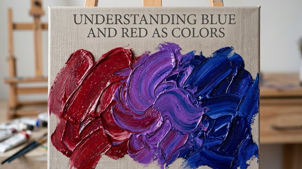
Blue and red are both primary colors. That means they can’t be created by mixing other colors. They are starting points. Every other color on a traditional color wheel is built from these primaries, plus yellow.
Red carries warmth. It feels bold and energetic. Blue carries coolness. It feels calm and stable. When you combine a warm color with a cool color, something interesting happens. You get a new color that holds a bit of both moods. That new color is purple.
This pairing matters because purple sits right between two emotional extremes. It borrows red’s intensity and blue’s calm. That’s part of why purple feels so unique on a color wheel.
“Think of red and blue like two singers with different voices,” one art teacher once said. “Blend them, and you get a whole new tone that neither voice could make alone.”
What Color Do You Get When You Mix Blue and Red Paint?
Here’s where things get practical. What color does blue and red make in real paint, not just theory? Let’s look at three simple ratios.
1:1 Ratio (Equal Parts): Mix one part blue with one part red. You get a balanced violet-purple. This is the classic “textbook” purple.
- Hex code: #8000FF
- Use case: General art projects, basic color wheels, kids’ craft mixing
2:1 Ratio (More Blue): Add two parts blue to one part red. The mix leans cooler. You get a blue-violet, often called indigo-purple.
- Hex code: #4B0082
- Use case: Night sky paintings, deep denim tones, moody backgrounds
1:2 Ratio (More Red): Add two parts red to one part blue. The mix leans warmer. You get a red-violet, close to magenta.
- Hex code: #C71585
- Use case: Floral illustrations, warm sunset skies, romantic color schemes
Beginner Tip: Always start with less pigment than you think you need. Blue is a strong color. A tiny drop can shift your whole mix. Add red slowly until you reach the shade you want.
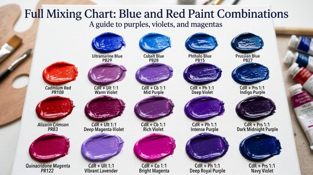
Full Mixing Chart: Blue and Red Paint Combinations
If you want exact results, use this chart. It shows what happens when blue and red paint are mixed in different pigment combinations.
| Blue Pigment | Red Pigment | Ratio | Resulting Color | Hex Code |
| Ultramarine Blue | Cadmium Red | 1:1 | Rich Purple | #7D26CD |
| Ultramarine Blue | Alizarin Crimson | 1:1 | Violet | #8A2BE2 |
| Phthalo Blue | Cadmium Red | 1:1 | Deep Plum | #5D3FD3 |
| Phthalo Blue | Alizarin Crimson | 1:1 | Cool Purple | #6A0DAD |
| Ultramarine Blue | Cadmium Red | 2:1 | Indigo | #4B0082 |
| Ultramarine Blue | Cadmium Red | 1:2 | Magenta-Violet | #C71585 |
| Cobalt Blue | Alizarin Crimson | 1:1 | Soft Lavender | #B57EDC |
| Prussian Blue | Cadmium Red | 1:1 | Dark Grape | #4E2A5A |
| Ultramarine Blue | Quinacridone Red | 1:1 | Bright Violet | #9B30FF |
| Phthalo Blue | Quinacridone Red | 1:1 | Vivid Purple | #8F00FF |
| Cobalt Blue | Cadmium Red | 1:1 | Muted Mauve | #9678B6 |
Notice how the pigment brand changes the result. This is a key part of understanding what color blue and red make when mixed in real-world painting, not just theory.
What Color Does Blue and Red Light Make?
Paint is not the only way to mix color. Light works differently. So, what color do blue and red light make?
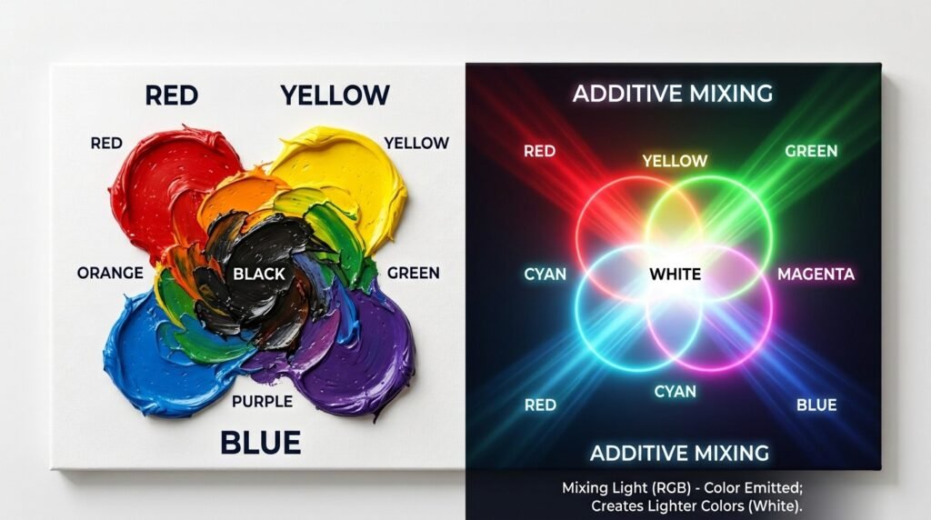
This question uses additive color mixing, not subtractive mixing. Paint mixing removes light. Light mixing adds it. These are opposite systems.
When you mix blue light and red light, you get magenta, not purple. Magenta is a vibrant pink-purple color made of pure light.
- Hex code: #FF00FF
This is the RGB model at work. Screens, LEDs, and stage lights all use this system.
Where this shows up:
- Screens: TVs, phones, and monitors mix red, green, and blue light to create every color you see
- LED lighting: Concert and event lighting often blends red and blue LEDs for a magenta glow
- Theater and stage lighting: Lighting designers mix red and blue gels to create dramatic magenta washes
“Mixing light is like mixing sound,” a lighting designer once explained. “Add more waves together, and the result gets brighter, not darker.”
Subtractive vs. Additive Mixing: A Side-by-Side Comparison
| Feature | Subtractive (Paint) | Additive (Light) |
| Base colors | Red, Blue, Yellow | Red, Green, Blue |
| Blue + Red result | Purple | Magenta |
| How it works | Removes wavelengths | Adds wavelengths |
| Common use | Painting, printing | Screens, stage lighting |
| More color added = | Darker result | Brighter result |
| Final mix of all colors | Black | White |
This table makes the difference clear. Paint and light behave in almost opposite ways, even though they start with similar colors.
How Ratio Affects the Final Color
Ratio is everything. Small changes shift the mood of your purple completely.
| Ratio (Blue: Red) | Resulting Color | Use Case |
| 3:1 | Deep Indigo | Night scenes, denim |
| 2:1 | Blue-Violet | Cool florals, ocean art |
| 1:1 | Classic Purple | General purpose mixing |
| 1:2 | Red-Violet | Warm sunsets, florals |
| 1:3 | Deep Magenta-Plum | Bold, dramatic accents |
| Equal + extra pigment | Near-Black Plum | Shadows, dark backgrounds |
As you add more pigment overall, the mix gets darker. Push it too far, and you’ll edge toward a deep plum that borders on black. This happens because layering too much color reduces the amount of light your paint reflects.
Why Your Mix Looks Muddy or Flat — and How to Fix It
Sometimes your purple doesn’t look right. It looks dull, brown, or gray instead of vibrant. Here’s why.
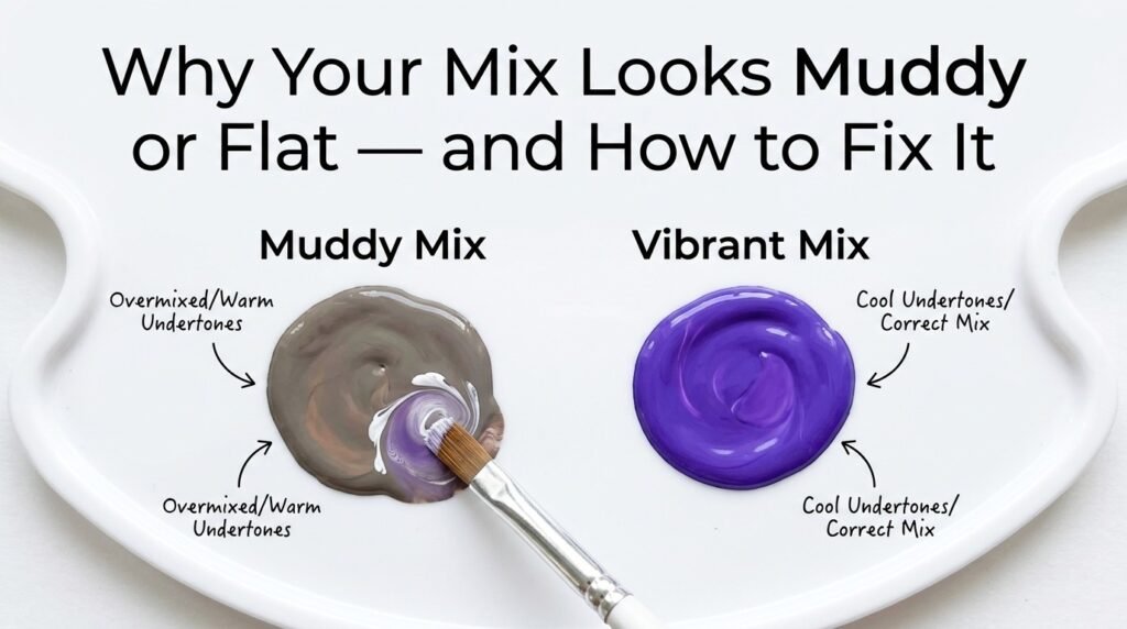
Problem 1: Undertone Clashes. Not all reds and blues are equal. Some carry warm undertones. Some carry cool undertones. Mixing a warm red with a cool blue can create a muddier result. Fix: Match undertones. Use a cool-toned red with a cool-toned blue for a cleaner purple.
Problem 2: Overmixing. Stirring too long, or adding too many small corrections, can dull your color. Fix: Mix gently. Stop as soon as you reach the shade you want.
Problem 3: Cheap Black Pigment. Some painters add black to darken purple. Cheap black often contains brown undertones, which flattens the color. Fix: Darken purple with a small amount of blue or a touch of complementary yellow instead of black.
Beginner Tip: If your purple looks muddy, don’t panic. Add a tiny bit of white first. This often reveals whether the mix is truly muddy or needs light to shine through.
Best Pigments to Mix for Clean Results
| Blue Pigment | Red Pigment | Result Description |
| Ultramarine Blue | Quinacridone Red | Bright, clean violet with high saturation |
| Phthalo Blue | Alizarin Crimson | Cool, deep purple, great for shadows |
| Cobalt Blue | Cadmium Red | Soft, slightly muted purple |
| Ultramarine Blue | Dioxazine Purple | Rich, intense violet (purple boost) |
Mixing Tips:
- Test small amounts on a white palette before committing to a full batch
- Add color slowly, one drop at a time
- Use a palette knife instead of a brush for more even blending
- Keep a reference chart nearby so you don’t lose track of ratios
Real-Life Examples of This Color in Use
The purples created from blue and red show up everywhere.

Traditional Art: Old masters used mixed purples for royal robes and dramatic shadows. Purple pigment was historically expensive, so artists mixed their own from blue and red.
Interior Design: Deep violet walls create a cozy, luxurious feel in bedrooms and reading nooks. Designers often reach for this exact blue-red blend when clients want “moody but warm.”
Digital Media: App icons and brand logos often use a violet gradient created by digitally blending blue and red. It signals creativity and premium quality.
What Happens When You Add White or Gray (Modifiers)?
Once you know what color does blue and red make, the next step is adjusting it.
Adding White: White lightens purple into a soft lavender or lilac. It also increases opacity, making the color feel airy.
- Example hex: #C8A2C8 (light lavender)
Adding Gray: Gray mutes purple into a dusty, vintage-looking tone. This works well for elegant, understated designs.
- Example hex: #8E7C93 (muted mauve-gray)
These two modifiers open the door to an entire family of shades, all starting from the same blue-and-red base.
Paint vs. Digital Media: A Closer Comparison
Paint and digital screens create purple through completely different processes, even when the end goal looks similar.
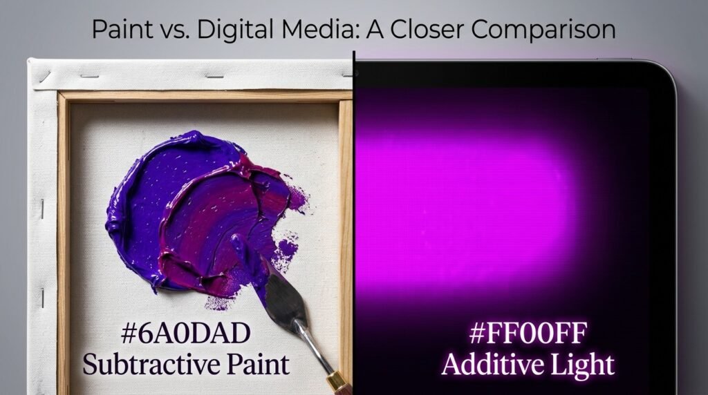
(Subtractive): Ultramarine Blue + Alizarin Crimson = deep violet, hex approximately #6A0DAD. This mix reflects only violet wavelengths to your eye.
Digital (Additive): Blue light + Red light = magenta, hex #FF00FF. This mix emits light directly, without reflection.
If you’re designing for print, think in paint terms. If you’re designing for screens, think in RGB light terms. Confusing the two often leads to colors that look different than expected once printed.
Tips for Artists Mixing Blue and Red
- Use black sparingly. A little goes a long way, and too much flattens your purple
- Test on a white palette first. White reveals the true color, unlike a colored surface
- Layer glazes instead of flat mixing. Thin, transparent layers of blue over red (or vice versa) create richer depth than a single flat mix
- Keep your brushes clean. Leftover yellow or green on a brush can quickly dull a purple mix
- Work in natural light. Studio lighting can trick your eye into misjudging a shade
This Purple Shade in Fashion and Interior Design
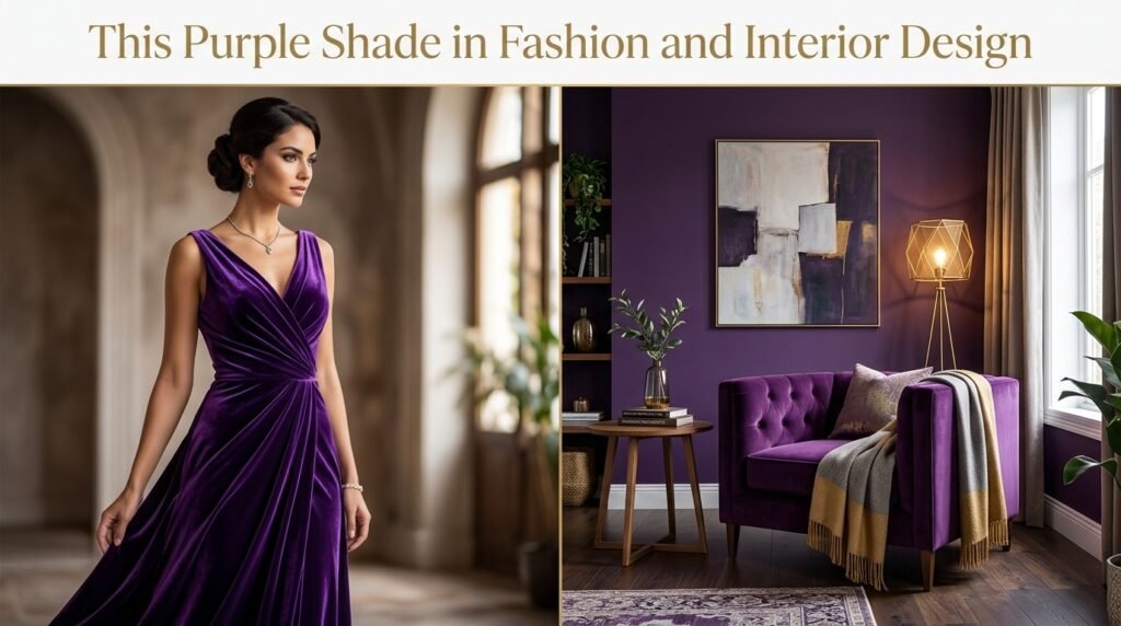
Purple, born from blue and red, carries a reputation for luxury. Fashion designers use it in evening wear to signal elegance. Interior designers use it in accent walls, velvet furniture, and statement lighting fixtures.
If you’re planning a home refresh and want this exact tone, testing a few sample paint pots before committing to a full wall is always the smart move. Small swatches under your actual room lighting reveal far more than a color chart ever will.
Where This Color Sits on the Color Wheel
On a traditional color wheel, purple sits directly between blue and red. That makes it a secondary color.
- Complementary color: Yellow sits opposite purple, creating high contrast when paired together
- Analogous colors: Blue-violet and red-violet sit on either side of purple, creating a smooth, harmonious palette
Understanding this placement helps you predict how purple will interact with other colors in a design or painting.
Color Psychology and Meaning
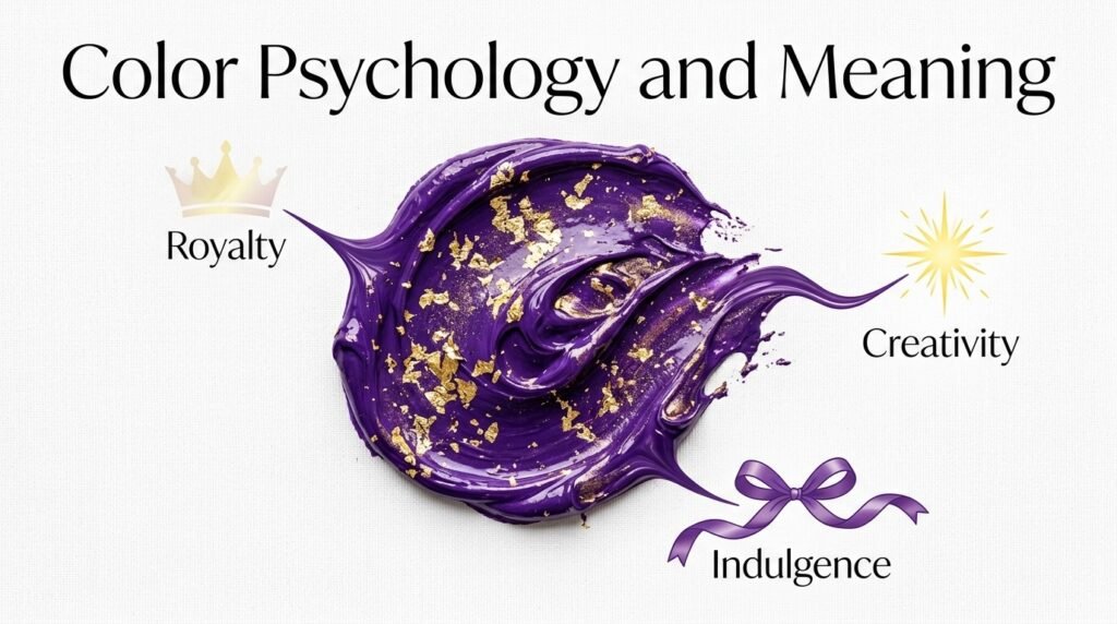
Purple carries strong symbolic weight. It represents mystery, luxury, and creativity. Historically, purple dye was rare and expensive, so it became linked to royalty and power.
Modern brands still lean on this meaning. Cadbury uses deep purple to signal indulgence. Hallmark uses purple to feel warm yet premium. Twitch uses violet to feel creative and energetic.
“Purple whispers luxury the way a night sky swallows violet light,” one designer once said, describing how the color feels both deep and glowing at once.
Conclusion
So, what color does blue and red make? In paint, the answer is purple, shifting between violet, indigo, and magenta-plum depending on your ratio. In light, the answer is magenta, created through additive mixing instead of subtractive mixing.
Watch out for muddy results. They usually come from clashing undertones, overmixing, or low-quality black pigment. With the right pigments and a little practice, you can consistently create a clean, vibrant purple every time.
Next time someone asks what color does blue and red make, you’ll have the full picture, not just the short answer.
FAQs
What color does blue and red make when mixed?
Blue and red make purple when mixed as paint. The exact shade depends on your ratio and pigment choice.
What color does blue and red make in light?
Blue and red light make magenta, a bright pink-purple tone created through additive color mixing.
What color do blue and red paint mixed create at a 1:1 ratio?
An equal mix of blue and red paint creates a balanced violet-purple, close to hex #8000FF.
Why does my blue and red mix look brown instead of purple?
This usually happens due to undertone clashes or a heavy hand with black pigment. Try matching cool-toned red with cool-toned blue instead.
Does more red or more blue create a darker purple?
Adding more of either color deepens the mix, but too much of both together can push the color toward near-black plum.
What color does blue and red make besides purple?
Depending on the ratio, you can also get indigo, magenta-violet, lavender, or muted mauve by adjusting the mix or adding white and gray.
Is purple a primary or secondary color?
Purple is a secondary color. It’s created by mixing the two primary colors, blue and red.