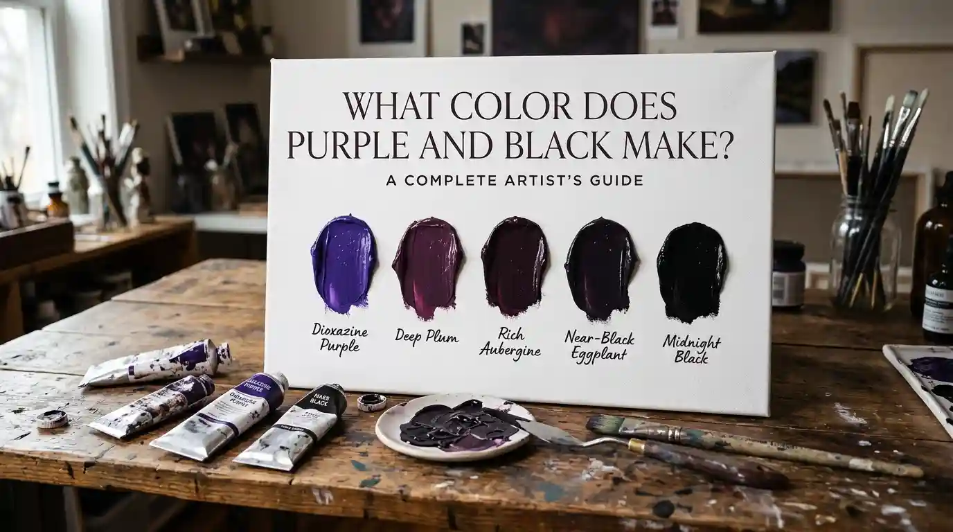
What Color Does Purple and Black Make? Complete Artist’s Guide
Have you ever added a bit of black to your purple paint, hoping for a deep shadow tone, only to end up with something murkier than you expected? If so, you’ve probably asked yourself what color does purple and black make.
Main Takeaway: Purple and black make a deep, dark plum or eggplant shade. Rather than creating a brand-new hue, black darkens and mutes purple’s brightness while keeping its violet undertone intact. A common resulting hex code is #301934.
That’s the short answer. But how dark, how muted, and how “purple” your final mix looks depends heavily on ratio and pigment choice. Let’s break it down so you know exactly what color does purple and black make in any situation.
Understanding Purple and Black as Colors
Before mixing, it helps to understand the two colors doing the work.
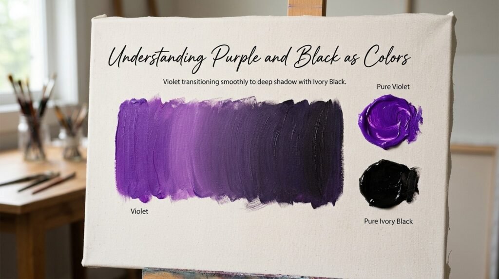
Purple is a secondary color (in traditional paint theory), formed by mixing red and blue. It sits between warm and cool on the color wheel, which is part of why it feels so rich and versatile — neither fully hot nor fully cold.
Black isn’t a hue at all — it’s the absence of reflected light. In pigment mixing, black acts as a shade-maker, darkening and muting any color it’s added to without changing its basic hue family.
Why the Pairing Matters
Because black doesn’t add a new hue, mixing it with purple simply pushes purple toward its darkest, moodiest version. Understanding this relationship is the key to answering what color purple and black make — and to avoiding a common beginner mistake of over-darkening the mix to near-black.
What Color Do You Get When You Mix Purple and Black Paint?
This is the heart of the question: what color do purple and black make, and how much black do you actually need?
Here’s the simple rule: a small amount of black deepens purple into a rich plum. Too much black, and you lose the purple altogether, ending up with something close to true black.
1. Ratio 1:1 (Equal Purple and Black)
- Resulting color: Near-Black Purple
- Hex code: #1C0F1E
- Use case: Deep shadow tones, gothic or moody color palettes.
2. Ratio 2:1 (More Purple than Black)
- Resulting color: Dark Plum
- Hex code: #301934
- Use case: Rich backgrounds, eggplant-toned illustrations, elegant branding.
3. Ratio 1:2 (More Black than Purple)
- Resulting color: Deep Aubergine (Almost Black)
- Hex code: #241023
- Use case: Subtle shading, night scenes, deep shadow work in paintings.
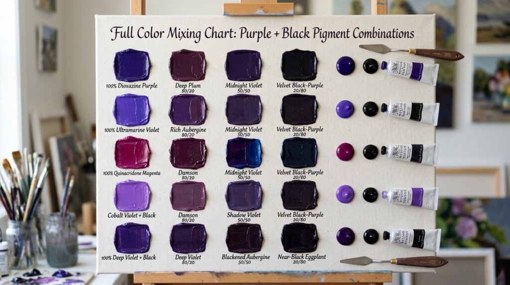
Full Color Mixing Chart: Purple + Black Pigment Combinations
Different purples and black pigments shift the final result. Here’s a detailed chart to help you see what color purple and black make with specific paints.
| Purple Pigment | Black Pigment | Resulting Color | Hex Code |
| Dioxazine Purple | Ivory Black | Deep Plum | #301934 |
| Ultramarine Violet | Mars Black | Cool Dark Violet | #2E1A47 |
| Quinacridone Violet | Lamp Black | Rich Aubergine | #3B1F3D |
| Cobalt Violet | Ivory Black | Muted Dark Purple | #38263F |
| Manganese Violet | Mars Black | Smoky Plum | #33262F |
| Permanent Violet | Lamp Black | Deep Grape | #2A1B3D |
| Dioxazine Purple | Carbon Black | Near-Black Eggplant | #221022 |
| Red-Violet | Ivory Black | Dark Wine Purple | #3A1929 |
| Blue-Violet | Mars Black | Midnight Violet | #231A3E |
| Ultramarine Violet | Lamp Black | Charcoal Violet | #2B2438 |
| Cobalt Violet | Carbon Black | Deep Shadow Purple | #291D2E |
As you can see, what color does purple and black make shifts quite a bit depending on the undertone of your purple — something we’ll explore more below.
What Color Does Purple and Black Light Make?
Here’s where things get interesting. Paint and light don’t mix the same way.
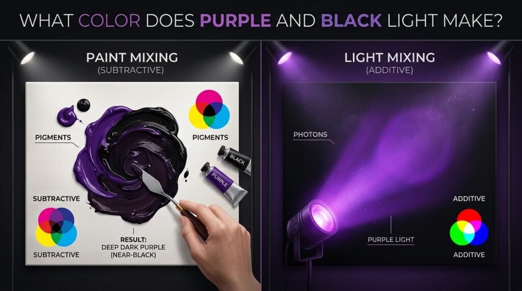
Paint mixing is subtractive. Pigments absorb (subtract) certain wavelengths of light and reflect others. That’s why mixing purple and black paint gives you a darker, muted plum — you’re removing light, not adding it.
Light mixing is additive. Red, green, and blue (RGB) are the primary colors of light, and they combine by adding wavelengths together. In an RGB system, “black” light simply means an absence of light — so combining purple light with black doesn’t create a new hue at all; it just dims the purple light’s intensity, since there’s no black light to “add.”
Use cases for dark purple in light-based media:
- Screens and displays — Designers lower the brightness or luminance value of a purple hex code (like #301934) to simulate a “purple plus black” effect on digital interfaces.
- LED lighting — Dimming a purple LED bulb reduces its intensity, creating a deep, moody violet glow rather than a true new color.
- Theater and stage lighting — Lighting designers layer a dim purple gel over a scene to create shadowy, mysterious atmospheres without physically mixing colors.
Subtractive vs. Additive Mixing: Side-by-Side Comparison
| Feature | Subtractive (Paint) | Additive (Light) |
| Primary colors | Red, Yellow, Blue | Red, Green, Blue |
| Purple + Black result | New, darker plum/eggplant hue | Dimmed purple (no new hue created) |
| How it works | Absorbs wavelengths | Emits/combines wavelengths |
| Common medium | Paint, ink, dye | Screens, stage lights, LEDs |
| Mixing more colors leads to | Darker, muddier tones | Brighter, whiter tones |
| Example | Acrylic or oil paint | Website UI, stage lighting |
How Ratio Affects the Final Color
The ratio of purple to black is the single biggest factor in your final shade.
| Ratio (Purple: Black) | Resulting Color | Best Use Case |
| 4:1 | Rich Violet-Plum | Bold backgrounds, jewel-toned art |
| 3:1 | Dark Plum | Elegant branding, moody florals |
| 2:1 | Deep Eggplant | Shadow tones, gothic aesthetics |
| 1:1 | Near-Black Purple | Deep shadows, night scenes |
| 1:2 | Almost True Black | Subtle shading, minimal purple hint |
Beginner Tip: Add black to your purple just a touch at a time. It’s much easier to darken a purple further than to bring it back once it’s gone too far toward black.
Why Your Mix Looks Muddy or Grayish — and How to Fix It
If you’ve ever mixed what should make a rich dark purple and ended up with a dull, grayish tone instead, you’re dealing with one of these common issues:
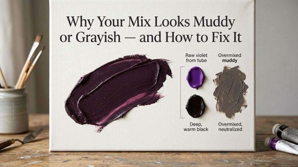
1. Undertones clashing. Some blacks (like Lamp Black) have a slightly blue or green undertone, which can mute a warm, red-leaning purple into gray rather than deepening it into plum. Fix: Use a neutral or warm black (like Mars Black) with red-leaning purples for a cleaner, richer result.
2. Overmixing. Blending too long, or adding black too quickly, muddies the pigment and loses the purple’s vibrancy. Fix: Mix gradually and stop as soon as you reach the shade you want.
3. Cheap or low-pigment paint. Budget paints often contain fillers that dull the vibrancy of the mix, making purple-black blends look flat. Fix: Invest in artist-grade paints for your purple, even if your black is more budget-friendly.
Best Pigments to Mix for Clean, Rich Results
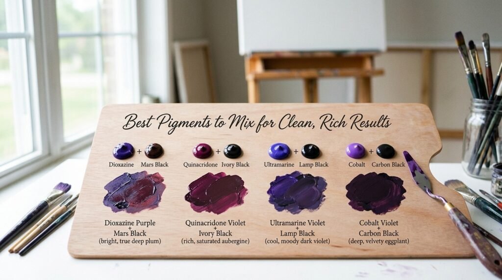
| Purple Pigment | Black Pigment | Result |
| Dioxazine Purple | Mars Black | Bright, true deep plum |
| Quinacridone Violet | Ivory Black | Rich, saturated aubergine |
| Ultramarine Violet | Lamp Black | Cool, moody dark violet |
| Cobalt Violet | Carbon Black | Deep, velvety eggplant |
Mixing tips:
- Always mix on a white surface so you can judge the true darkness of your purple.
- Add black in very small amounts — it’s a powerful pigment that darkens quickly.
- Test your mix on scrap paper and let it dry, since dark colors often shift slightly as paint dries.
Real-Life Examples: Purple and Black in Traditional Art, Interior Design, and Digital Media
Traditional art: Gothic and Romantic-era painters often layered deep violet and black tones to create dramatic, shadowed backgrounds that conveyed mystery and depth.
Interior design: Deep plum and eggplant tones have become popular in “moody maximalist” and luxury interior styles, often paired with gold accents, deep green, or black trim.
Digital media: App icons, luxury brand logos, and dark-mode interfaces frequently use deep purple-black tones (like #301934) because they read as sophisticated, premium, and mysterious.
What Happens When You Add White, Brown, or Black to Purple?
Once you’ve nailed your base dark purple, modifiers let you fine-tune it further.
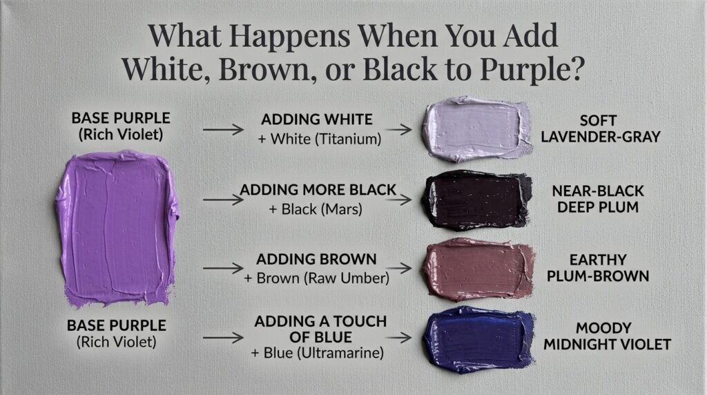
- Adding white → Creates a soft, dusty lavender-gray, moving away from the deep plum entirely. Example hex: #B6A6C2.
- Adding more black → Pushes the mix even further into near-black, muting the purple almost completely. Example hex: #1C0F1E.
- Adding brown → Creates an earthy, muted plum-brown, often used for rustic or vintage-style palettes. Example hex: #4A2E35.
- Adding a touch of blue → Cools the purple-black mix, nudging it toward a moody midnight violet. Example hex: #231A3E.
Beginner Tip: Add modifiers in tiny amounts — white, brown, and extra black can all quickly overpower your deep purple mix.
Paint vs. Digital Media: Subtractive vs. Additive, Revisited
To bring it all together: if you’re painting on canvas, you’re working with subtractive color — purple and black pigments mixing to form a new, deeper plum tone by absorbing other wavelengths of light.
If you’re designing for a screen, you’re working with additive color — where “purple and black” doesn’t create a new hue at all. Instead, designers simply lower the brightness value of a purple hex code (like taking #8E44AD down to #301934) to simulate the same darkening effect.
Think of paint mixing like adding shadow to a painted wall — physically deepening the color. Light mixing is more like turning down a dimmer switch — the hue stays the same, just less bright.
Tips for Artists: Getting Better Purple-Black Mixes Every Time
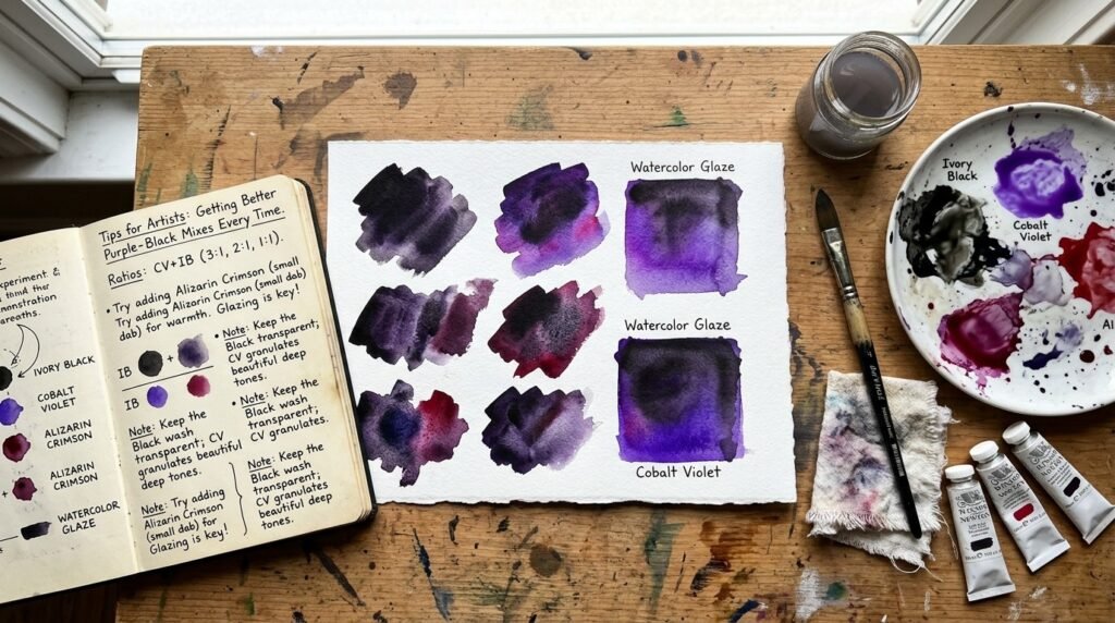
- Know your purples. Warm, red-leaning purples and cool, blue-leaning purples darken differently with black — test both to see which fits your project.
- Test on your actual palette white, not a screen — dark colors always look different in person.
- Layer instead of overmixing. In watercolor or thin acrylics, glazing a thin black layer over a dry purple base can create a more luminous dark tone than mixing them directly.
- Keep a mixing journal. Note down your exact ratios and pigment brands so you can recreate your favorite dark purple later.
- Use a limited palette for practice. Working with just one purple and one black at a time helps you truly understand what color does purple and black make before adding more complexity.
Purple and Black in Fashion and Interior Design
The combination of purple and black has become a signature pairing in both fashion and home decor for its dramatic, luxurious feel.
In fashion, deep plum and eggplant tones paired with black accents are staples of fall and winter collections, prized for their rich, sophisticated look. In interior design, deep purple-black tones — especially in accent walls, velvet upholstery, and statement furniture — pair beautifully with gold, brass, or broad green accents for a moody, upscale aesthetic.
If you’re planning a home refresh or a creative project, testing a few deep plum or eggplant paint swatches from your local hardware or design store against your existing furniture is one of the easiest ways to see which shade — from rich violet-plum to near-black eggplant — fits your space best.
Where Purple Sits on the Color Wheel
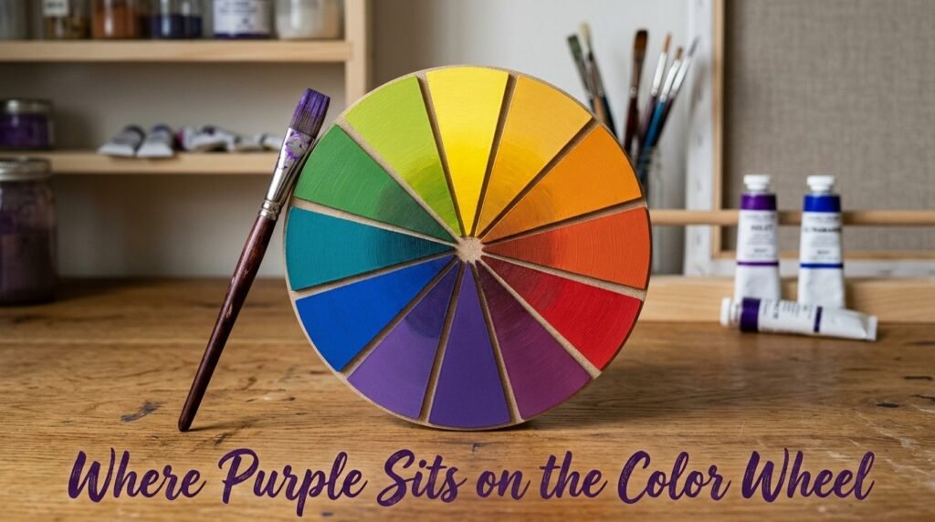
Purple is a secondary color, formed by mixing the primary colors red and blue, sitting between them on the color wheel. Adding black doesn’t move it to a new position — it simply pulls the same hue toward the darkest end of its value range.
- Complementary color: Yellow. Purple and yellow sit opposite each other on the color wheel, which is why deep purple-black tones pair so strikingly with warm gold or mustard accents.
- Analogous colors: Blue-violet and red-violet sit on either side of purple, making them natural partners for smooth, harmonious dark palettes.
Conclusion
So, what color does purple and black make? In paint, the answer is a rich, dark plum or eggplant tone — with the exact depth depending on how much black you add. In light-based media, black doesn’t create a new hue at all; it simply dims the purple’s brightness.
Just remember — add black gradually, watch your undertones, and don’t panic if your first attempt looks grayish or too dark. Every rich, dramatic dark purple starts with a bit of testing and adjustment. Now that you know exactly what color purple and black make, grab your palette and start mixing your perfect deep shade.
FAQs
1. What color does purple and black make in paint?
Purple and black make a deep, dark plum or eggplant shade in paint, with the exact tone depending on the ratio used.
2. What color do purple and black make when mixed in different ratios?
More purple creates a richer, more visible plum tone, while more black pushes the mix toward near-black with only a hint of purple remaining.
3. What color do purple and black make when the mix looks muddy or gray?
This usually happens when a cool-undertone black is mixed with a warm purple; using a neutral or warm black gives a cleaner, richer result.
4. Do purple and black make a new color in light or on screens?
Not exactly. In additive (light) mixing, black represents an absence of light, so combining it with purple simply lowers the purple’s brightness rather than creating a new hue.
5. What color do you get when you mix dark purple with white?
Mixing dark purple with white creates a soft, dusty lavender-gray tone.
6. What is the complementary color of purple?
Yellow is the complementary color of purple, since they sit opposite each other on the color wheel.
7. What color do purple and black make besides plum?
Depending on the specific purple and black pigments used, you can also get deep aubergine, midnight violet, or near-black eggplant tones.