
How to Make Sand Color: Complete Mixing Guide for Artists
Have you ever looked at a beach photo, a piece of pottery, or a warm-toned wall and wondered exactly how to make sand color? It’s one of those shades that looks simple but is surprisingly easy to get wrong — too yellow, too gray, or too brown.
Main Takeaway: Sand color is made by mixing white and yellow, then adding a very small touch of brown or red to warm and mute it. The most common hex code for sand color is #C2B280, a soft, warm, low-saturation beige-tan.
That’s the quick answer. But nailing the exact warmth and softness of sand color takes a bit more understanding. Let’s break down how to make sand color step by step, so you get it right every time.
Understanding Yellow and White as Colors
Before mixing, it helps to understand the base colors involved in how to make sand color.
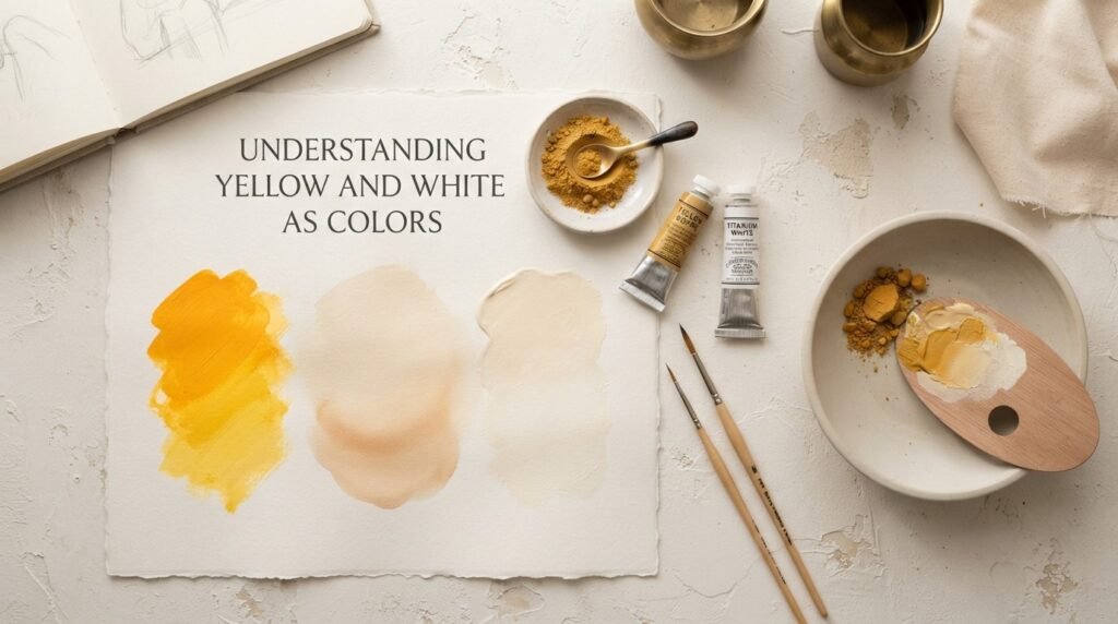
Yellow is a warm, primary color. It’s bright, energetic, and reflects more light than any other hue on the wheel — it’s the backbone of nearly every warm neutral, including sand.
White isn’t technically a “color” in pigment terms — it’s a neutral that lightens and softens whatever it’s mixed with, without shifting the hue itself.
Why the Pairing Matters
Yellow provides the warmth, and white provides the softness and lightness that make sand color feel gentle and natural rather than bold or saturated. This pairing — plus a small touch of brown — is the real foundation behind how to make sand color convincingly.
What Color Do You Get When You Mix Yellow and White Paint?
This is the starting point for how to make sand color. Here’s what happens at three common ratios, before adding your final touch of brown.
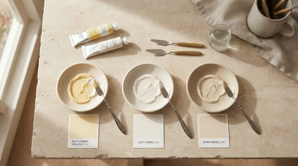
1. Ratio 1:1 (Equal Yellow and White)
- Resulting color: Pale Cream Yellow
- Hex code: #F5E7B2
- Use case: A light base for very pale, sun-bleached sand tones.
2. Ratio 1:3 (More White than Yellow)
- Resulting color: Soft Ivory
- Hex code: #F8F0DC
- Use case: A near-white base, ideal for light beach or desert highlights.
3. Ratio 1:2 (Moderate White, More Yellow)
- Resulting color: Warm Beige
- Hex code: #E8D5A3
- Use case: The closest base to true sand, ready for a touch of brown.
To complete the look, add a tiny touch of brown or burnt sienna to the warm beige mix above — this is the final step in how to make sand color feel truly natural.
Full Color Mixing Chart: How to Make Sand Color with Different Pigments
Different pigment combinations shift the exact tone. Here’s a detailed chart with 11 combinations for how to make sand color.
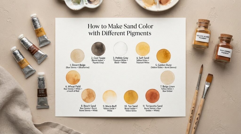
| Yellow Pigment | White | Muting Agent (small amount) | Resulting Color | Hex Code |
| Yellow Ochre | Titanium White | Burnt Sienna | Classic Sand | #C2B280 |
| Naples Yellow | Titanium White | Raw Umber | Soft Desert Sand | #D8C99B |
| Cadmium Yellow | Titanium White | Burnt Umber | Warm Golden Sand | #D2B48C |
| Hansa Yellow Light | Zinc White | Yellow Ochre | Pale Beach Sand | #EDE0C8 |
| Lemon Yellow | Titanium White | Raw Sienna | Cool Sand Beige | #DFCFA6 |
| Indian Yellow | Titanium White | Burnt Sienna | Rich Amber Sand | #C9A66B |
| Yellow Ochre | Zinc White | Black (tiny touch) | Muted Gray Sand | #B8AC8A |
| Golden Yellow | Titanium White | Raw Umber | Toasted Sand | #C7A874 |
| Naples Yellow | Titanium White | Burnt Sienna | Sunbaked Sand | #D9B98B |
| Cadmium Yellow Light | Titanium White | Yellow Ochre | Light Dune Sand | #E6D2A8 |
| Yellow Ochre | Titanium White | Raw Sienna | Traditional Sand | #CBB283 |
As this chart shows, there isn’t just one way to approach how to make sand color — it’s a whole family of warm, muted beige tones depending on your pigment choices.
How to Make Sand Color for Screens: Additive (RGB) vs. Subtractive (Paint) Mixing
Just like any color, the process for how to make sand color shifts depending on whether you’re working in paint or on a screen.
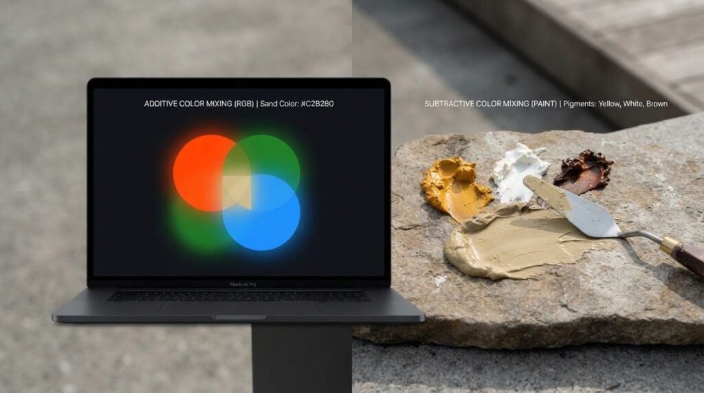
Paint mixing is subtractive. Pigments absorb certain wavelengths and reflect others. Sand color in paint comes from physically blending yellow, white, and a small amount of brown pigment.
Light mixing is additive. On screens, sand color is built using red, green, and blue (RGB) light values rather than pigments. A typical digital sand tone, like #C2B280, is created with high red and green light and a moderate amount of blue.
Use cases for digital sand color:
- Screens and displays — Website backgrounds, app themes, and minimalist branding often use sand color (#C2B280 or similar) for a calm, neutral, natural feel.
- LED lighting — Warm, low-intensity LED lighting can approximate a sandy glow for a cozy interior ambiance.
- Theater and stage lighting — Pale amber and beige gels are used to simulate desert or beach lighting environments on stage.
Subtractive vs. Additive Mixing: Side-by-Side Comparison
| Feature | Subtractive (Paint) | Additive (Light) |
| Base colors for sand | Yellow + White + Brown | Red + Green + moderate Blue (light) |
| How it works | Absorbs wavelengths | Emits/combines wavelengths |
| Common medium | Paint, ink, dye | Screens, stage lights, LEDs |
| Result of mixing more colors | Darker, muddier tones | Brighter, whiter tones |
| Typical sand hex | #C2B280 (matte) | #C2B280 (as RGB light values) |
| Example | Wall paint, ceramics | Website themes, UI backgrounds |
How Ratio Affects the Final Sand Color
The ratio of yellow, white, and your muting agent is the biggest factor in how to make sand color look light and airy versus deep and warm.
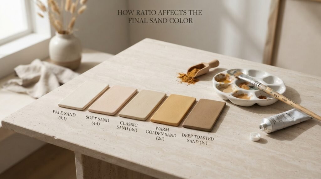
| Ratio (Yellow-White Base: Muting Agent) | Resulting Color | Best Use Case |
| 5:1 | Pale Sand | Light interiors, minimalist decor |
| 4:1 | Soft Sand | General-purpose beige, apparel |
| 3:1 | Classic Sand | Standard walls, pottery, illustrations |
| 2:1 | Warm Golden Sand | Sunset scenes, richer accents |
| 1:1 | Deep Toasted Sand | Shadows, rustic or desert themes |
Why Your Sand Mix Looks Muddy or Too Gray — and How to Fix It
If you’ve tried to make sand color and ended up with something dull, gray, or overly brown instead of warm and light, you’re likely running into one of these issues:
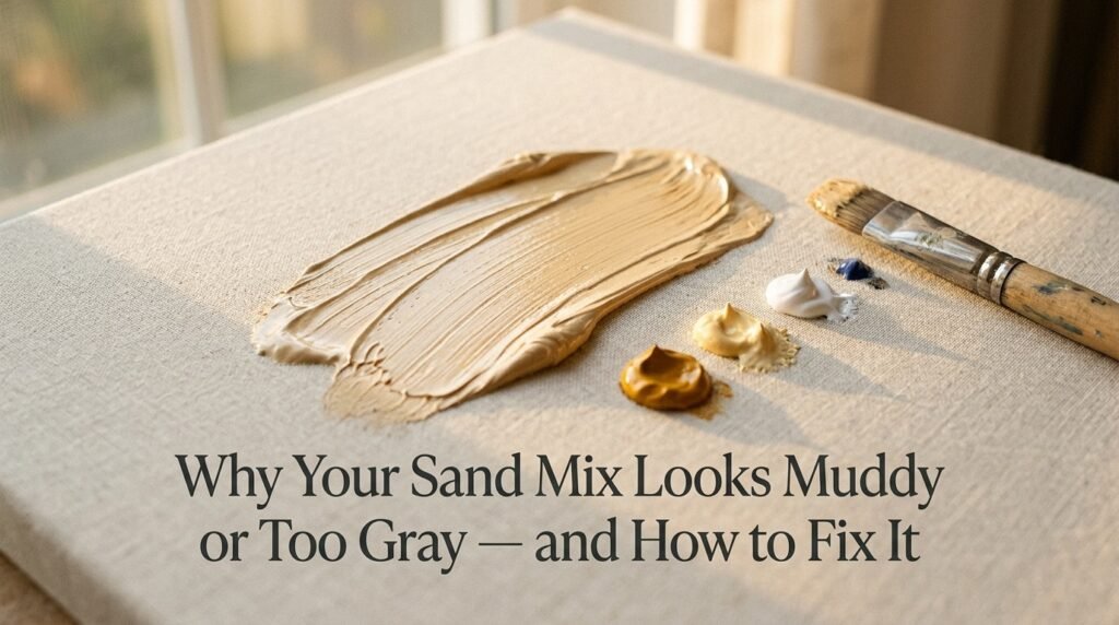
1. Undertones clashing. Cool-leaning yellows (like Lemon Yellow) or cool whites can flatten the warmth and color needs. Fix: Use warm-leaning yellows (like Yellow Ochre or Naples Yellow) and a warm white if your brand offers one.
2. Overmixing. Blending too long or adding too many extra pigments quickly dulls sand color into gray. Fix: Mix just until the colors combine, and stop as soon as you hit the warm, light tone you’re after.
3. Cheap or low-pigment paint. Budget paints often contain fillers that make sand color look chalky or flat instead of soft and natural. Fix: Use artist-grade or quality wall paint for your yellow and white base, even if your browns are more budget-friendly.
Best Pigments to Mix for Clean Sand Color Results
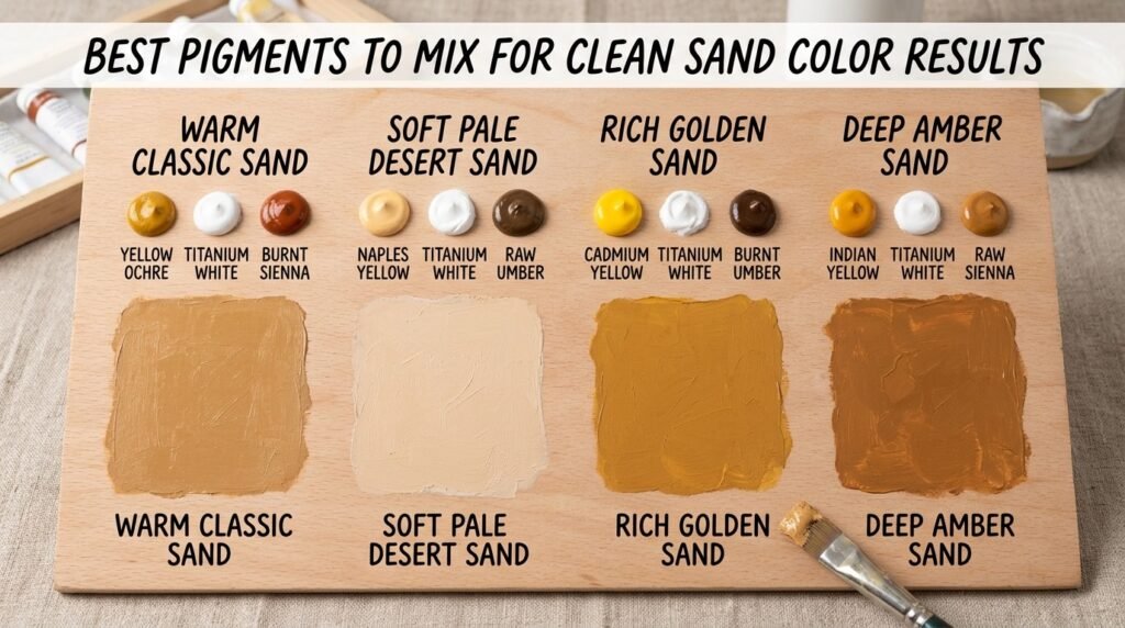
| Yellow Pigment | White | Muting Agent | Result |
| Yellow Ochre | Titanium White | Burnt Sienna | Warm, classic sand |
| Naples Yellow | Titanium White | Raw Umber | Soft, pale desert sand |
| Cadmium Yellow | Titanium White | Burnt Umber | Rich, golden sand |
| Indian Yellow | Titanium White | Raw Sienna | Deep, amber-toned sand |
Mixing tips:
- Always test sand color on a white surface so you can accurately judge its true warmth and lightness.
- Add your muting agent in tiny increments — brown is strong and can overpower the light, airy quality of sand quickly.
- Let your test swatch dry fully, since sand color can shift slightly lighter or warmer as paint dries.
Real-Life Examples: Sand Color in Traditional Art, Interior Design, and Digital Media
Traditional art: Desert and coastal landscape painters have long relied on warm beige and ochre tones to capture the soft, sunbaked look of dunes and shorelines realistically.
Interior design: Sand color has become a cornerstone of the “coastal minimalist” and “warm neutral” design trends, frequently paired with white, soft blue, and natural wood tones.
Digital media: Sand color (#C2B280 and similar shades) is popular in wellness apps, travel branding, and minimalist websites because it feels calm, natural, and easy on the eyes.
What Happens When You Add White, Brown, or Black to Sand Color?
Once you understand the basics of how to make sand color, modifiers let you fine-tune the shade even further.
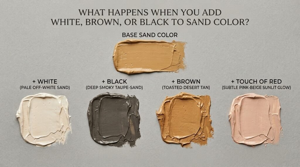
- Adding more white → Creates a very pale, almost off-white sand, often used for minimalist interiors. Example hex: #EDE0C8.
- Adding black → Creates a deep, smoky taupe-sand, useful for shadows or grounding tones. Example hex: #7A6F52.
- Adding more brown → pushes toward a deeper, toasted tan, ideal for rustic or desert-inspired palettes. Example hex: #A68A5B.
- Adding a touch of red → Warms it further, giving it a subtle pink-beige, sunlit glow. Example hex: #D6B594.
Beginner Tip: Add modifiers a tiny bit at a time — sand color’s charm comes from its soft balance, and it’s easy to accidentally push it too far toward brown, gray, or pink.
Paint vs. Digital Media: Subtractive vs. Additive, Revisited
To bring it all together: if you’re painting on canvas or mixing wall paint, you’re working with subtractive color — yellow, white, and brown pigments combining to form sand color by absorbing other wavelengths of light.
If you’re designing for a screen, you’re working with additive color — where sand color is achieved by adjusting red, green, and blue light channels in an RGB system (for example, #C2B280 is created by setting red and green fairly high and blue moderately lower).
Think of paint mixing like blending flour and butter into dough — combine them physically, and you get a new texture and tone. Light mixing is more like adjusting a dimmer switch on three different colored bulbs — combine the right intensities, and a new color “appears” on the wall.
Tips for Artists: Getting Better Sand Color Every Time
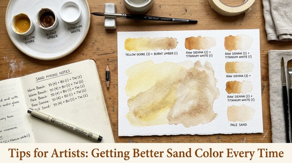
- Know your yellows and whites. Warm-leaning yellows and warm whites (without cool blue undertones) give the softest, most convincing results.
- Test on your actual palette white, not a screen — sand color shifts noticeably depending on lighting.
- Layer instead of overmixing. In watercolor or thin acrylics, glazing a pale yellow wash first, then a light brown layer on top, can create a more dimensional effect than mixing everything at once.
- Keep a mixing journal. Note your exact ratios and pigment brands so you can recreate your favorite sand tone later.
- Use a limited palette for practice. Working with just one yellow, one white, and one brown at a time is the fastest way to master how to make it reliably.
in Fashion and Interior Design
Sand color has remained a timeless neutral in both fashion and home decor, valued for its soft, versatile, effortlessly calming quality.
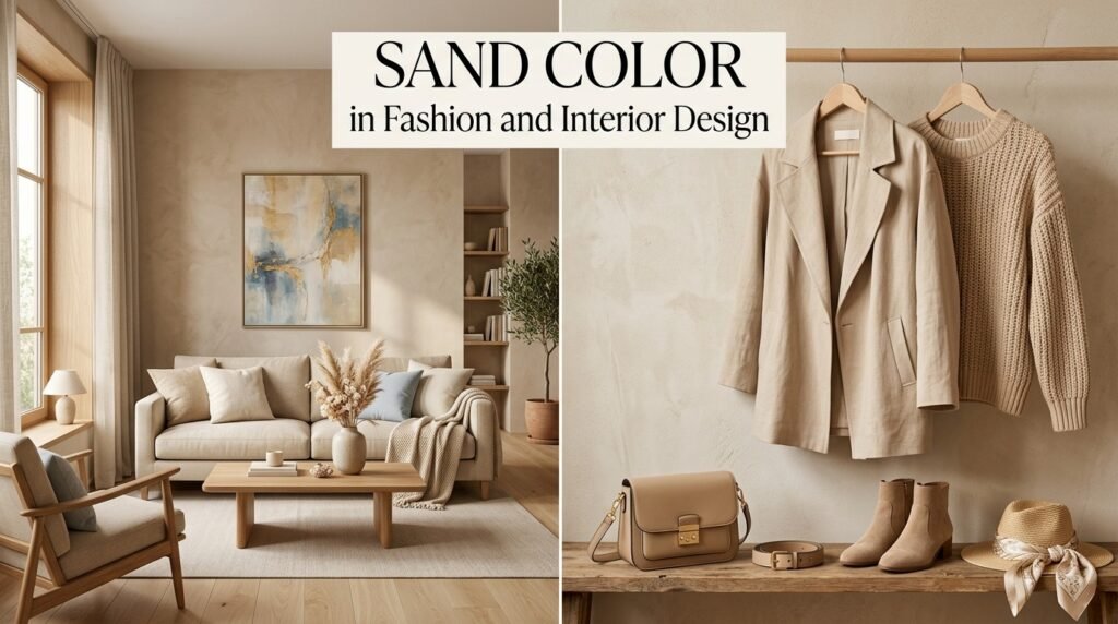
In fashion, sand-toned linen, knitwear, and accessories are wardrobe staples for their ability to pair with almost anything else. In interior design works beautifully with white, soft blues, and natural wood, making it a favorite for walls, upholstery, and textiles in coastal and minimalist spaces.
If you’re planning a home refresh, testing a few sand-colored paint swatches from your local hardware or design store against your existing furniture is one of the easiest ways to find the exact warmth — from pale ivory-sand to deeper golden sand — that suits your space best.
Where Sand Color Sits on the Color Wheel
Sand color doesn’t have its own dedicated slot on the traditional color wheel — instead, it sits in the yellow to yellow-brown family, built by lightening yellow with white and muting it with a touch of brown.
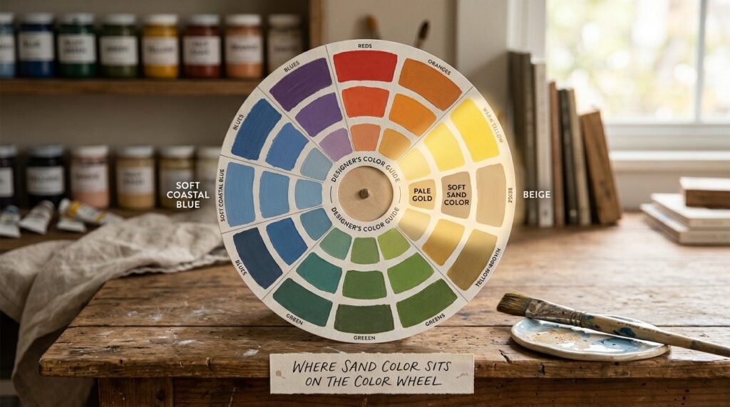
- Complementary color: Blue. Just like other warm neutrals in the yellow-orange family, sand color pairs beautifully with blue, creating a classic, calming coastal contrast.
- Analogous colors: Beige and pale gold sit closest to each other on the wheel, sharing their soft, warm, low-saturation qualities and making them natural partners for harmonious neutral palettes.
Conclusion
So, how to make sand color? In paint, it comes down to mixing yellow and white, then adding a small touch of brown to warm and ground the tone — landing you around the classic hex code #C2B280. On screens, that same soft warmth is recreated using red, green, and blue light values in an RGB system.
Just remember — watch your undertones, add brown slowly, and don’t worry if your first attempt looks a little too gray or too yellow. Every soft, natural color starts with a bit of testing and adjustment. Now that you know exactly how to do it, grab your palette and start mixing your perfect warm neutral.
FAQs
1. How to make sand color at home with basic paint?
Mix yellow and white together, then add a very small touch of brown to warm and mute the tone into a natural sand shade.
2. What color do yellow and white make when creating a sand color?
Yellow and white create a pale beige base, which becomes true once a small amount of brown is added.
3. How to make sand color look less gray or muddy?
Use warm-leaning yellows and whites, avoid overmixing, and add brown in very small amounts to keep the tone light and warm.
4. What is the hex code for sand color?
The most common hex code for sand color is #C2B280, though it can range from pale ivory-sand to deeper golden tones.
5. What color do you get when you mix sand color with white?
Mixing with more white creates a very pale, almost off-white sand tone, ideal for minimalist interiors.
6. What is the complementary color of sand color?
Blue is generally considered the complementary color of sand color, creating a classic, calming warm-cool contrast.
7. How to make sand color besides mixing yellow, white, and brown?
Some artists achieve sand-like tones by mixing a small amount of orange into a white base, or by using pre-mixed beige or khaki paint as a shortcut starting point.