What Color Does Red and Brown Make? The Complete Mixing Guide
Ever stared at your palette wondering what color does red and brown make before you commit brush to canvas? You’re not alone — it’s one of the most common mixing questions beginner painters ask.
Main takeaway: Mixing red and brown together produces a deep, earthy shade of red known as maroon — sometimes leaning toward brick red or rust, depending on the ratio and the specific pigments you use.
If you’ve ever tried to darken a red without turning it muddy or gray, you’ve probably instinctively reached for brown. It works — but the exact result depends on a few key variables we’ll walk through below. So let’s answer this properly: what color does red and brown make, why does it happen, and how do you control the result?
Understanding Red and Brown as Colors
Before we mix anything, it helps to know what we’re actually working with.
Red is a primary color in the traditional RYB (red-yellow-blue) color model used by most painters. That means it can’t be created by mixing other colors — it’s a starting point. Red is also a warm color, associated with energy, passion, and intensity.
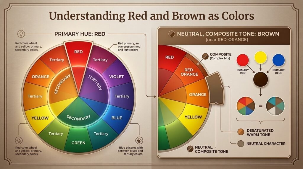
Brown, on the other hand, isn’t a “pure” color at all. It’s a composite — typically the result of mixing all three primary colors together, or mixing a color with its complementary opposite (like red and green). Brown is also warm-leaning, earthy, and neutral, which is exactly why it pairs so naturally with red.
Here’s why this pairing matters: because brown already contains a hidden amount of red pigment mixed with darker, muted tones, adding more red to it doesn’t fight the mixture — it reinforces it. That’s the whole reason this combination behaves so predictably compared to, say, mixing two totally unrelated hues.
Think of it like adding a shot of espresso to a mocha — you’re not introducing something foreign, you’re intensifying a flavor that’s already there.
Beginner Tip: If you’re new to mixing, always start with the lighter color (in this case, red) and add small amounts of the darker color (brown) gradually. It’s much easier to darken a mix than to lighten it back up.
What Color Do You Get When You Mix Red and Brown Paint?
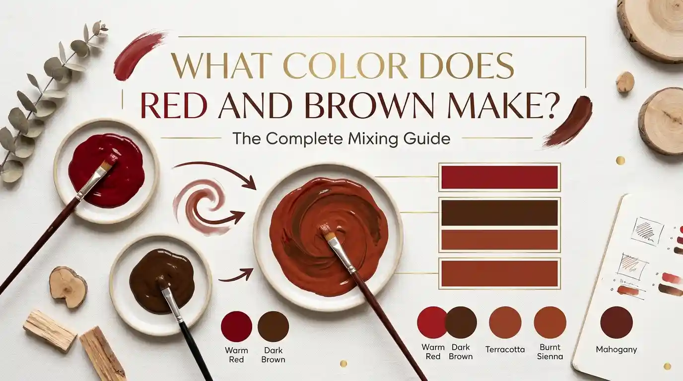
This is the heart of the question: red and brown make what color when mixed, exactly? The answer shifts slightly depending on your ratio. Here are three common combinations:
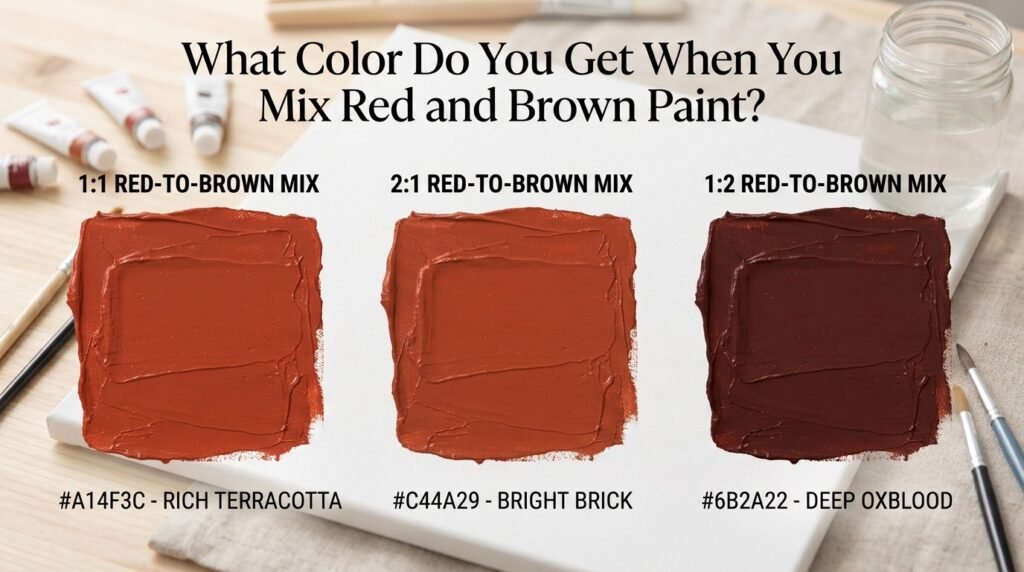
1:1 Ratio (equal parts red and brown)
- Result: A balanced maroon
- Hex code: #8b2f23
- Use case: Great for painting wine bottles, autumn leaves, or warm shadow tones on skin
2:1 Ratio (two parts red, one part brown)
- Result: A warmer, brighter brick-red
- Hex code: #a83a2a
- Use case: Ideal for terracotta pots, brick walls, or sunset-toned skies
1:2 Ratio (one part red, two parts brown)
- Result: A deep, muted brownish-red (closer to oxblood)
- Hex code: #6e2f22
- Use case: Perfect for leather textures, tree bark shadows, or moody backgrounds
Full Mixing Chart: Red + Brown Pigment Combinations
Different pigment brands and shades of brown will shift your outcome. Here’s a mixing chart to reference:
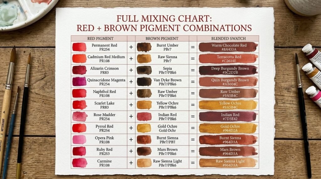
| Brown Shade | Red Shade | Resulting Color | Hex Code |
| Burnt Sienna | Cadmium Red | Warm Maroon | #9c3a2a |
| Burnt Umber | Alizarin Crimson | Deep Wine | #6b2333 |
| Raw Sienna | Cadmium Red Light | Terracotta Red | #b1502f |
| Van Dyke Brown | Naphthol Red | Dark Oxblood | #5e2420 |
| Raw Umber | Pyrrole Red | Muted Brick | #8a3d2c |
| Sepia | Vermilion | Rustic Red | #8f3527 |
| Burnt Sienna | Alizarin Crimson | Deep Rosewood | #7a2c2b |
| Mars Brown | Cadmium Red Medium | Bold Maroon | #9e3220 |
| Chocolate Brown | Fire Engine Red | Rich Burgundy-Red | #7c2429 |
| Walnut Brown | Scarlet | Warm Sienna-Red | #a04531 |
| Umber | Crimson | Classic Maroon | #7f2d2d |
What Color Does Red and Brown Light Make?
So far we’ve covered paint — but light behaves completely differently. Paint mixing is subtractive: pigments absorb certain wavelengths of light and reflect others, so combining colors removes light, making mixtures darker.
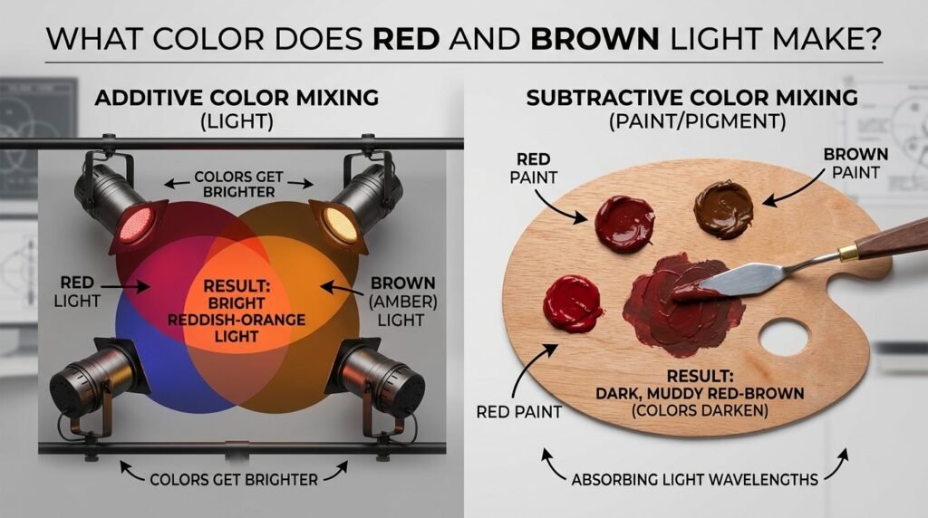
Light mixing, used in screens and stage lighting, is additive, based on the RGB (red-green-blue) model. Here, colors combine by adding wavelengths together, and mixtures get brighter, not darker.
In additive light mixing, there’s no true “brown” primary — brown is actually created by combining red, green, and blue light at specific low-intensity ratios (it’s essentially a dim, desaturated orange). So when you ask what color does red and brown light make, the honest answer is: mixing red light with a brown-toned light source will simply shift the hue slightly, usually landing on a dim reddish-orange rather than a true maroon.
This matters practically for:
- Screen and monitor design, where colors are built from RGB pixels
- Stage and theatrical lighting, where colored gels combine additively
- LED displays and signage, where brown is notoriously hard to render since it doesn’t exist as a “pure” hue in light
Subtractive vs. Additive Mixing: Side-by-Side Comparison
| Feature | Subtractive (Paint) | Additive (Light) |
| Base model | RYB / CMYK | RGB |
| Mixing effect | Colors get darker | Colors get brighter |
| Brown exists as | A natural pigment | A dim, desaturated orange |
| Red + Brown result | Maroon/brick red | Dim reddish-orange |
| Common in | Painting, printing | Screens, stage lighting, LEDs |
How Ratio Affects the Final Color
| Ratio (Red: Brown) | Resulting Color | Best Use Case |
| 3:1 | Bright brick red | Sunset skies, warm highlights |
| 2:1 | Brick red | Terracotta, autumn foliage |
| 1:1 | Balanced maroon | Wine, wood stain, shadows |
| 1:2 | Deep oxblood | Leather, bark, moody tones |
| 1:3 | Near-brown with red undertone | Soil, tree trunks, aged wood |
Why Your Mix Looks Muddy — and How to Fix It
If your red-and-brown mix looks dull, gray, or “off” rather than a clean maroon, it’s usually one of these issues:
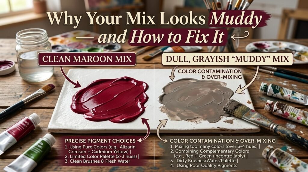
1. Clashing undertones. A cool-toned red (like Alizarin Crimson, which leans purple) mixed with a warm brown can neutralize itself into mud. Fix: Match warm reds with warm browns, and cool reds with cooler browns.
2. Overmixing. Stirring too long or adding too many colors at once can flatten vibrancy. Fix: Mix minimally and stop as soon as you hit the color you want.
3. Cheap or chalky paint. Lower-quality pigments often contain fillers that dull the mix. Fix: Invest in artist-grade paints, even just for your reds and browns, since they carry the most pigment load.
“A muddy mix is like over-steeping tea — once you’ve gone too far, you can’t un-steep it. Better to add color gradually than try to rescue an over-mixed batch.”
Best Pigments to Mix for Clean Results
| Pigment Pair | Result | Notes |
| Cadmium Red + Burnt Sienna | Warm, clean maroon | Great for beginners |
| Naphthol Red + Van Dyke Brown | Deep, saturated oxblood | Strong tinting power |
| Pyrrole Red + Raw Umber | Balanced brick tone | Good for landscapes |
| Vermilion + Sepia | Rustic, vintage red | Ideal for portraits |
| Cadmium Red Medium + Mars Brown | Bold, opaque maroon | Covers well in one layer |
Mixing tip: Always test your ratio on scrap paper or a palette first, and let it dry — many mixes look different once they’ve set, especially with watercolor and acrylic.
Real-Life Examples of Red and Brown Mixed
This color pairing shows up more often than you’d think:
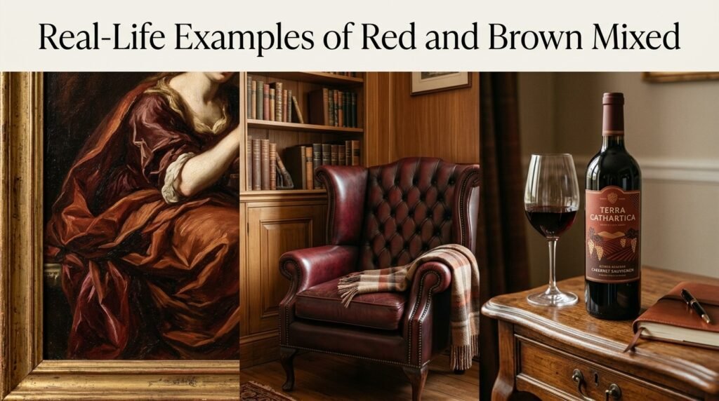
- Traditional art: Old Master painters used variations of this mix for drapery shadows, wood textures, and warm skin undertones.
- Interior design: Deep maroon and oxblood tones (born from this exact mix) are popular for accent walls, leather furniture, and moody dining rooms.
- Digital media: Brand palettes for wine labels, coffee packaging, and autumn-themed marketing frequently use this red-brown family of colors.
What Happens When You Add White, Yellow, or Black?
Once you’ve settled on your base maroon, modifiers let you fine-tune it further:
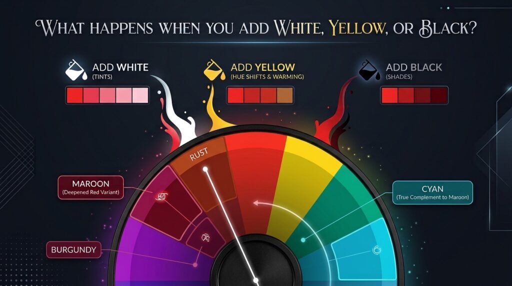
- Add white: Creates a dusty rose-brown, or “mauve-taupe.” Example hex: #c98a82
- Add yellow: Warms the mix toward a rust or terracotta shade. Example hex: #b1602f
- Add black: Deepens it into a near-black wine tone. Example hex: #3f1a17
- Add a touch of blue: Cools the mix slightly, pushing it toward a plum-maroon. Example hex: #6e2a3d
Paint vs. Digital Media: A Concrete Comparison
If you’re painting traditionally, mixing Cadmium Red with Burnt Sienna gives you a warm maroon at roughly #9c3a2a. If you’re designing digitally and want the visual effect of that same color, you’d simply select #9c3a2a directly in RGB — no physical mixing required, since digital tools let you skip the subtractive process entirely and pick the endpoint color.
This is a key difference for artists moving between mediums: physical paint requires understanding pigment behavior, while digital software only requires knowing your target hex code.
Tips for Artists
- Match temperature: Pair warm reds with warm browns for the cleanest results.
- Test on your palette first: Always dab a small mix before applying it to your canvas.
- Layer instead of mixing flat: For richer depth, apply a red glaze over a dried brown base rather than mixing them fully.
- Keep a swatch journal: Track your ratios and resulting hex codes so you can recreate favorite mixes later.
Maroon (and Friends) in Fashion and Interior Design
The maroon and oxblood family born from this red-brown mix has become a staple in both fashion and interiors. In fashion, deep maroon shows up in autumn/winter collections, leather goods, and accent accessories, prized for feeling both bold and grounded. In interior design, oxblood leather sofas, maroon accent walls, and rust-toned textiles are frequently used to add warmth without the intensity of pure red.
If you’re pulling this palette into a home project or a design mockup, it’s worth testing a few swatches against your existing furniture and lighting — a color-matching or paint-sample app can save you a lot of back-and-forth before committing to a wall.
Where This Result Sits on the Color Wheel
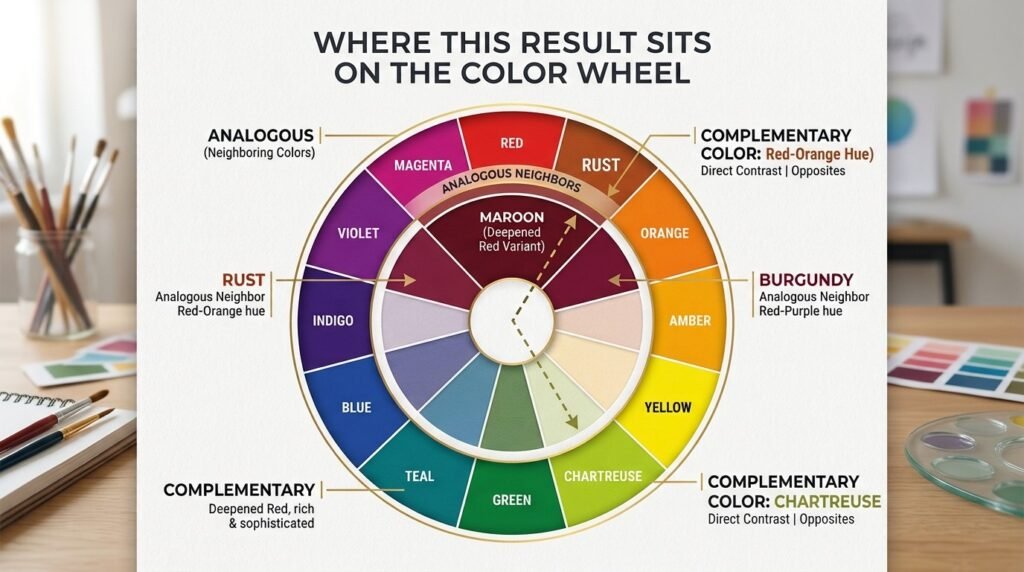
Maroon (the typical result of mixing red and brown) sits as a tertiary, deepened variant of red on the color wheel — not a “pure” wheel color itself, but a shade derived from it. Its complementary color is a deep forest or olive green, and its closest analogous colors are rust, burgundy, and deep terracotta. This is useful to know when building a full palette: pairing maroon with muted greens creates natural contrast, while pairing it with rust or burgundy creates a cohesive, monochromatic warm palette.
Conclusion
To sum it up: when you’re mixing paint, red and brown make maroon — a deep, earthy red that shifts toward brick or oxblood depending on your ratio and pigment choice. When you’re working with light instead of paint, the additive RGB model gives you a dimmer, reddish-orange result instead, since true brown doesn’t exist as a light primary.
Just watch out for muddy mixes — matching warm-to-warm pigments and avoiding overmixing will keep your maroon clean and vibrant. Whether you’re painting a still life, designing a room, or just satisfying your curiosity, now you have a full answer to what color does red and brown make — and the tools to control exactly how it turns out.
FAQs
What color does red and brown make when mixed? Mixing red and brown together typically produces maroon, a deep earthy red that can lean toward brick or oxblood depending on the ratio used.
Do red and brown make burgundy?
Yes — with the right ratio (more brown than red, using cooler pigments), you can land close to burgundy, which is a purplish-red tone.
What color does red and brown make in digital design (RGB)?
In additive light mixing, red and brown combine into a dim, desaturated reddish-orange rather than a true maroon, since brown isn’t a pure light primary.
Is maroon a primary, secondary, or tertiary color?
Maroon is generally considered a tertiary or “derived” shade — a deepened variant of red rather than a color on the primary/secondary wheel itself.
Why does my red and brown mix look muddy instead of maroon?
This usually happens from mismatched undertones (cool red with warm brown), overmixing, or lower-quality paint with too many fillers.
What’s the best pigment pairing if I want a clean answer to what color does red and brown make?
Cadmium Red mixed with Burnt Sienna is one of the most reliable pairings for a clean, warm maroon.
Can I lighten the red-and-brown mix without losing the color?
Yes — add small amounts of white gradually. This creates a dusty rose-brown tone rather than diluting the color into gray.