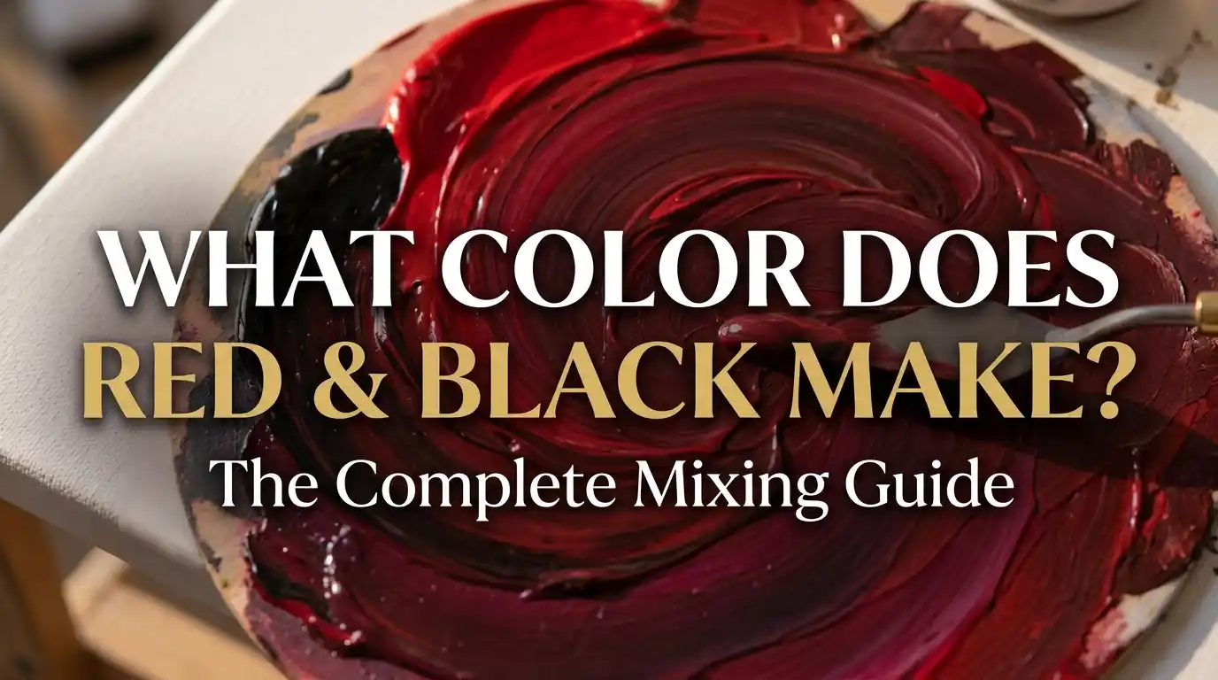
What Color Does Red and Black Make? The Complete Mixing Guide
Staring at your palette wondering what color does red and black make before you darken that painting? You’re not alone — this is one of the most common shading questions painters ask, right up there with knowing exactly how much black to add before it’s too much.
Main takeaway: Mixing red and black together produces a deep, darkened shade of red — typically landing somewhere between maroon and burgundy, depending on the specific red you start with and how much black you add.
Black has a reputation for being a “dangerous” color to mix with — add too much, and you can flatten a vibrant hue into something lifeless. But used carefully, it’s one of the most reliable ways to deepen a color without changing its basic identity. So let’s break this down properly: what color does red and black make, why does it behave this way, and how do you keep control over the result?
Understanding Red and Black as Colors
Before mixing, it’s worth understanding what each color actually brings to the table.
Red is a primary color in the RYB (red-yellow-blue) model most painters use — it can’t be created by mixing other hues, only from itself. It’s also a warm color, tied to energy, intensity, and passion.
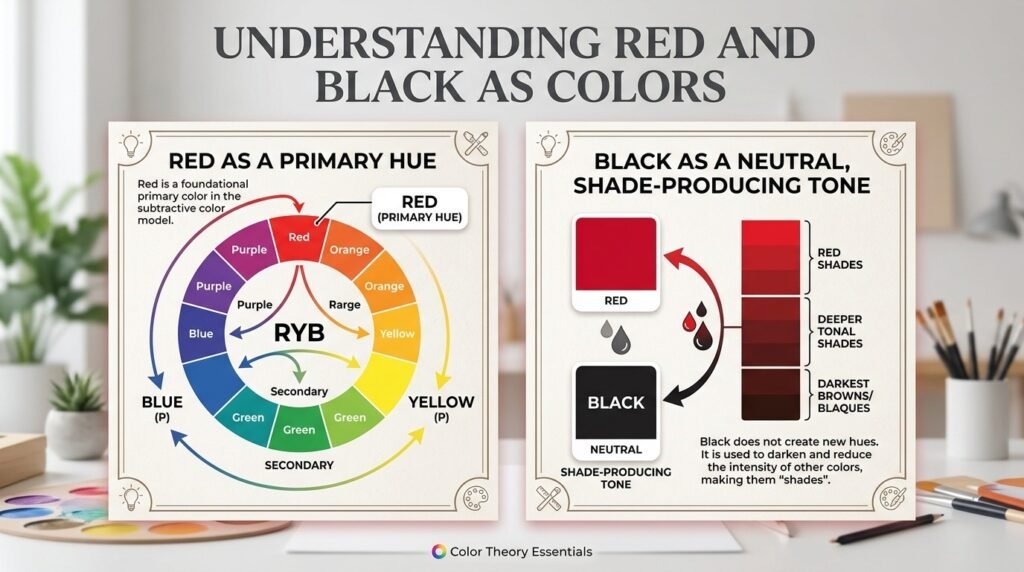
Black, technically, isn’t a “color” in the traditional sense — it’s a neutral, sitting outside the color wheel entirely. In painting, black’s main job is to darken other colors by absorbing nearly all light, creating what color theorists call a “shade.” Unlike brown or gray, black doesn’t shift the hue much on its own — it mostly just deepens whatever it’s mixed with.
This is exactly why the pairing matters: because black doesn’t fight red’s warmth or push it toward another hue family, the two combine in a very predictable, controllable way — which is why so many painters reach for black the moment they need a darker red.
Think of it like dimming a stage light rather than swapping the bulb — the color of the light stays essentially the same; it’s just less intense.
Beginner Tip: Add black in tiny increments — a toothpick-tip’s worth at a time. Black is extremely strong relative to most other pigments, and a little goes a long way toward overpowering your red.
What Color Do You Get When You Mix Red and Black Paint?
Here’s the heart of it: red and black make what color when mixed, exactly? The answer shifts depending on the ratio. Here are three common combinations:
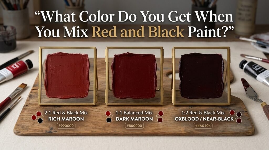
1:1 Ratio (equal parts red and black)
- Result: A deep, near-black maroon
- Hex code: #4d0000
- Use case: Great for deep shadow tones, gothic-style illustrations, or dramatic backgrounds
2:1 Ratio (two parts red, one part black)
- Result: A rich, balanced maroon
- Hex code: #7f0000
- Use case: Ideal for wine bottle labels, velvet drapery, or moody portrait backgrounds
1:2 Ratio (one part red, two parts black)
- Result: A near-black, oxblood-like tone
- Hex code: #330000
- Use case: Perfect for deep leather textures, night scenes with red accents, or somber color studies.
Full Mixing Chart: Red + Black Pigment Combinations
Different red pigments respond differently to black. Here’s a mixing chart to reference:
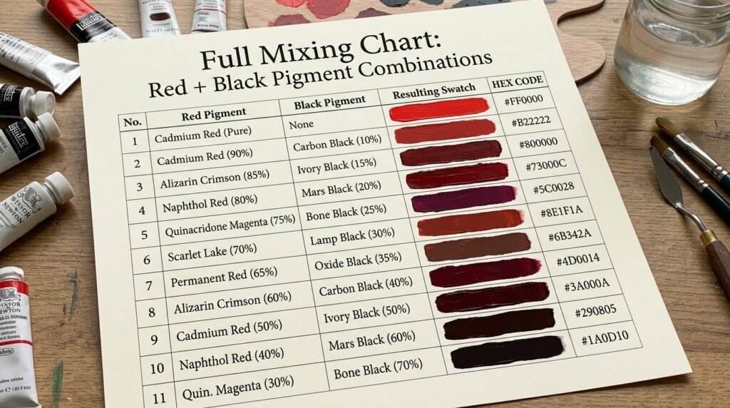
| Red Shade | Black Shade | Resulting Color | Hex Code |
| Cadmium Red | Ivory Black | Warm Dark Maroon | #7a0d0d |
| Alizarin Crimson | Mars Black | Cool Burgundy | #5c0e1f |
| Naphthol Red | Lamp Black | Deep Brick-Maroon | #6e1414 |
| Pyrrole Red | Ivory Black | Rich Garnet | #701010 |
| Vermilion | Mars Black | Warm Oxblood | #7c1a10 |
| Cadmium Red Light | Lamp Black | Bright Dark Red | #831414 |
| Crimson | Ivory Black | Classic Maroon | #661010 |
| Scarlet | Mars Black | Deep Wine Red | #7a1414 |
| Fire Engine Red | Lamp Black | Blackened Cherry | #6b0c0c |
| Venetian Red | Ivory Black | Earthy Dark Red | #5e1a12 |
| Rose Madder | Mars Black | Muted Plum-Red | #5a1220 |
What Color Does Red and Black Light Make?
Paint and light behave very differently. Paint mixing is subtractive — pigments absorb certain wavelengths and reflect others, so combining colors removes light and produces darker results.
Light mixing, used in screens and stage lighting, is additive, based on the RGB (red-green-blue) model. Here, adding light makes things brighter — but black is a special case, since black in light isn’t really a “color” at all. It’s the absence of light.
So when you ask what color does red and black light make, the honest answer is: it stays red. Adding “black light” to red light doesn’t darken it the way black paint does — it simply means less light is present overall, which reads visually as a dimmer red, not a shifted hue like maroon.
This distinction matters for:
- Screen and monitor design, where “darker red” is achieved by lowering RGB values, not adding a black pigment
- Stage and theatrical lighting, where dimming a red gel reduces intensity rather than mixing in black
- LED displays, where a “black” pixel is simply a pixel that’s turned off
Subtractive vs. Additive Mixing: Side-by-Side Comparison
| Feature | Subtractive (Paint) | Additive (Light) |
| Base model | RYB / CMYK | RGB |
| Mixing effect | Colors get darker | Colors get brighter (or dimmer if reduced) |
| Black represents | A darkening neutral pigment | Absence of light |
| Red + Black result | Maroon/burgundy | Dimmer red (no true hue shift) |
| Common in | Painting, printing | Screens, stage lighting, LEDs |
How Ratio Affects the Final Color
| Ratio (Red: Black) | Resulting Color | Best Use Case |
| 4:1 | Deep, warm red | Subtle shadow tones |
| 3:1 | Rich brick-red | Autumn leaves, warm shading |
| 2:1 | Balanced maroon | Wine labels, drapery |
| 1:1 | Deep maroon, near-black | Gothic art, dramatic accents |
| 1:2 | Near-black oxblood | Night scenes, deep leather |
Why Your Mix Looks Muddy — and How to Fix It
If your red-and-black mix looks dull, gray, or lifeless rather than a rich dark red, it’s usually one of these issues:
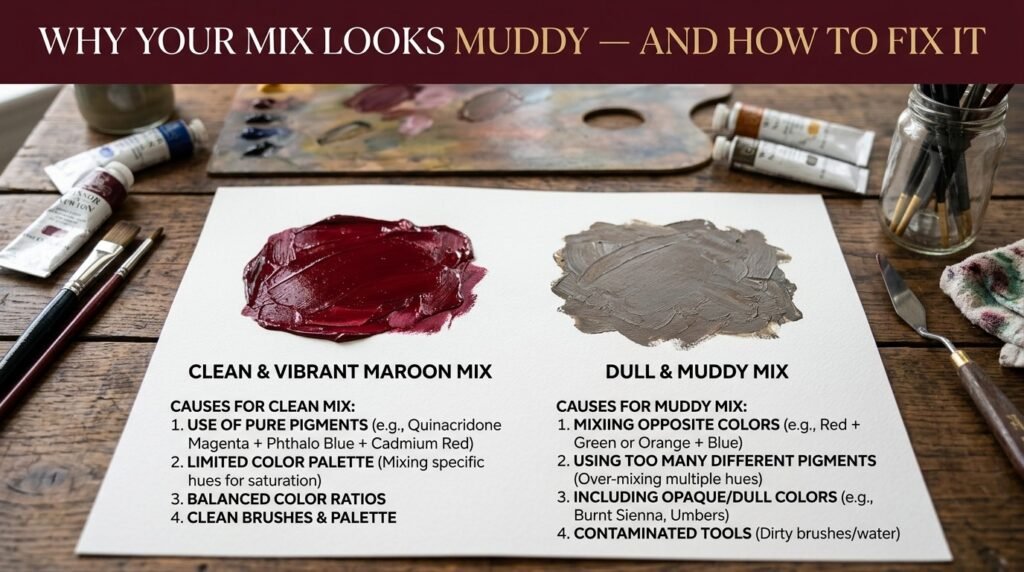
1. Too much black too fast. Black is a powerful pigment, and overshooting the amount instantly flattens the red’s vibrancy. Fix: Add black in tiny amounts and mix thoroughly before adding more.
2. Clashing undertones. A cool-toned red (like Alizarin Crimson) combined with certain blacks can push the mix toward a grayish plum instead of a clean maroon. Fix: Test small batches first, and adjust with a touch more red if it looks flat.
3. Cheap or chalky paint. Lower-quality paints often contain fillers that mute the mix. Fix: Use artist-grade reds and blacks, since they carry more pigment and less filler.
“Adding black to red is like adding salt to a dish — a pinch enhances it, but dump in too much, and you can’t undo it. Go slow.”
Best Pigments to Mix for Clean Results
| Pigment Pair | Result | Notes |
| Cadmium Red + Ivory Black | Warm, clean dark maroon | Great for beginners |
| Alizarin Crimson + Mars Black | Cool-toned burgundy | Good for cooler palettes |
| Naphthol Red + Lamp Black | Deep brick-maroon | Strong tinting strength |
| Vermilion + Mars Black | Warm oxblood | Ideal for dramatic shadows |
| Pyrrole Red + Ivory Black | Rich garnet tone | Excellent opacity |
Mixing tip: Test your ratio on scrap paper and let it dry before committing — many red-black mixes darken further once they set, especially in acrylic and oil.
Real-Life Examples of Red and Black Mixed
This color pairing shows up constantly, often without people realizing exactly how it was achieved:
- Traditional art: Gothic and Baroque painters used red darkened with black for deep drapery folds, shadowed velvet, and dramatic lighting effects.
- Interior design: Deep maroon and oxblood tones (often born from this exact mix) are popular for accent walls, leather furniture, and moody dining spaces.
- Digital media: Wine branding, luxury fashion logos, and gothic-themed digital art frequently pull from this dark red family.
What Happens When You Add White, Blue, or Brown?
Once you’ve landed on your base dark red, modifiers let you fine-tune the tone further:
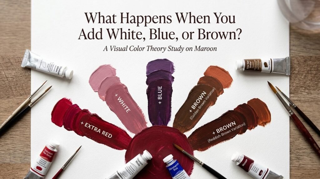
- Add white: Lightens the mix into a dusty rose or “brick pink.” Example hex: #c98a8a
- Add blue: Cools the mix toward a plum-burgundy. Example hex: #5c1a3a
- Add brown: Warms and earths the tone into a rustic oxblood. Example hex: #6e2f22
- Add a touch more red: Brightens the mix back up slightly without fully undoing the darkening. Example hex: #8f1414
Image caption: A row of five swatches branching from a central maroon base, each showing the shift caused by adding white, blue, brown, or extra red.
Paint vs. Digital Media: A Concrete Comparison
If you’re painting traditionally, mixing Cadmium Red with Ivory Black gives you a warm dark maroon around #7a0d0d. If you’re designing digitally and want that same visual result, you’d simply select #7a0d0d directly in RGB — no physical pigment mixing required, since digital color pickers let you jump straight to the target hue.
This is the core distinction for artists moving between mediums: physical paint mixing depends on understanding pigment strength and behavior, while digital tools only require knowing the target hex code.
Tips for Artists
- Add black last, and sparingly: It’s far easier to darken further than to lighten a mix that’s gone too dark.
- Test on your palette first: A small dab dried and viewed in natural light tells you more than a wet swatch.
- Layer instead of flat-mixing: For richer depth, apply a black glaze over dried red rather than mixing them fully together.
- Keep a swatch journal: Log your ratios and hex codes so you can recreate a favorite dark red later.
Maroon and Burgundy in Fashion and Interior Design
The maroon and burgundy family that comes from mixing red and black has become a design staple across both fashion and interiors. In fashion, deep maroon and burgundy appear constantly in fall/winter collections, formal wear, and leather accessories — colors that feel bold yet sophisticated rather than loud. In interior design, oxblood leather furniture, burgundy accent walls, and deep red textiles are popular for adding drama and warmth without overwhelming a space.
If you’re pulling this palette into a home or wardrobe project, it’s worth testing a few physical swatches against your existing lighting first — a color-matching or paint-sample app can save a lot of trial and error before you commit.
Where This Result Sits on the Color Wheel
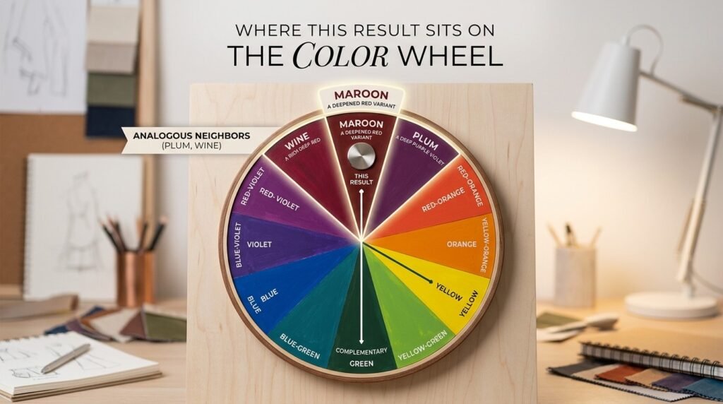
Maroon and burgundy (the typical results of mixing red and black) sit as deepened, tertiary variants of red on the color wheel — shades derived from red rather than standalone wheel colors. Their complementary color is a deep forest or hunter green, and their closest analogous colors are deep plum, wine, and rust. This is useful when building a full palette: pairing maroon with deep greens creates striking contrast, while pairing it with plum or wine creates a cohesive, moody monochromatic look.
Conclusion
Watch out for muddy results — adding black slowly and testing as you go will keep your dark red clean rather than lifeless. Whether you’re deepening a portrait’s shadows, designing a moody room, or just satisfying your curiosity, you now have a complete answer to what color does red and black make — and the control to get exactly the shade you want.
To sum it up: when mixing paint, red and black make a deep, darkened shade of red — usually maroon or burgundy, depending on the exact red and how much black you use. When working with light instead of paint, black isn’t really a color at all — it’s an absence of light — so “mixing” red with black in the digital world just means dimming the red rather than shifting its hue.
FAQs
What color does red and black make when mixed?
Mixing red and black together produces a deep, darkened red — usually maroon or burgundy, depending on the specific red used and how much black is added.
Does red and black make burgundy?
Yes — using a cooler-toned red, like Alizarin Crimson, with black often produces a burgundy with purplish undertones rather than a straightforward maroon.
What color does red and black make in digital design (RGB)?
In light mixing, black represents an absence of light rather than a pigment, so combining red with black essentially just dims the red rather than shifting it into maroon.
Is maroon a primary, secondary, or tertiary color?
Maroon is considered a tertiary or “derived” shade — a deepened variant of red rather than a standalone color on the primary/secondary wheel.
Why does my red and black mix look muddy or gray instead of maroon?
This usually happens from adding too much black too quickly, using low-quality paint with fillers, or mismatched undertones between the specific red and black used.
What’s the best pigment pairing if I want a clean answer to what color does red and black make?
Cadmium Red mixed with Ivory Black is one of the most reliable pairings for a clean, warm dark maroon.
Can I lighten a red-and-black mix without losing the color?
Yes — add small amounts of white gradually. This creates a dusty rose or brick-pink tone rather than diluting the mix into gray.