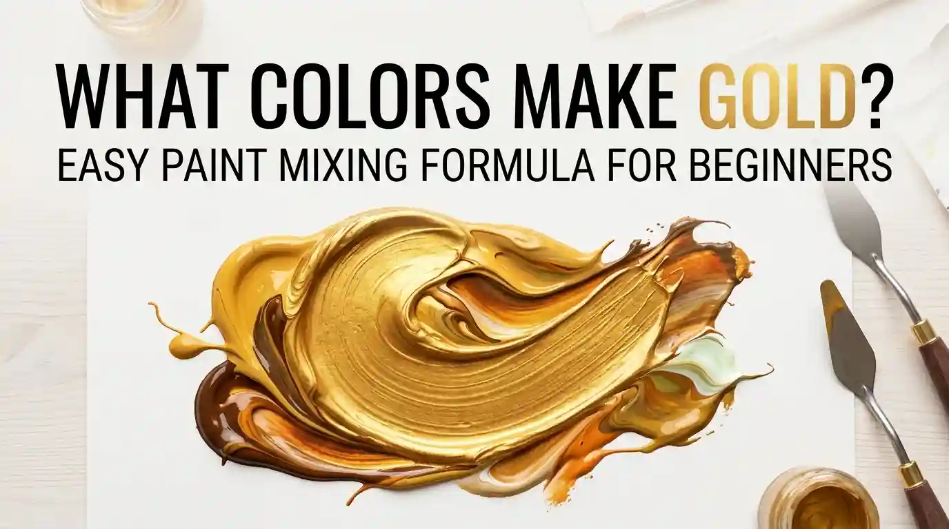
What Colors Make Gold? Easy Paint Mixing Formula for Beginners
Have you ever tried to paint a picture frame, a ring, or a shimmering sunset and wondered what colors make gold? It’s a question that trips up a lot of beginner painters — because gold isn’t a color you’ll find sitting on the standard color wheel.
Main Takeaway: Gold is made by mixing yellow with a touch of brown (and sometimes a little white or orange). It’s not a primary or secondary color — it’s a warm, muted tone built from yellow’s brightness and brown’s depth. The exact ratio determines whether you get a bright, shiny gold or a deep, antique gold.
That’s the quick answer. But getting a gold that looks rich and metallic — instead of flat and mustard-colored — takes a little more finesse. Let’s walk through it step by step so you know exactly what colors make gold every time you pick up your brush.
Understanding Gold as a Color
Unlike red, blue, or yellow, gold isn’t a primary color, and it isn’t even a true secondary color like orange or green. Gold is what color theorists call a tone — a color that’s been softened and deepened by adding a neutral or darker hue to a base color.
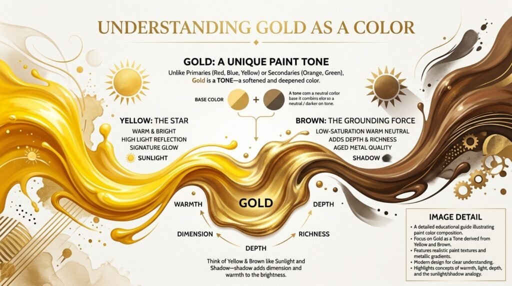
Yellow is the star of the gold formula. It’s warm, bright, and reflects more light than any other hue, giving gold its signature glow.
Brown is what grounds it. Brown is a low-saturation, warm neutral that adds depth, richness, and the “aged metal” quality gold is known for.
Why the Pairing Matters
Because yellow provides brightness and brown provides depth, this pairing is what separates a true metallic-looking gold from a plain, flat yellow. Understanding this relationship is the key to answering what colors make gold in any medium — paint, digital design, or fabric dye.
What Color Do You Get When You Mix Yellow and Brown Paint?
This is the core of the question: what colors make gold, and how much of each do you need?
Here’s the simple rule: more yellow gives you a brighter, more radiant gold. More brown gives you a deeper, antique-style gold. Try these three ratios as a starting point.
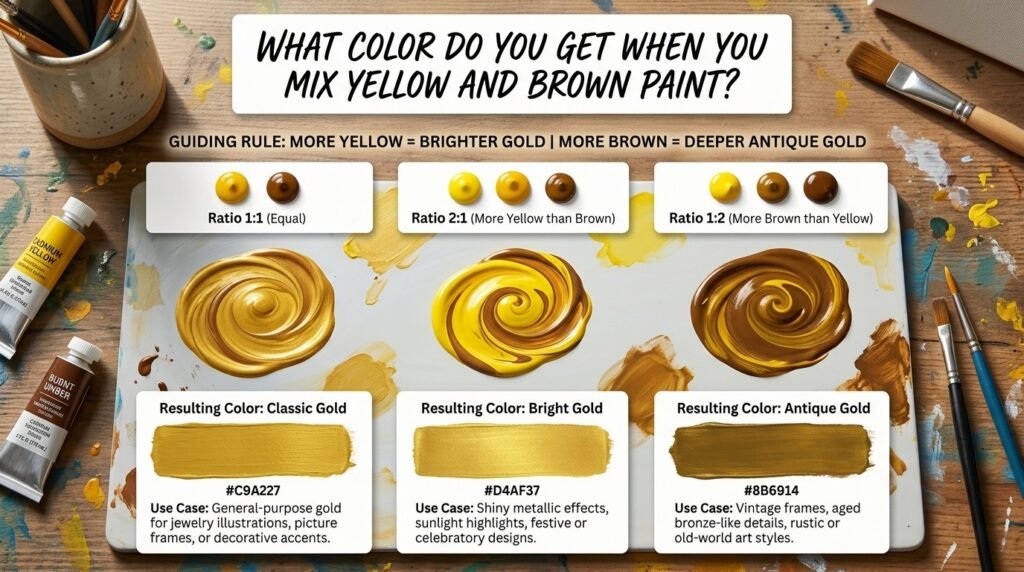
1. Ratio 1:1 (Equal Yellow and Brown)
- Resulting color: Classic Gold
- Hex code: #C9A227
- Use case: General-purpose gold for jewelry illustrations, picture frames, or decorative accents.
2. Ratio 2:1 (More Yellow than Brown)
- Resulting color: Bright Gold
- Hex code: #D4AF37
- Use case: Shiny metallic effects, sunlight highlights, festive or celebratory designs.
3. Ratio 1:2 (More Brown than Yellow)
- Resulting color: Antique Gold
- Hex code: #8B6914
- Use case: Vintage frames, aged bronze-like details, rustic or old-world art styles.
Full Color Mixing Chart: Yellow + Brown Pigment Combinations
Different pigments and brands shift the final result. Here’s a detailed chart to help you find what color yellow and brown make with specific paints.
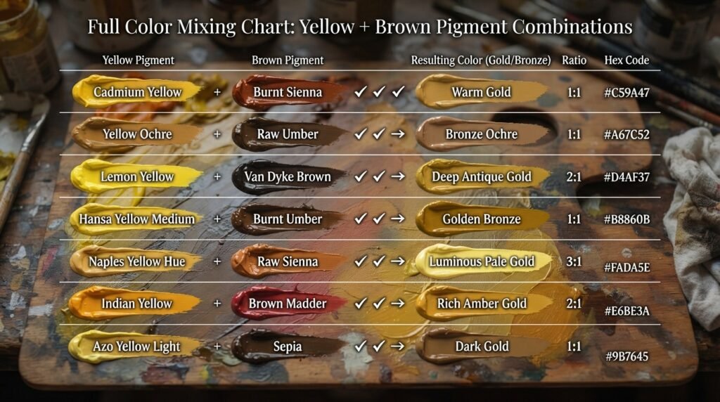
| Yellow Pigment | Brown Pigment | Resulting Color | Hex Code |
| Cadmium Yellow | Burnt Sienna | Warm Gold | #C68E17 |
| Yellow Ochre | Raw Umber | Antique Gold | #B8860B |
| Hansa Yellow | Burnt Umber | Deep Bronze Gold | #8B6914 |
| Lemon Yellow | Van Dyke Brown | Muted Old Gold | #A67C00 |
| Golden Yellow | Sepia | Rich Gold | #CD9575 |
| Naples Yellow | Raw Sienna | Soft Champagne Gold | #E4C989 |
| Cadmium Yellow Deep | Burnt Sienna | Sunlit Gold | #DAA520 |
| Yellow Ochre | Mars Brown | Rustic Gold | #B8860B |
| Indian Yellow | Burnt Umber | Deep Amber Gold | #B87333 |
| Chrome Yellow | Sepia | Classic Metallic Gold | #D4AF37 |
| Hansa Yellow Light | Raw Umber | Pale Straw Gold | #E1C16E |
As you can see, what colors make gold can shift quite a bit depending on the warmth of your yellow and the depth of your brown — something we’ll explore more below.
Additive (RGB) vs. Subtractive (Paint) Mixing for Gold
Just like with any color, the answer to what colors make gold shifts depending on whether you’re working with paint or light.
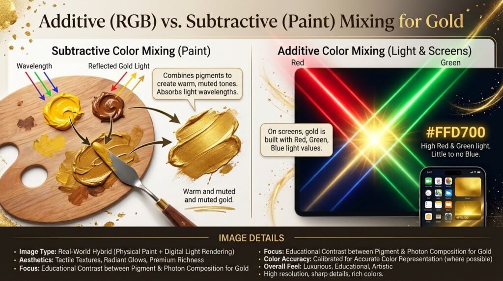
Paint mixing is subtractive. Pigments absorb certain wavelengths of light and reflect others. Mixing yellow and brown paint physically combines pigments to create the warm, muted tone we call gold.
Light mixing is additive. On screens, gold isn’t mixed from yellow and brown at all — it’s built using red, green, and blue (RGB) light values. A typical digital gold, like #FFD700, is created by combining high red and green light with little to no blue.
Use cases for digital gold:
- Screens and displays — App icons, banners, and websites use RGB-based gold (#FFD700 or #D4AF37) for a premium, luxury feel.
- LED lighting — Warm amber-gold LED lighting is achieved by blending red and green channels at high intensity.
- Theater and stage lighting — Amber and gold gels are layered over warm white lights to create a glowing, regal atmosphere on stage.
Subtractive vs. Additive Mixing: Side-by-Side Comparison
| Feature | Subtractive (Paint) | Additive (Light) |
| Base colors for gold | Yellow + Brown | Red + Green (light) |
| How it works | Absorbs wavelengths | Emits/combines wavelengths |
| Common medium | Paint, ink, dye | Screens, stage lights, LEDs |
| Result of mixing more colors | Darker, muddier tones | Brighter, whiter tones |
| Typical gold hex | #C9A227 (matte gold) | #FFD700 (bright digital gold) |
| Example | Acrylic or oil paint | Website banners, app icons |
How Ratio Affects the Final Gold Color
The ratio of yellow to brown is the biggest factor in whether your gold looks bright and shiny or deep and antique.
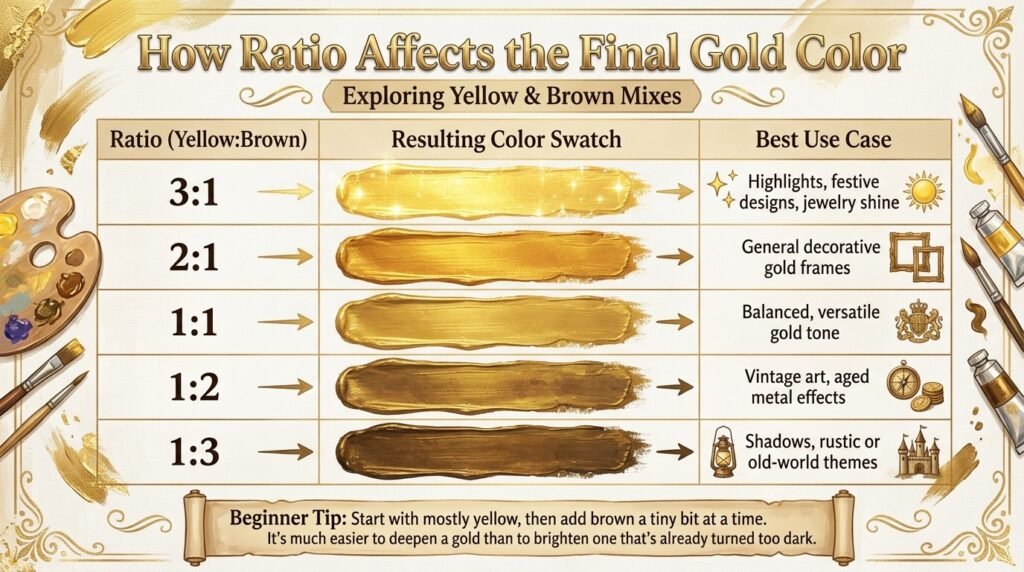
| Ratio (Yellow:Brown) | Resulting Color | Best Use Case |
| 3:1 | Bright Sunlit Gold | Highlights, festive designs, jewelry shine |
| 2:1 | Warm Gold | General decorative gold frames |
| 1:1 | Classic Gold | Balanced, versatile gold tone |
| 1:2 | Antique Gold | Vintage art, aged metal effects |
| 1:3 | Deep Bronze Gold | Shadows, rustic or old-world themes |
Why Your Gold Mix Looks Muddy or Brownish — and How to Fix It
If you’ve mixed what should make gold and ended up with a flat, dull mustard color instead, you’re likely running into one of these issues:
1. Undertones clashing. Cool-leaning yellows (like Lemon Yellow) mixed with cool-leaning browns can flatten the warmth that makes gold glow. Fix: Use warm-leaning yellows (like Cadmium Yellow or Yellow Ochre) paired with warm browns (like Burnt Sienna).
2. Overmixing. Blending too thoroughly, or adding too many extra colors, can dull the shine right out of your gold. Fix: Mix just until the colors combine — stop as soon as you hit the shade you want.
3. Cheap or low-pigment paint. Budget paints often contain fillers that make gold look chalky instead of rich. Fix: Use artist-grade yellow and brown pigments, even if the rest of your palette is student-grade.
Best Pigments to Mix for Clean, Rich Gold Results
| Yellow Pigment | Brown Pigment | Result |
| Cadmium Yellow Medium | Burnt Sienna | Bright, warm gold |
| Yellow Ochre | Raw Umber | Classic antique gold |
| Hansa Yellow | Van Dyke Brown | Deep, rich bronze-gold |
| Naples Yellow | Burnt Umber | Soft, muted champagne gold |
Mixing tips:
- Always mix on a white surface so you can accurately judge the true gold tone.
- Add brown gradually — it’s a strong pigment, and a little goes a long way.
- For a metallic finish, mix in a small amount of metallic gold or pearl medium after you’ve achieved your base color.
Real-Life Examples: Gold in Traditional Art, Interior Design, and Digital Media
Traditional art: Byzantine and Renaissance artists used gold leaf and gold-toned pigments to create halos and divine light in religious paintings, using the color to symbolize wealth, holiness, and permanence.
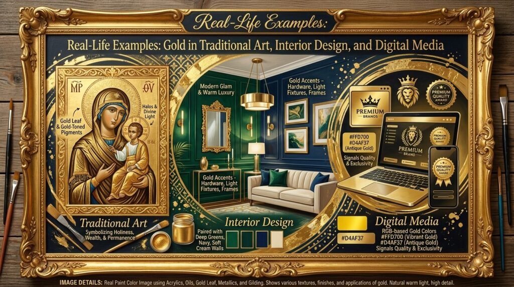
Interior design: Gold accents — in hardware, light fixtures, and frames — have become a signature of the “modern glam” and “warm luxury” interior trends, often paired with deep greens, navy, or soft cream walls.
Digital media: Premium brand logos, award badges, and luxury product websites frequently use RGB-based gold (#FFD700 and #D4AF37) because it instantly signals quality and exclusivity.
What Happens When You Add White, Brown, or Black to Gold?
Once you’ve nailed your base gold, modifiers let you fine-tune it even further.
- Adding white → Creates a soft, pale gold, often called “champagne” or “straw gold.” Example hex: #E4C989. Great for soft, elegant designs or highlights.
- Adding black → Creates a deep, smoky bronze-gold. Example hex: #6B5010. Useful for shadows and depth in metallic renderings.
- Adding more brown → Pushes gold toward a rustic, antique bronze tone. Example hex: #8B6914. Common in vintage or rustic-style artwork.
- Adding a touch of orange → Warms the gold further, giving it a sunlit, amber-like glow. Example hex: #DAA520.
Paint vs. Digital Media: Subtractive vs. Additive, Revisited
To bring it all together: if you’re painting on canvas, you’re working with subtractive color — yellow and brown pigments mixing to form gold by absorbing other wavelengths of light.
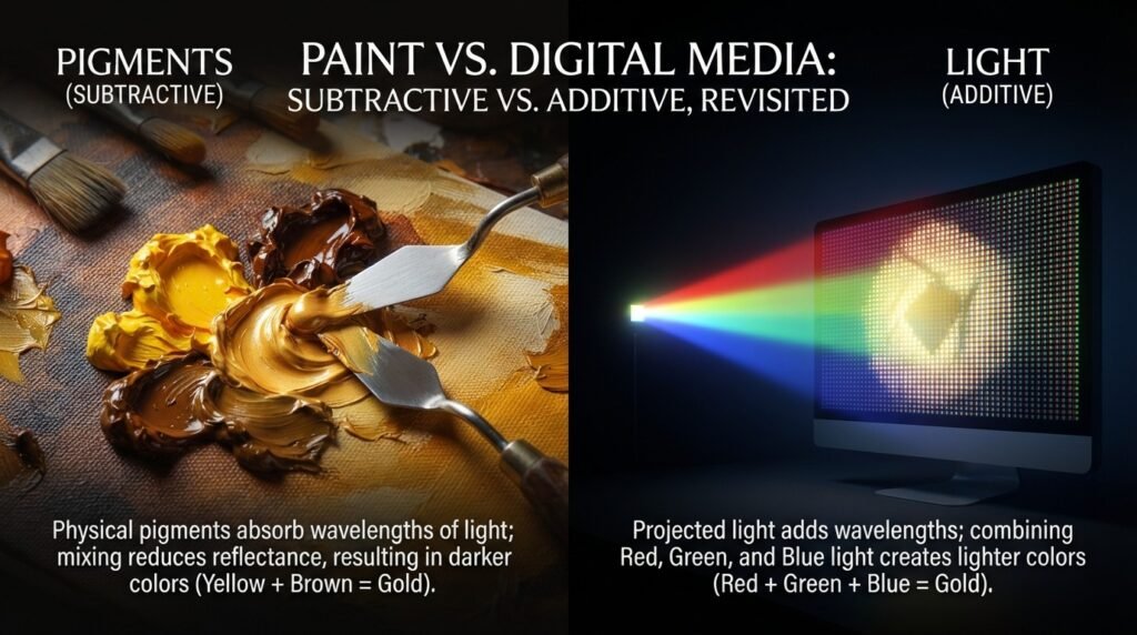
If you’re designing for a screen, you’re working with additive color — where gold is achieved by adjusting red, green, and blue light channels in an RGB system (for example, #FFD700 is created by setting red to full intensity, green to about 84%, and blue to zero).
Tips for Artists: Getting Better Golds Every Time
- Know your yellows and browns. Warm-leaning yellows and browns (without cool blue or green undertones) give the richest, most convincing golds.
- Test on your actual palette white, not a screen — gold tones shift depending on lighting and surface.
- Layer instead of overmixing. In watercolor or thin acrylics, glazing a brown layer over a dry yellow layer can create a more luminous, dimensional gold than mixing them directly.
- Keep a mixing journal. Note your exact ratios and pigment brands so you can recreate your favorite golds later.
- Add metallic mediums last. If you want a true shimmer, mix your base gold color first, then blend in a small amount of metallic paint or mica powder at the end.
Gold in Fashion and Interior Design
Gold has remained a timeless staple in both fashion and home decor, prized for the sense of luxury and warmth it brings to any palette.
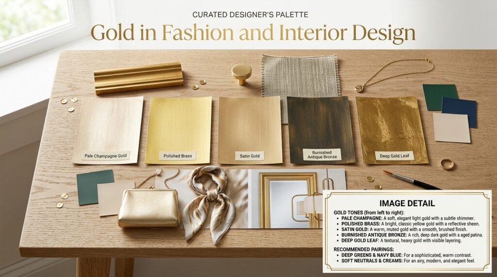
In fashion, gold jewelry, metallic threads, and gold-toned fabrics are wardrobe staples for formal wear and statement accessories. In interior design, gold accents — cabinet hardware, mirror frames, and light fixtures — pair beautifully with deep greens, navy blues, and soft neutrals to create a warm, upscale feel.
If you’re planning a home refresh or a creative project, testing a few gold-toned paint swatches or metallic finish samples against your existing color scheme is one of the easiest ways to find the exact gold — from pale champagne to deep antique bronze — that suits your space best.
Where Gold Sits on the Color Wheel
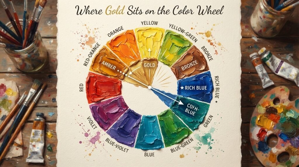
Gold doesn’t have its own dedicated slot on the traditional color wheel the way primary and secondary colors do. Instead, it sits in the yellow-orange to yellow-brown family, built by muting and deepening yellow with brown.
- Complementary color: Blue. Just like its close relatives orange and yellow-orange, gold pairs strikingly with blue, creating a warm-cool contrast that’s popular in both art and interior design.
- Analogous colors: Amber and bronze sit alongside gold, sharing their warm, earthy undertones and making them natural partners for cohesive, harmonious palettes.
Conclusion
So, what colors make gold? In paint, the answer is yellow and brown, mixed and adjusted with white, black, or orange until you land on the exact warmth and depth you want. In digital design, gold shifts to an additive RGB mix, most commonly represented by hex codes like #FFD700 and #D4AF37.
Just remember — watch your undertones, add brown slowly, and don’t worry if your first attempt looks a little flat or muddy. Every rich, glowing gold starts with a bit of testing and adjustment. Now that you know exactly what colors make gold, grab your palette and start mixing your perfect shade.
FAQs
1. What colors make gold in paint?
Yellow and brown make gold when mixed in paint, with the exact shade depending on the ratio and specific pigments used.
2. What color do yellow and brown make when mixed in different ratios?
More yellow creates a brighter, sunlit gold, while more brown creates a deeper, antique-style gold.
3. What colors make gold look flat or muddy? Cool-undertone yellows or browns, overmixing, or low-quality paint are the most common causes of a dull, flat gold.
4. Do red and green lights make gold on screens?
Yes, in additive (light) mixing, combining high-intensity red and green light with little to no blue produces the bright digital gold seen in hex codes like #FFD700.
5. What color do you get when you mix gold with white?
Mixing gold with white creates a soft, pale champagne or straw-gold tone.
6. What is the complementary color of gold?
Blue is generally considered the complementary color of gold, since gold sits in the warm yellow-orange family opposite blue on the color wheel.
7. What colors make gold besides yellow and brown?
Some artists achieve gold-like tones by mixing yellow, orange, and a touch of black, or by adding metallic gold or mica-based paint to a yellow-brown base for extra shine.