What Colors Make Yellow? Real Mixing Results & Color Guide
Ever stood at your easel wondering what colors make yellow, only to realize your paint set doesn’t have a tube of it? You’re not alone. It’s one of the most common questions beginner painters ask, right up there with “why does my green look muddy?”
Main takeaway: Here’s the short answer before we dig in. In traditional paint, yellow is a primary color, so you can’t mix it from other paints — but you can shift an existing yellow warmer, cooler, lighter, or darker with small additions. Digitally, though, you genuinely can mix yellow from scratch: red light + green light, at full brightness, makes yellow. This guide covers both paths in full.
If you’ve ever typed “how do you make yellow color” into a search bar hoping for a magic formula, this article walks through everything — paint mixing, digital hex codes, common mistakes, and every shade of yellow worth knowing.
What Is Yellow?
Yellow sits at the warmest, brightest point of the color wheel. It’s the color of sunlight, egg yolks, and highlighter pens — high energy, high visibility, hard to ignore.
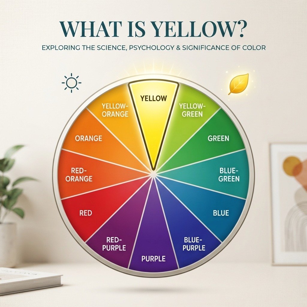
On a traditional artist’s color wheel, yellow occupies the 12 o’clock position, directly across from purple. In technical terms, its hue angle sits at roughly 60°, right between red and green.
Yellow reads as a warm color in almost every context, though some yellows lean cooler than others. A lemon yellow with a touch of green in it feels crisp and fresh. A golden yellow with a hint of orange feels rich and heavy. Both are still yellow, just shifted along the warm end of the spectrum.
Culturally, yellow gets tied to optimism, caution, and energy all at once — think warning signs and taxi cabs on one hand, sunflowers and smiley faces on the other.
What Colors Make Yellow?
Here’s the part that trips up a lot of beginners, so let’s be straightforward about it. If you’re asking what colors make yellow in the context of paint, the honest answer is: nothing does — yellow is a primary color.
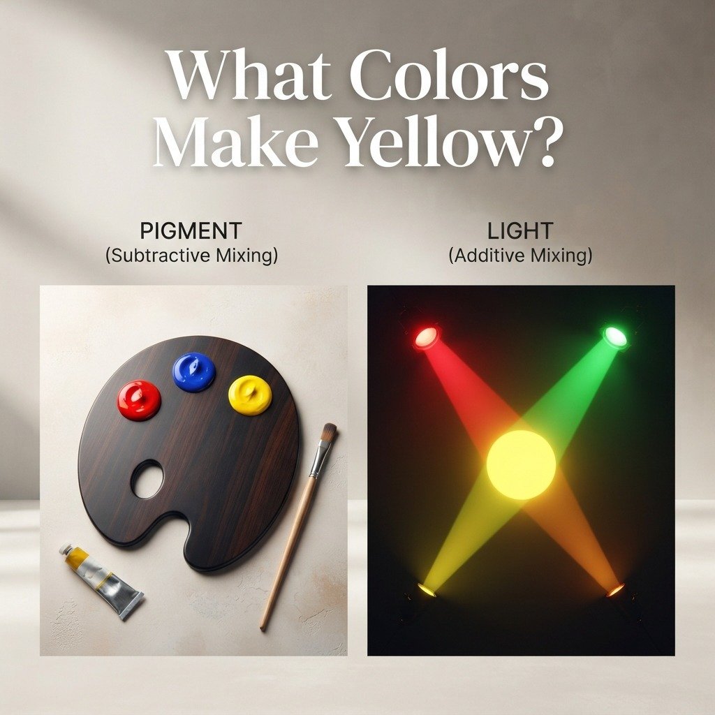
Painters work with three primary colors: red, blue, and yellow. Primary colors are, by definition, the ones you can’t mix from anything else. Every other color on your palette comes from combining these three in different amounts. So if a paint mixing chart ever shows you “red + green = yellow” in the paint aisle, treat it with real skepticism — that combination almost always produces a murky brown or olive tone, not yellow.
There is one place where mixing genuinely does make yellow, and it’s worth knowing: light. Point a red spotlight and a green spotlight at the same spot on a white wall, and the overlapping area glows yellow. This is how screens work, and we’ll cover it fully in the digital section below.
So the practical version of how to make yellow in a paint context isn’t about mixing it from zero — it’s about starting with a yellow you already have and adjusting it into the exact shade you need. That’s what the next section walks through.
Step-by-Step: How to Mix Yellow in Paint
Since yellow itself has to come from a tube, this section focuses on shaping that yellow into whatever version your painting needs. Here’s a simple process to follow.
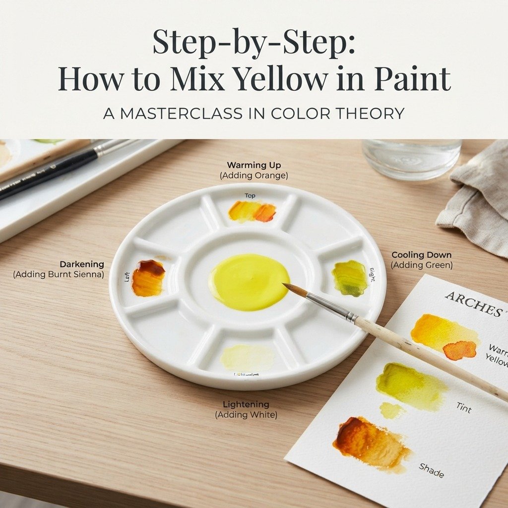
- Start with a true, unmixed yellow — cadmium yellow or hansa yellow both work well as a neutral base.
- To warm it up, add a tiny touch of orange or a whisper of red. A little goes a long way here.
- To cool it down, mix in a small amount of green, or a yellow that already leans green, like lemon yellow.
- To lighten it, add white in small increments, testing after each addition.
- To darken it without dulling it, use a touch of burnt sienna rather than black, which tends to gray yellow out fast.
- Mix in small batches, testing the color on scrap paper before committing to your canvas.
The golden rule when learning how to make yellow work for you: add color a drop at a time. Yellow is one of the most sensitive colors on the wheel — even a tiny amount of another pigment can shift it dramatically.
Think of yellow paint like a spotlight on a stage — the moment you add even a small colored filter, the whole mood of the light changes.
Beginner Tip: Keep a spare piece of white paper next to your palette at all times. Yellow looks completely different against white than it does pooled on a plastic palette, so always test there before judging the shade.
Mixing Chart: Yellow Variations by Pigment Combination
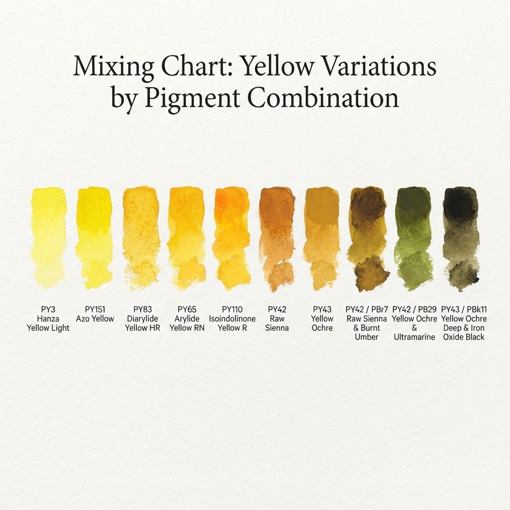
The table below shows how small additions to a base yellow shift both its name and its hex code. Each row starts from a pure yellow and adds one modifier, so you can see exactly how much a “pinch” of another color changes the outcome. Use this as a reference chart rather than an exact recipe, since actual paint brands vary in strength and pigment load.
| Base + Modifier | Resulting Shade | Approx. Hex Code |
| Pure Yellow (unmixed) | Lemon Yellow | #FFF44F |
| Yellow + tiny white | Pale Yellow | #FFF9B0 |
| Yellow + more white | Cream Yellow | #FFFACD |
| Yellow + touch of orange | Golden Yellow | #FFDF00 |
| Yellow + more orange | Amber | #FFBF00 |
| Yellow + touch of red | Marigold | #EAA221 |
| Yellow + touch of green | Chartreuse-Yellow | #DFFF00 |
| Yellow + brown (small) | Mustard | #FFDB58 |
| Yellow + brown (more) | Ochre | #CC7722 |
| Yellow + tiny violet | Muted/Grayed Yellow | #C9B458 |
A few rows stand out here. Mustard and ochre both come from the same brown-leaning path, but the amount of brown makes a huge visual difference between the two. Chartreuse-yellow is the one entry that pushes toward green rather than orange, which makes it useful for spring or nature-themed palettes. Notice how the last row, muted yellow, shows what happens when yellow’s complementary color — violet — sneaks in even slightly, dulling the whole mix.
How to Make Yellow With Different Starting Colors
Not everyone has a full paint set on hand. If your only yellow options are limited, here are a few workarounds worth knowing.
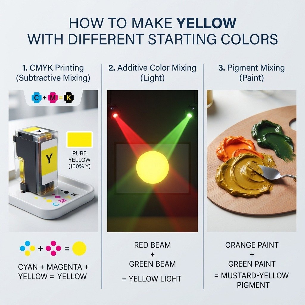
If you’re mixing printer inks or digital CMYK values, yellow already exists as one of the four core inks (cyan, magenta, yellow, black), so there’s no mixing required there either — you simply select 100% yellow ink.
This is the one true exception to “yellow can’t be mixed,” and it only works with light, not pigment.
If you’re stuck with only a green and an orange paint and genuinely no yellow, a very heavily orange-weighted mix can approximate a dull, warm yellow-ish tone, though it will never reach the clarity of true pigment yellow. This is more of an emergency workaround than a real technique, and most working artists would rather wait and buy actual yellow paint.
How to Make Yellow Digitally (RGB/Hex)
This is where how to make yellow color gets refreshingly simple, because digital yellow really is a mix. In the RGB light system that powers every screen, colors combine additively.
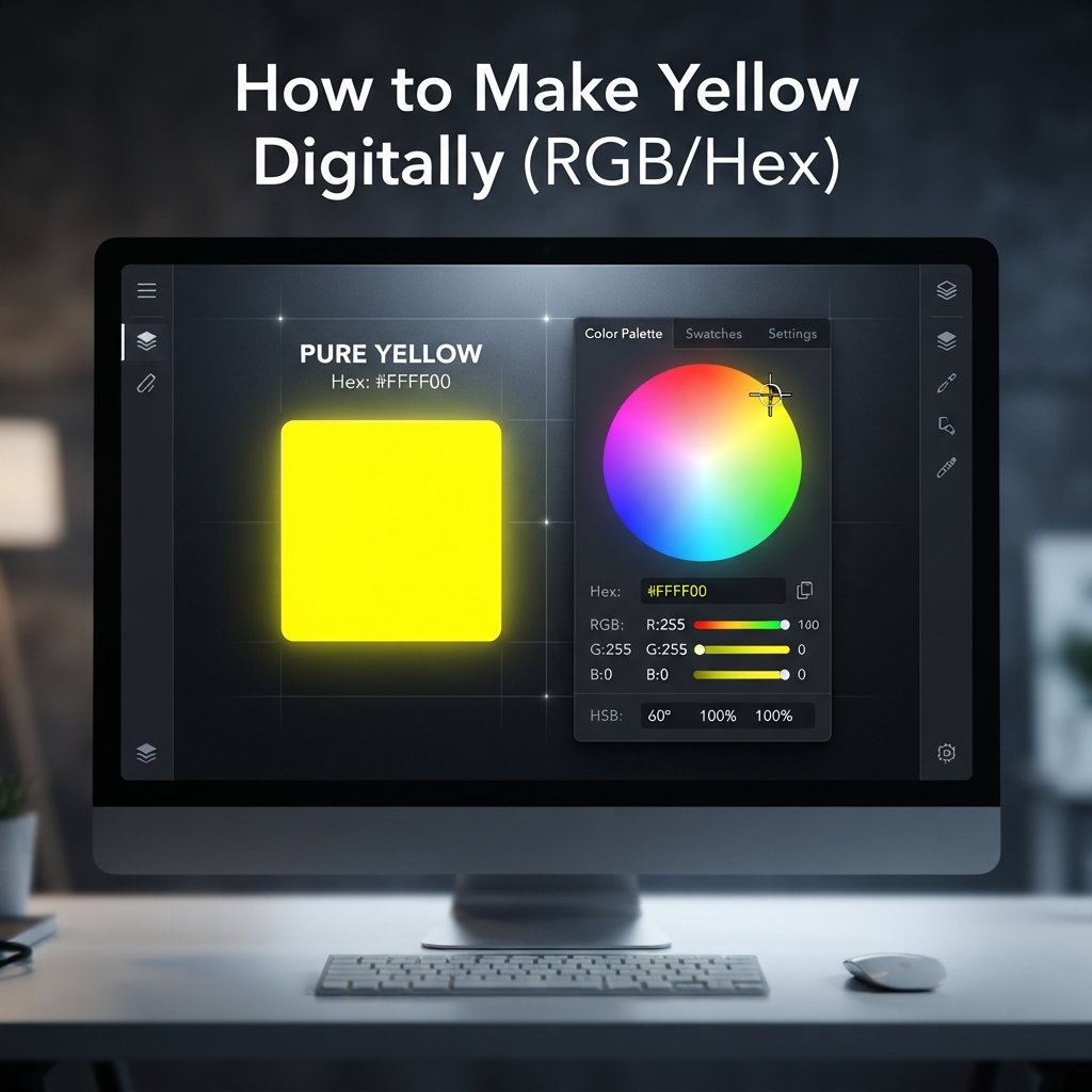
Pure yellow in digital design is:
- Hex code: #FFFF00
- RGB values: rgb(255, 255, 0)
That’s full-strength red and full-strength green, with zero blue. Turn blue up even slightly and yellow shifts toward a paler, greenish tone; leave blue at zero, and you get a clean, saturated yellow.
In Photoshop or Procreate: open the color picker and type FFFF00 directly into the hex field, or set R to 255, G to 255, and B to 0 manually.
In CSS, this looks like:
background-color: #FFFF00;
/* or */
background-color: rgb(255, 255, 0);
For a slightly warmer, more paint-like yellow on screen — closer to golden yellow than neon yellow — try #FFD700 instead, which is a widely used “gold” hex value.
Common Mistakes and How to Fix Them
Problem: Your yellow keeps turning green. This usually happens when a paintbrush isn’t fully cleaned before dipping back into the yellow, carrying trace blue residue with it. Fix it by rinsing brushes thoroughly and using a dedicated brush just for yellows during a session.
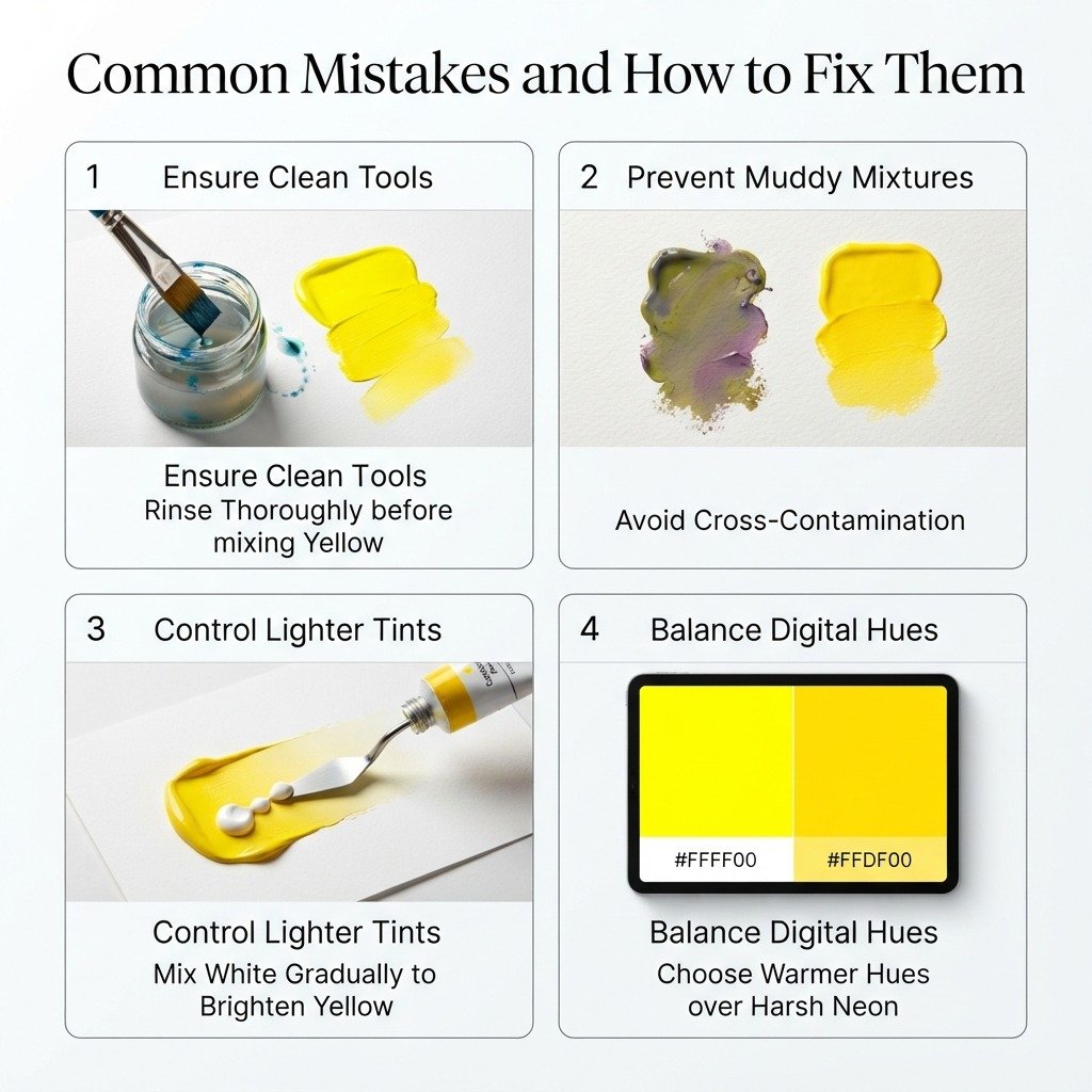
Problem: Your yellow looks muddy or gray. This is almost always caused by accidentally mixing in a touch of yellow’s complement, purple, often through cross-contamination on the palette. Start fresh with clean yellow and rebuild the shade slowly instead of trying to “fix” a muddy batch.
Problem: Your yellow looks too pale or washed out. This happens from adding white too quickly without testing along the way. Add white in smaller increments and check the result against white paper after each addition.
Problem: Digital yellow looks neon instead of natural. Pure #FFFF00 is intense by design. If you want something closer to a natural, paint-like yellow, drop the hex to something like #FFDF00 or #F4C430 instead.
Tips for Getting a Consistent, Vivid Yellow
Getting a reliable, repeatable version of how to make yellow work every time comes down to a few habits.
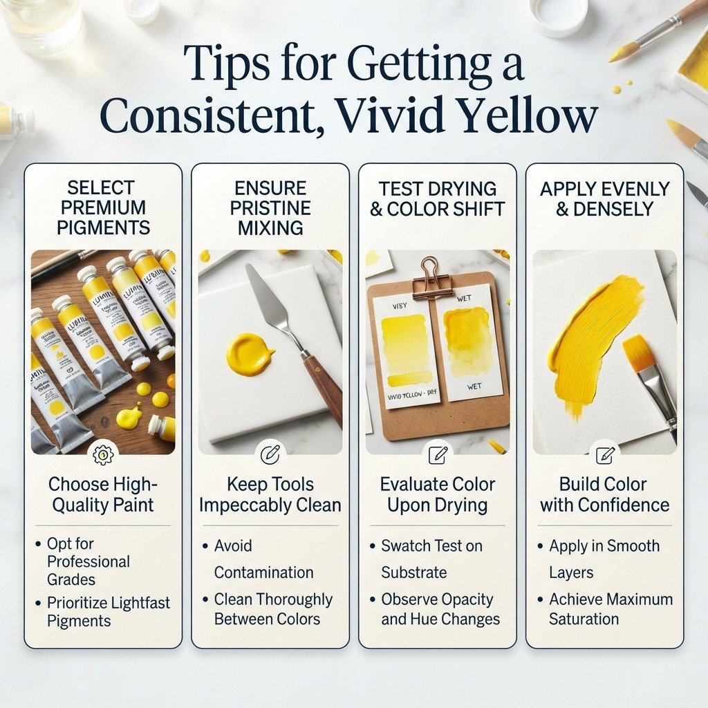
Use quality pigment. Cheap student-grade yellows often contain fillers that dull the color and make it harder to predict how it’ll shift when mixed.
Test in small batches. Mix a tiny amount first, let it dry (paint often shifts slightly in tone once dry), and only then mix your full batch to match.
Keep your palette clean. Yellow is more sensitive to contamination than almost any other color, so a dirty palette knife can throw off a whole batch.
Dry-test before committing. Dab a small amount onto scrap paper of the same type you’re using for your final piece, since paper absorbency changes how a color reads.
Real-Life Uses of Yellow
Yellow shows up constantly outside the studio, and understanding how to make yellow work in context helps explain why.
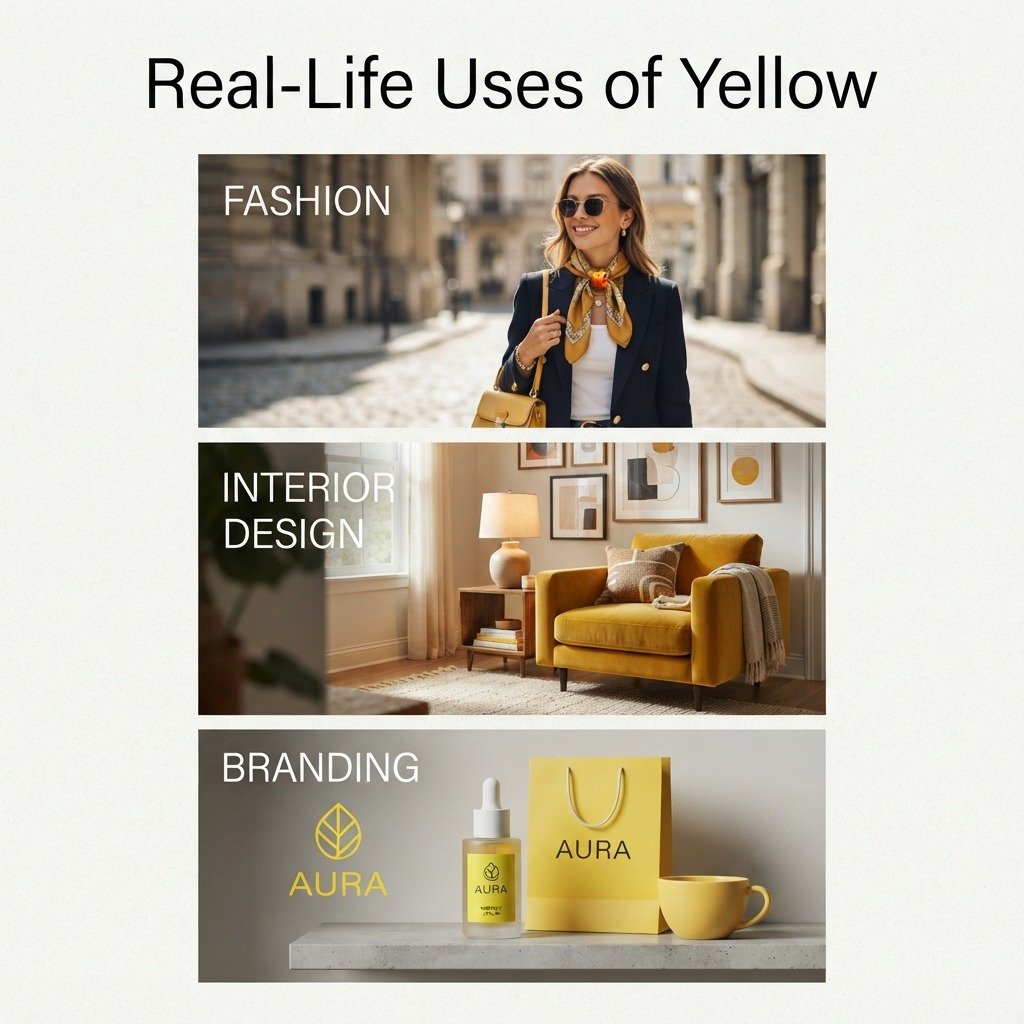
Fashion: Yellow reads as a confident, attention-grabbing accent color. It’s most often used sparingly — in accessories, shoes, or a single statement piece — rather than head-to-toe outfits.
Interior Design: Softer yellows, like cream or pale butter tones, warm up a room without overwhelming it. Bolder mustard yellows work best as a single statement wall or a standout piece of furniture, rather than covering an entire space.
Branding: Yellow gets used deliberately for its high visibility and its association with optimism and energy. This is exactly why fast food chains, delivery services, and children’s brands lean on it so heavily.
Shades and Variations of Yellow
Not all yellows serve the same purpose, and knowing a few named variations makes it easier to communicate exactly what you’re after.
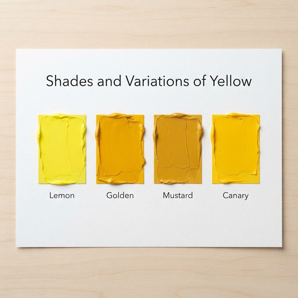
| Shade Name | Hex Code | Best Used For |
| Lemon Yellow | #FFF44F | Bright, fresh accents; spring themes |
| Golden Yellow | #FFDF00 | Warm interiors, vintage branding |
| Mustard Yellow | #FFDB58 | Fall palettes, retro design |
| Canary Yellow | #FFEF00 | High-visibility signage, bold fashion |
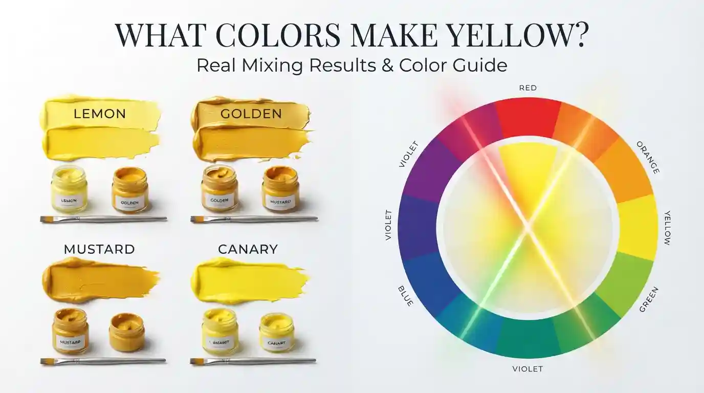
Lemon yellow reads as the coolest and cleanest of the four, which makes it the go-to choice for anything meant to feel fresh or modern. Mustard sits at the opposite end, carrying enough brown undertone to feel earthy and grounded rather than electric. Canary yellow is the loudest of the group, which is exactly why it shows up so often in safety gear and eye-catching signage.
Where Yellow Sits on the Color Wheel
Yellow’s position on the wheel explains a lot about how it behaves when paired with other colors. Its complementary color is purple, sitting directly opposite it — which is exactly why a tiny bit of purple grays yellow out so fast, and why the two colors look so striking together in bold amounts.
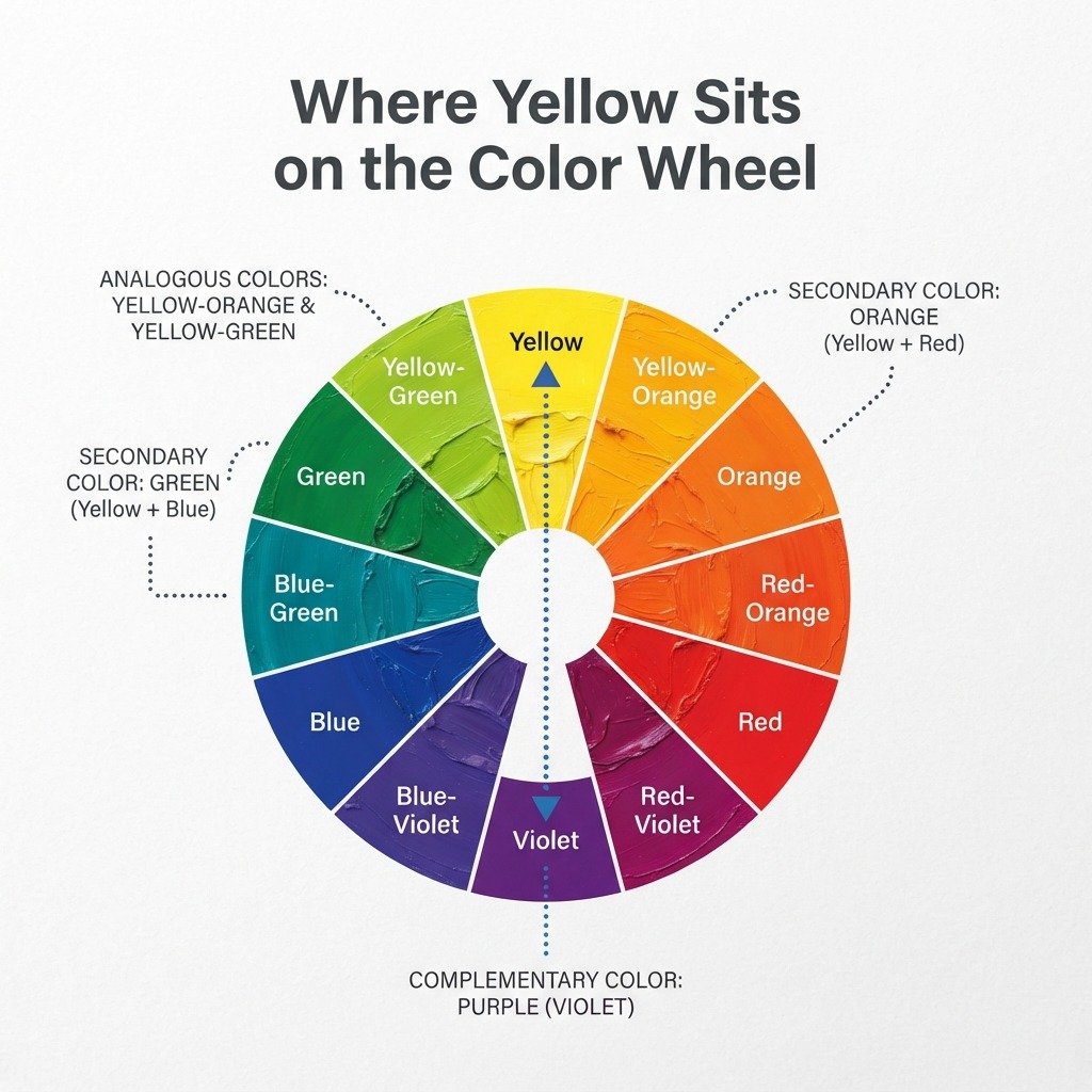
Its analogous colors — the ones sitting right next to it on the wheel — are yellow-orange and yellow-green. These pair naturally with yellow in a design without competing for attention, which is why so many nature-themed and spring palettes lean on this trio.
As one of the three primary colors, yellow also plays a role in every secondary and tertiary color nearby. Mix it with red, and you get orange; mix it with blue, and you get green. Every yellow-adjacent tertiary color, like yellow-green or yellow-orange, traces directly back to this one primary hue.
Conclusion
To recap: true paint yellow can’t be mixed from other pigments, since it’s one of the three primary colors — but it can absolutely be shaped, warmed, cooled, lightened, and darkened once you have a tube to start from. Digitally, the answer to what colors make yellow is refreshingly literal: red and green light at full strength. Test small batches, keep your palette clean, and don’t be afraid to experiment with the ratios in the mixing chart above until you land on the exact yellow your project needs.
FAQs
What colors make yellow in paint?
Technically, no combination of paint colors makes true yellow, since it’s a primary color. The closest you can get from other pigments is a dull, orange-leaning approximation, not a clean yellow.
What two colors make yellow?
In light, red and green combined at full brightness make yellow. In paint, there’s no reliable two-color combination that produces a true yellow.
Do red and green make yellow?
Yes, but only with colored light, not paint. On a screen, full-intensity red and green light overlap to create yellow directly.
How do you make yellow color darker without losing brightness?
Add a small amount of burnt sienna or a warm brown instead of black, which tends to gray the color out. Add it in small increments and test as you go.
What is the hex code for yellow?
The standard web hex code for pure yellow is #FFFF00, which corresponds to RGB(255, 255, 0). Slightly warmer paint-like yellows often use #FFDF00 or #FFD700 instead.
Why does my yellow paint look green instead of true yellow?
This usually happens from brush contamination, where trace blue or green pigment mixes in from a previous color. Rinse brushes thoroughly between colors to avoid this.
What color is yellow’s complementary color?
Yellow’s complement is purple, sitting directly opposite it on the color wheel. Mixing the two, even in small amounts, produces a muted, grayish tone rather than a vibrant one.