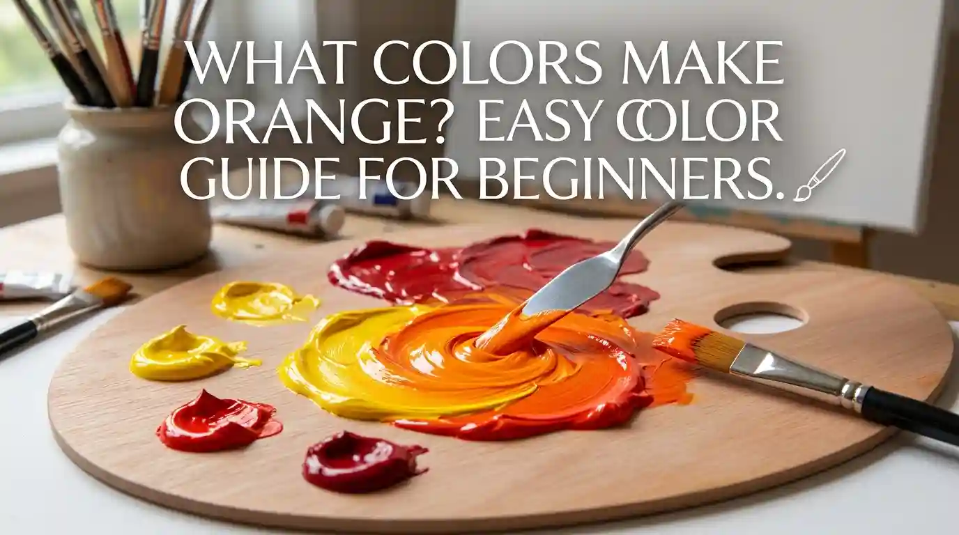
What Colors Make Orange? Easy Color Mixing Guide for Beginners
Have you ever stood at your easel, paint-stained fingers hovering over your palette, wondering what colors make orange? You’re not alone. It’s one of the first questions every beginner painter, designer, or curious kid asks.
Main Takeaway: Red and yellow make orange. Mix them in paint (subtractive color mixing) or red and green light for a different orange effect on digital screens (additive mixing). The exact shade depends on your ratio and the specific pigments you use.
That’s the short answer. But if you want your oranges to look vibrant instead of muddy, there’s a bit more to learn. Let’s break it down step by step, so by the end, you’ll know exactly what colors make orange every single time.
Understanding Red and Yellow as Colors
Before you start mixing, it helps to understand the two colors doing all the work.
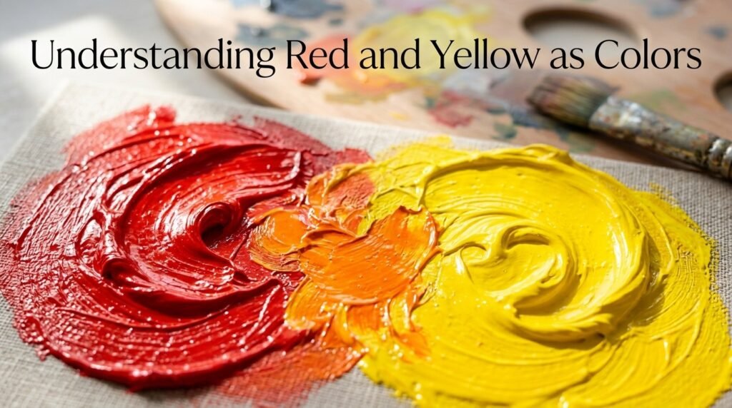
Red is a warm, primary color. It sits on the “hot” end of the color wheel and carries energy, intensity, and boldness. In traditional color theory, red cannot be created by mixing other colors — it’s one of the three primaries (along with blue and yellow).
Yellow is also a primary color, and it’s the warmest, brightest color on the wheel. It reflects the most light of any hue, which is why it feels cheerful and energetic.
Why the Pairing Matters
Because red and yellow are both primary colors, they can’t be broken down further — but together, they create orange, a secondary color. This is the foundation of the entire color wheel, and it’s why understanding this one pairing unlocks so much of color theory.
What Color Do You Get When You Mix Red and Yellow Paint?
This is the heart of the question: what colors make orange, and how much of each do you actually need?
Here’s the short version: more red gives you a deeper, warmer orange. More yellow gives you a brighter, lighter orange. Here are three common ratios to try.
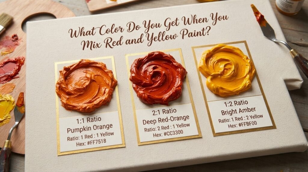
1. Ratio 1:1 (Equal Red and Yellow)
- Resulting color: Classic Orange
- Hex code: #FF7F00
- Use case: Standard pumpkin-orange, great for autumn-themed art or basic color wheel demonstrations.
2. Ratio 2:1 (More Red than Yellow)
- Resulting color: Red-Orange (Persimmon)
- Hex code: #FF4500
- Use case: Warm sunset skies, fire and flame effects, bold accent walls.
3. Ratio 1:2 (More Yellow than Red)
- Resulting color: Yellow-Orange (Amber)
- Hex code: #FFAE42
- Use case: Cheerful floral illustrations, marigold tones, warm lighting effects.
Full Color Mixing Chart: Red + Yellow Pigment Combinations
Different brands and pigment types shift the final result. Here’s a detailed chart to help you find what color do red and yellow make with specific paints.
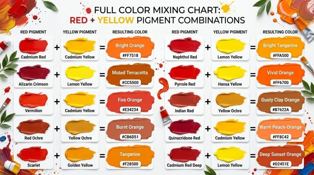
| Red Pigment | Yellow Pigment | Resulting Color | Hex Code |
| Cadmium Red | Cadmium Yellow | Bright Orange | #FF7518 |
| Alizarin Crimson | Lemon Yellow | Muted Terracotta | #CC5500 |
| Vermilion | Cadmium Yellow | Fire Orange | #E34234 |
| Red Ochre | Yellow Ochre | Burnt Orange | #CB6D51 |
| Scarlet | Golden Yellow | Tangerine | #F28500 |
| Crimson | Cadmium Yellow | Coral-Orange | #FF7F50 |
| Naphthol Red | Lemon Yellow | Bright Tangerine | #FFA500 |
| Pyrrole Red | Hansa Yellow | Vivid Orange | #FF6700 |
| Indian Red | Yellow Ochre | Dusty Clay Orange | #B7622A |
| Quinacridone Red | Cadmium Yellow | Warm Peach-Orange | #FF8C42 |
| Cadmium Red Deep | Lemon Yellow | Deep Sunset Orange | #D2451E |
As you can see, the exact colors that make orange shift quite a bit depending on the undertone of your red and yellow — something we’ll dig into more below.
What Color Do Red and Yellow Lights Make?
Here’s where things get interesting. Paint and light don’t mix the same way.
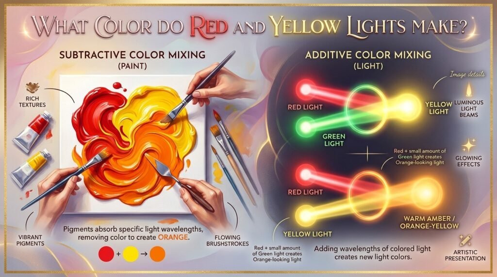
Paint mixing is subtractive. Pigments absorb (subtract) certain wavelengths of light and reflect others. That’s why mixing red and yellow paint gives you orange — you’re removing light, not adding it.
Light mixing is additive. Red, green, and blue (RGB) are the primary colors of light, and they combine by adding wavelengths together. When you mix red and green light, you get yellow — not orange. To get an orange-looking light, you typically mix red light with a small amount of green light (in an RGB system), since orange isn’t a standalone primary in additive color.
Use cases for orange light:
- Screens and displays — TVs, phones, and monitors — simulate orange by combining red and green LEDs at specific intensities.
- LED lighting — Warm-toned smart bulbs use RGB channels to approximate orange for a cozy ambiance.
- Theater and stage lighting — Lighting designers layer red and amber gels to create warm, orange-toned washes on stage.
Subtractive vs. Additive Mixing: Side-by-Side Comparison
| Feature | Subtractive (Paint) | Additive (Light) |
| Primary colors | Red, Yellow, Blue | Red, Green, Blue |
| How it works | Absorbs wavelengths | Emits/combines wavelengths |
| Red + Yellow result | Orange | N/A (yellow isn’t primary here) |
| Common medium | Paint, ink, dye | Screens, stage lights, LEDs |
| Mixing more colors leads to | Darker, muddier tones | Brighter, whiter tones |
| Example | Watercolor palette | Phone screen pixels |
How Ratio Affects the Final Color
The ratio of red to yellow is the single biggest factor in your final shade.
| Ratio (Red:Yellow) | Resulting Color | Best Use Case |
| 3:1 | Deep Red-Orange | Fire, embers, dramatic sunsets |
| 2:1 | Red-Orange | Warm portraits, autumn leaves |
| 1:1 | Classic Orange | General-purpose orange, pumpkins |
| 1:2 | Yellow-Orange | Bright florals, citrus fruit |
| 1:3 | Golden Amber | Sunlight, warm highlights |
Beginner Tip: Start with more yellow than you think you need, then add red slowly, one drop at a time. It’s much easier to deepen an orange than to lighten one that’s already too red.
Why Your Mix Looks Muddy or Brownish — and How to Fix It
If you’ve ever mixed what should make orange and ended up with sludgy brown instead, you’re dealing with one of these common issues:
1. Undertones clashing. Some reds lean toward blue (like Alizarin Crimson), and some yellows lean toward green (like Lemon Yellow). Blue and green are cool colors, and mixing cool undertones into warm colors dulls the result. Fix: Use warm-leaning reds (like Cadmium Red) and warm-leaning yellows (like Cadmium Yellow) for a cleaner orange.
2. Overmixing. Blending too long, or adding too many colors into the mix, muddies the pigment. Fix: Mix just enough to combine the colors — stop as soon as you reach the shade you want.
3. Cheap or low-pigment paint. Budget paints often contain fillers that dull the vibrancy of the mix. Fix: Invest in artist-grade paints for your reds and yellows, even if the rest of your palette is student-grade.
Beginner Tip: If your orange turns brown, don’t panic — you can often rescue it by adding a small amount of fresh cadmium yellow to brighten it back up.
Best Pigments to Mix for Clean, Vibrant Results
| Red Pigment | Yellow Pigment | Result |
| Cadmium Red Light | Cadmium Yellow Medium | Bright, true orange |
| Pyrrole Red | Hansa Yellow Light | Vivid, saturated orange |
| Naphthol Red | Cadmium Yellow | Clean tangerine tone |
| Vermilion | Indian Yellow | Warm, glowing orange |
Mixing tips:
- Always mix on a white surface so you can judge the true color.
- Add small amounts at a time — pigment strength varies widely between brands.
- Test your mix on scrap paper and let it dry, since colors often shift slightly as paint dries.
Real-Life Examples: Orange in Art, Design, and Digital Media
Traditional art: Impressionist painters like Van Gogh used bold red-yellow mixes to create the fiery oranges in works like The Sower, using the color to convey warmth and energy.
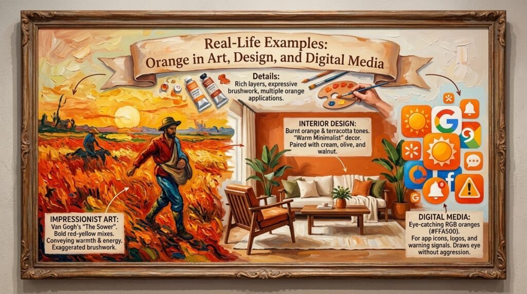
Interior design: Burnt orange and terracotta tones have become staples in “warm minimalist” home decor, often paired with cream, olive, and walnut wood tones.
Digital media: App icons, brand logos, and warning signals often use RGB-based orange (#FFA500 and similar) because it draws the eye without the aggression of pure red.
What Happens When You Add White, Brown, or Black to Orange?
Once you’ve nailed the base orange, modifiers let you fine-tune it further.
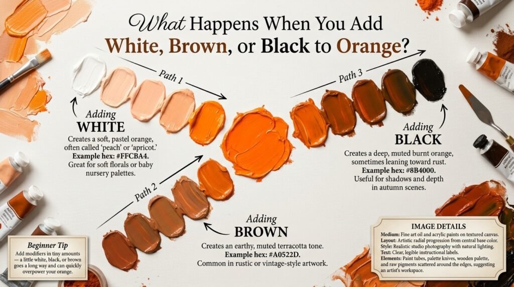
- Adding white → Creates a soft, pastel orange, often called “peach” or “apricot.” Example hex: #FFCBA4. Great for soft florals or baby nursery palettes.
- Adding black → Creates a deep, muted burnt orange, sometimes leaning toward rust. Example hex: #8B4000. Useful for shadows and depth in autumn scenes.
- Adding brown → Creates an earthy, muted terracotta tone. Example hex: #A0522D. Common in rustic or vintage-style artwork.
- Adding a touch of blue → Neutralizes and dulls the orange, moving it toward gray-brown. Useful for creating natural shadow tones without using black.
Paint vs. Digital Media: Subtractive vs. Additive, Revisited
To bring it all together: if you’re painting on canvas, you’re working with subtractive color — red and yellow pigments mixing to form orange by absorbing other wavelengths of light.
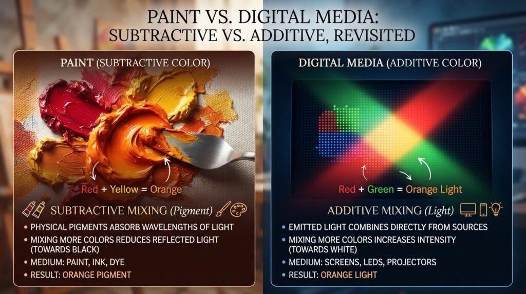
If you’re designing for a screen, you’re working with additive color — where orange is achieved by adjusting the intensity of red, green, and blue light channels in an RGB system (for example, #FFA500 is created by setting red to full intensity, green to about 65%, and blue to zero).
Think of paint mixing like blending juices — combine them and you get a new flavor. Light mixing is more like turning up different speakers in a room — combine the right volumes, and you “hear” a new color.
Tips for Artists: Getting Better Oranges Every Time
- Know your reds and yellows. Warm-leaning reds and yellows (no blue or green undertone) give the cleanest oranges.
- Test on your actual palette white, not a screen — paint colors always look different in person.
- Layer instead of overmixing. In watercolor or thin acrylics, glazing a yellow layer under a red layer can create a more luminous orange than mixing them directly.
- Keep a mixing journal. Note down your exact ratios and pigment brands so you can recreate your favorite oranges later.
- Use a limited palette for practice. Working with just one red and one yellow at a time helps you truly understand what colors make orange before adding complexity.
Orange in Fashion and Interior Design
Orange has had a major resurgence in both fashion and home decor. Burnt orange blazers, rust-colored knitwear, and terracotta accessories have become seasonal staples for their warmth and versatility.
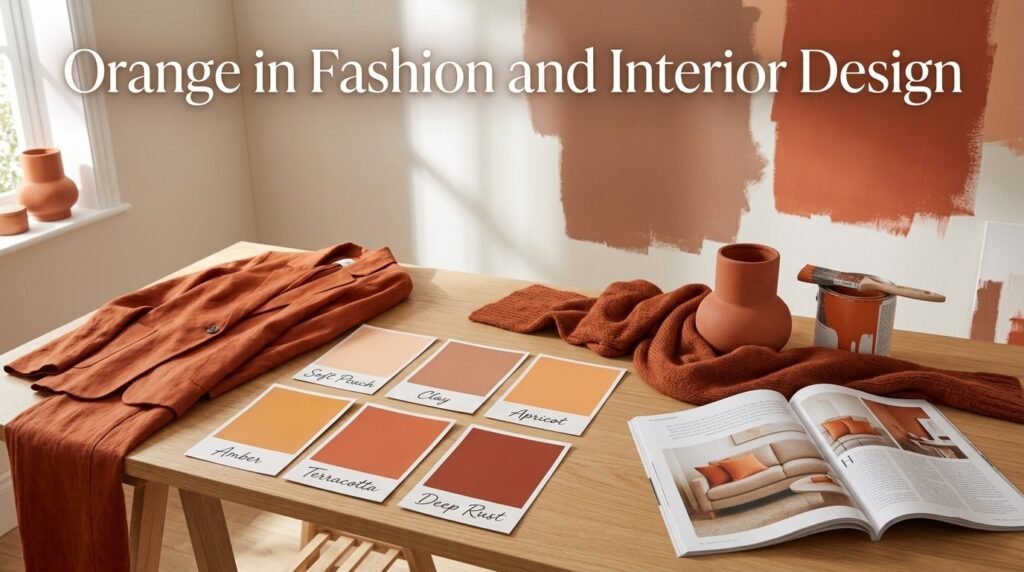
In interior design, orange — especially in muted tones like clay, apricot, and amber — pairs beautifully with neutral bases like beige, cream, and warm wood. It’s a popular choice for accent walls, throw pillows, and statement furniture because it adds energy without feeling overwhelming.
If you’re planning a home refresh, testing a few orange paint swatches from your local hardware or design store against your existing furniture is one of the easiest ways to see which shade — from soft peach to deep rust — fits your space best.
Where Orange Sits on the Color Wheel
Orange is a secondary color, formed by mixing the primary colors red and yellow, sitting right between them on the color wheel.
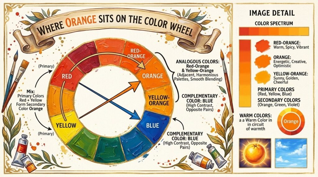
- Complementary color: Blue. Orange and blue sit opposite each other, which is why they create such striking, high-contrast pairings in art and design.
- Analogous colors: Red-orange and yellow-orange sit on either side of orange, making them natural partners for smooth, harmonious color palettes.
Conclusion
So, what colors make orange? In paint, it’s simple: red and yellow, mixed in the ratio that matches the shade you’re after. In light, the answer shifts slightly, since orange is created additively through red and green light channels rather than a direct red-yellow mix.
Just remember — watch your undertones, mix in small amounts, and don’t panic if your first attempt looks a little muddy. Every great orange starts with a bit of trial and error. Now that you know exactly what colors make orange, grab your palette and start mixing your perfect shade.
FAQs
1. What colors make orange in paint?
Red and yellow make orange when mixed in paint. The exact shade depends on the ratio and the specific pigments used.
2. What color do red and yellow make when mixed in different ratios?
More red creates a deeper red-orange, while more yellow creates a brighter yellow-orange or amber.
3. What colors make orange paint look muddy?
Cool-undertone reds or yellows, overmixing, or low-quality paint are the most common causes of a muddy orange.
4. Do red and yellow lights make orange?
Not exactly. In additive (light) mixing, red and green light combine to make yellow, and true orange light is created by adjusting the intensity of red and green within an RGB system.
5. What color do you get when you mix orange with white?
Mixing orange with white creates a soft peach or apricot tone.
6. What is the complementary color of orange?
Blue is the complementary color of orange, since they sit opposite each other on the color wheel.
7. What colors make orange besides red and yellow?
While red and yellow are the classic combination, mixing certain warm pinks with yellow, or orange-leaning reds with golden yellows, can also produce orange-toned results.