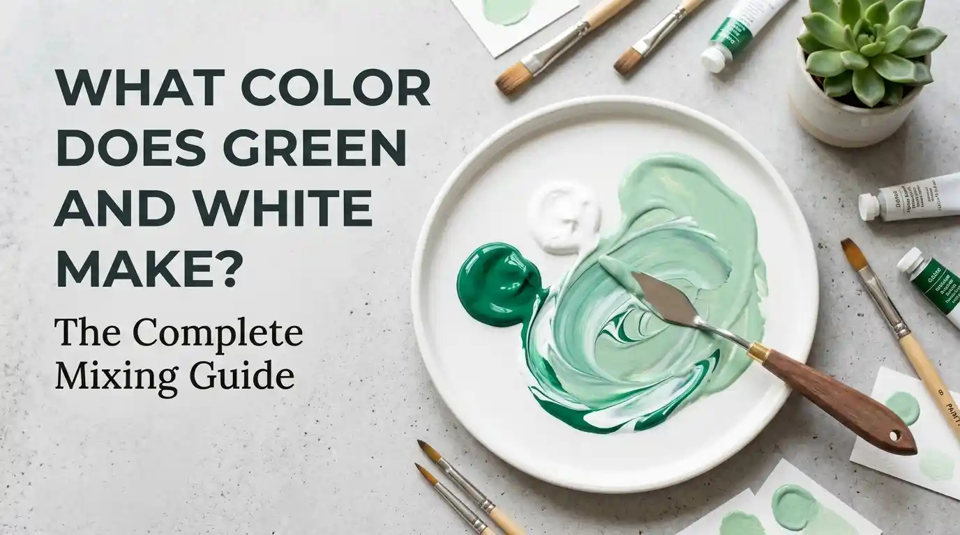
What Color Does Green and White Make? The Complete Mixing Guide
Meta line: Wondering what color does green and white make when you mix them? The short answer is light green (mint or sage, depending on ratio) — here’s everything you need to know.
Ever squeezed out a blob of green paint, added a dollop of white, and wondered what you’d actually end up with? You’re not alone. What color does green and white make is one of the most common questions beginner painters, designers, and DIY decorators ask — and the answer is simpler than you’d think.
Main takeaway: Mixing green and white makes a lighter, softer version of green — commonly called mint green, sage, or pale green — depending on how much white you add. There’s no hue shift involved; white simply “tints” the green, making it lighter and less saturated.
In this guide, we’ll cover exact ratios, hex codes, mixing charts, the difference between paint and light mixing, common mistakes, and how this soft green shows up in art, fashion, and interior design. By the end, you’ll know exactly what color green and white make when mixed in any context.
Understanding Green and White as Colors
Before jumping into mixing, it helps to understand what each color actually brings to the table.
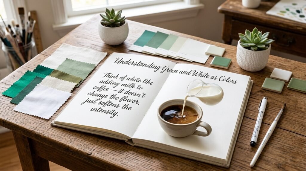
Green is a secondary color, made by mixing blue and yellow. It sits comfortably between warm and cool — a yellow-green leans warm, while a blue-green leans cool. Green is associated with nature, balance, and growth, which is part of why it’s such a popular base color in design.
White, technically, isn’t a hue at all. It’s the presence of all light wavelengths (in light) or the absence of pigment saturation (in paint). In painting, white acts as a tint agent — it doesn’t add color; it dilutes it, making whatever it’s mixed with lighter and softer.
This is exactly why green and white make what color when mixed is such a predictable question to answer: white doesn’t introduce a new hue; it just lightens green’s existing one. That’s different from mixing two chromatic colors (like blue and yellow), where you get an entirely new hue.
What Color Do You Get When You Mix Green and White Paint?
Here’s where what color does green and white make gets practical. The ratio of green to white drastically changes the outcome — from a barely-there tint to a nearly-white pastel.
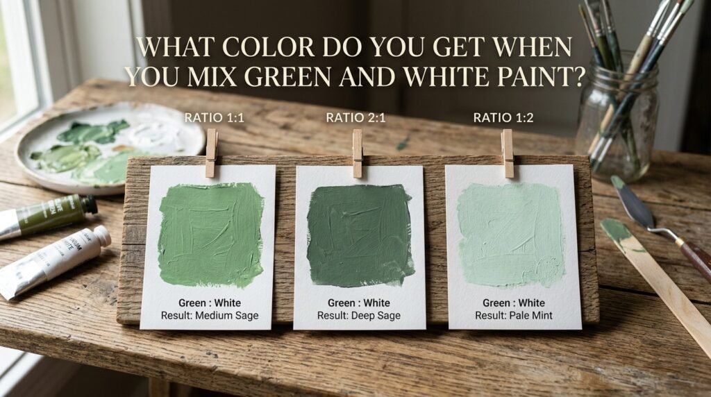
Ratio 1:1 (Equal Parts Green and White)
- Resulting color: Light Green / Mint Green
- Hex code: #90EE90
- Use case: Great for spring-themed illustrations, nursery walls, or soft branding palettes.
Ratio 2:1 (Two Parts Green, One Part White)
- Resulting color: Medium Sage Green
- Hex code: #8FBC8F
- Use case: Popular in botanical illustration and muted, earthy interior accent walls.
Beginner Tip: Always add white to green gradually, a small amount at a time. It’s much easier to lighten a color further than to darken it back down. Start with a 4:1 ratio (mostly green) and adjust from there.
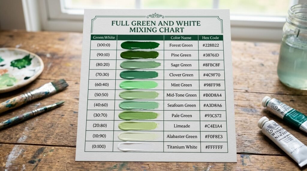
Full Green and White Mixing Chart
If you’re wondering exactly what color green and white make across different pigment brands and combinations, this chart breaks it down by common pairings.
| Green Pigment | White Pigment | Resulting Color Name | Hex Code |
| Phthalo Green | Titanium White | Cool Mint | #98FF98 |
| Sap Green | Titanium White | Soft Sage | #9DC183 |
| Hooker’s Green | Zinc White | Muted Mint | #8FAF8F |
| Emerald Green | Titanium White | Bright Pastel Green | #96DED1 |
| Forest Green | Titanium White | Dusty Sage | #A9BA9D |
| Viridian | Zinc White | Cool Pale Green | #B2D8B2 |
| Olive Green | Titanium White | Muted Khaki-Mint | #B5B35C (light) |
| Chrome Green | Titanium White | Light Grass Green | #A8E4A0 |
| Kelly Green | Titanium White | Soft Kelly Mint | #A2E3A2 |
| Pine Green | Zinc White | Cool Sage Grey | #9FB6A5 |
| Grass Green | Titanium White | Pastel Spring Green | #B6E5A0 |
Notice how what color green and white make shifts subtly depending on the base green — cooler greens (phthalo, viridian) produce minty, blue-leaning pastels, while warmer greens (olive, grass) produce more yellow-leaning pastels.
What Color Does Green and White Light Make?
Paint and light don’t behave the same way, so it’s worth asking separately: what color does green and white light make when mixed on a screen or with LEDs?

Paint mixing is subtractive — pigments absorb wavelengths of light, and mixing them removes more light, making colors darker or muted. Light mixing is additive — combining light wavelengths adds up toward white, not away from it.
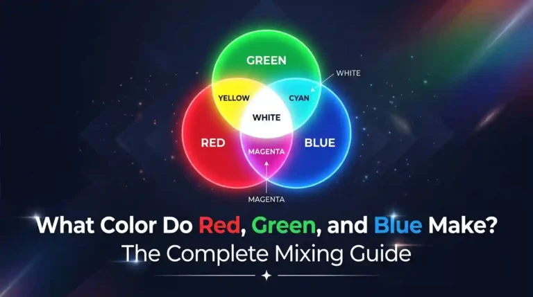
In the RGB (additive) color model, white light already contains green as one of its three primary components (red, green, blue). So when you “mix” green light with white light, you’re essentially adding more green intensity into a base that already includes it. The result is a brighter, more saturated green light, not a pastel tint like in paint.
Use cases for green-white light mixing:
- Screens and displays: Adjusting green channel intensity against a white backlight to create lighter or richer green tones.
- LED lighting: Combining green LEDs with white LEDs to produce a soft glow, often used in ambient or stage lighting.
- Theater and stage design: Lighting designers mix green and white gels to create natural, forest-like or moonlit lighting effects.
Subtractive vs. Additive Mixing: Side-by-Side Comparison
| Feature | Paint (Subtractive) | Light (Additive) |
| Base principle | Pigments absorb light | Wavelengths combine |
| Result of mixing | Darker / more muted | Brighter / more saturated |
| Green + White outcome | Pastel mint or sage | Brighter green glow |
| Common in | Painting, printing, dyeing | Screens, stage lighting, LEDs |
| Primary colors | Red, Yellow, Blue (or CMY) | Red, Green, Blue |
| White’s role | Lightening/tinting agent | Already contains all colors |
How Ratio Affects the Final Color
| Ratio (Green: White) | Resulting Color | Use Case |
| 4:1 | Deep muted green | Forest backdrops, dark foliage |
| 2:1 | Medium sage | Wall accents, botanical art |
| 1:1 | Mint green | Nursery décor, spring themes |
| 1:2 | Pale mint | Pastel illustration, packaging |
| 1:4 | Almost-white green tint | Highlight details, soft backgrounds |
This table is a quick reference any time you ask what color green and white make at a specific ratio — just find your proportion and read across.
Why Your Mix Looks Muddy — and How to Fix It
Sometimes, instead of a clean mint or sage, you get a dull, greyish-green. Here’s why that happens and how to avoid it.
Common causes:
- Conflicting undertones: A green with a yellow undertone mixed with a warm (cream-toned) white can shift toward khaki instead of mint.
- Overmixing: Stirring too long or blending on a dirty palette pulls in leftover pigment residue, dulling the result.
- Cheap paint: Budget pigments often contain fillers that reduce vibrancy, making mixes look chalky rather than clean.
How to fix it:
- Use a cool-toned white (like titanium white) with cool greens for a cleaner mint.
- Mix on a clean palette and use fresh white each time.
- Invest in artist-grade pigments for green and white — the color payoff is noticeably better.
Beginner Tip: If your mix already looks muddy, don’t keep adding white to “fix” it — that usually just creates more grey. Start fresh with clean pigment instead.
Best Pigments to Mix for Clean Results
| Green Pigment | White Pigment | Result Description |
| Phthalo Green | Titanium White | Vivid, clean cool mint |
| Viridian | Titanium White | Soft, slightly blue-green pastel |
| Sap Green | Titanium White | Warm, natural sage tone |
| Permanent Green Light | Zinc White | Bright, candy-like pastel green |
| Emerald Green | Titanium White | Crisp, jewel-toned pastel |
Mixing tips:
- Add white in small increments and mix thoroughly before adding more.
- Test your mix on scrap paper before applying to your final piece — colors often look different once dry.
- Keep your green and white pigments from the same paint line when possible, since formulations vary between brands.
Real-Life Examples: Where This Mix Shows Up
Traditional art: Landscape painters frequently mix green and white to create highlights on leaves, distant hills, or morning mist over grass — the lightened green suggests sunlight without losing the sense of foliage.
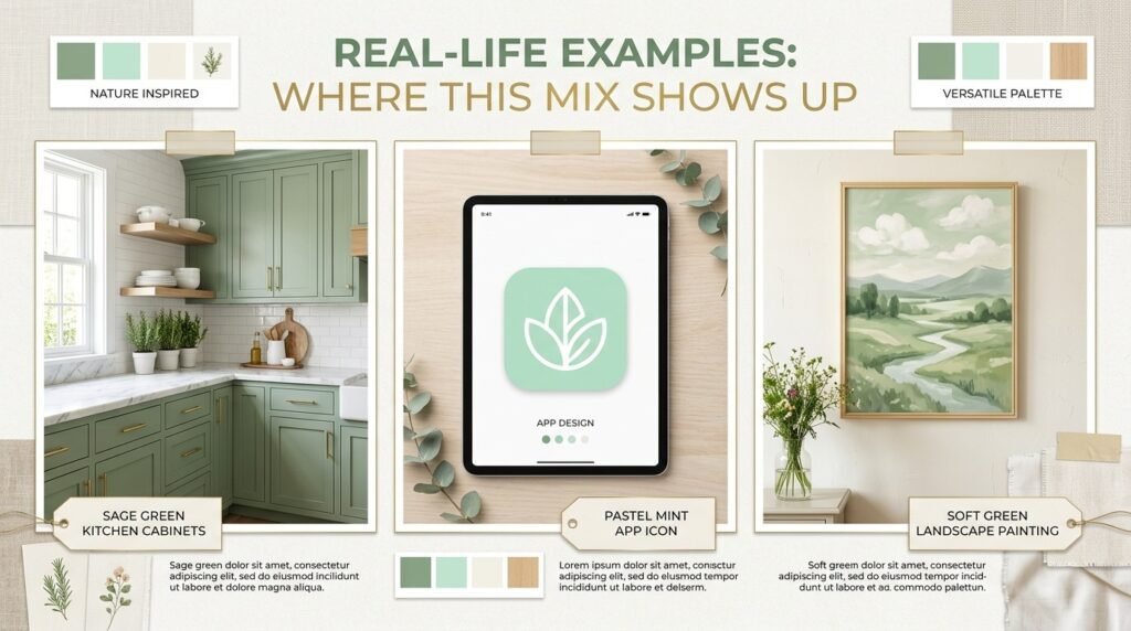
Interior design: Sage and mint greens (a direct result of this mix) are popular for calming, nature-inspired spaces — think kitchen cabinets, bathroom tiles, or accent walls in a “cottagecore” or Scandinavian-style home.
Digital media: UI designers use lightened greens for success messages, eco-friendly branding, and wellness apps, since the tone reads as fresh and non-aggressive compared to a saturated green.
What Happens When You Add White, Yellow, or Black to Green
Once you’ve nailed the basic green and white make what color answer, it’s worth exploring how other modifiers change things further.
- Adding more white (#E0F5E0): Pushes the mix toward a near-pastel, almost mint-white tone. Great for soft highlights.
- Adding yellow (#B5D96B): Shifts the mix toward a warmer, more “spring grass” green — useful for lively, energetic designs.
- Adding black (#5A6B4F): Deepens and mutes the mix into a shadowy olive-grey green, useful for shading foliage in shadow.
- Adding blue (#7FC8C0): Cools the mix further into a teal-mint, useful for ocean or aquatic themes.
Paint vs. Digital Media: A Concrete Comparison
In paint, mixing green and white physically blends pigment particles — the white pigment reflects more wavelengths overall, thinning out the green’s saturation. A real-world example: mixing Sap Green with Titanium White on a palette knife produces a visibly opaque, creamy sage tone.
In digital media, “mixing” usually means adjusting a hex or RGB value rather than physically combining anything. A designer might simply increase the lightness value of a green hex code (like taking #008000 and lightening it to #90EE90) to simulate the same visual effect digitally — no pigment interaction required.
Both processes land on a similar visual result — a lighter green — but the mechanism behind them is completely different, which is why what color does green and white make can have slightly different technical explanations depending on the medium.
Tips for Artists Mixing Green and White
- Choose your green’s temperature deliberately — cool greens (phthalo, viridian) make cleaner mints; warm greens (sap, olive) make earthier sages.
- Test on a white palette test strip before committing to canvas, since wet paint often dries slightly darker or duller.
- Layer instead of overmixing — for a more dynamic look, apply a base green and add lighter green-white highlights in thin layers rather than blending everything into one flat tone.
- Keep your white fresh — old or dried-out white paint can throw off consistency between mixing sessions.
Mint and Sage Green in Fashion and Interior Design
The soft, muted greens that come from mixing green and white have become a mainstay in both fashion and home décor. Sage green shows up in relaxed loungewear and minimalist accessories, while mint green pops up in spring and summer collections for its fresh, breezy feel.
In interior design, these tones are a go-to for creating a calm, nature-connected atmosphere — think sage cabinetry, mint accent pillows, or a pale green feature wall. If you’re planning a room refresh, sampling a few tester pots in different green-to-white ratios (like the 2:1 and 1:2 examples above) is a simple way to find the right shade before committing to a full paint job.
Where This Green Sits on the Color Wheel
The green produced by mixing green and white is still fundamentally a secondary color (green), just at a lighter tint level rather than full saturation. It doesn’t move position on the color wheel — tints and shades don’t change hue family, only lightness.
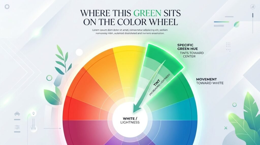
- Complementary color: Red/pink tones (directly opposite green on the wheel) — a soft mint pairs beautifully with dusty rose or blush pink.
- Analogous colors: Yellow-green and blue-green, which sit on either side of green and blend naturally with mint or sage in a cohesive palette.
Conclusion
So, what color does green and white make? In paint, it’s a lighter, softer green — ranging from sage to mint to pale honeydew, depending on your ratio. In light, mixing green with white produces a brighter, more saturated green glow, since light mixing works additively rather than subtractively.
Just watch out for muddy results — undertone clashes, overmixing, and low-quality paint are the usual culprits, and they’re easy to avoid with a little care. Whether you’re painting a landscape, decorating a nursery, or designing an app icon, understanding what color green and white make gives you a reliable, repeatable way to hit the exact soft green you’re after. Grab your palette, start with a small ratio, and adjust from there — the perfect mint or sage is just a few brushstrokes away.
FAQs
1. What color does green and white make when mixed?
Green and white make a lighter, softened green — typically mint, sage, or pale green, depending on the ratio used.
2. What color does green and white make in equal parts?
A 1:1 ratio of green and white typically produces a classic mint green (#90EE90).
3. Does green and white make a completely different color, as blue mixing with green does?
No. Since white isn’t a chromatic color, it doesn’t shift green into a new hue — it only lightens the existing green.
4. What color do green and white make when mixed as light instead of paint?
As light, green and white combine additively to create a brighter, more saturated green, rather than a pastel tint.
5. Why does my green and white mix look grey or muddy instead of minty?
This usually happens due to mismatched undertones, overmixing, or lower-quality paint — using a cool white with a cool green, on a clean palette, gives cleaner results.
6. What ratio of green and white makes sage green specifically?
A 2:1 ratio (more green than white) typically produces a medium sage tone.
7. Is the color made from mixing green and white a primary, secondary, or tertiary color?
It remains a secondary color (green) at a lighter tint — mixing with white changes lightness, not hue family.