Green and Purple Make What Color? The Complete Mixing Guide
Have you ever mixed green and purple on your palette and ended up with a color you didn’t expect? You’re not alone — this is one of the most common questions painters and designers ask when they start experimenting with color theory.
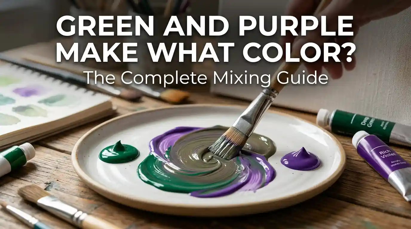
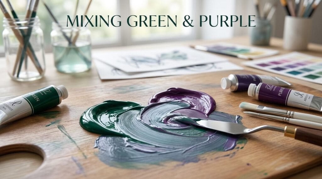
Main takeaway: Green and Purple Make What Color? The short answer is a muted, muddy brown-gray tone. Because green and purple sit close to opposite sides of the color wheel, mixing them neutralizes both hues and produces a soft, earthy shade rather than a vibrant new color.
This guide breaks down exactly what happens when you mix green and purple in paint, in light, and in different ratios — plus how to fix a muddy mix and where this color works best in real design projects.
Understanding Green and Purple as Colors
Before answering what green and purple make what color, it helps to understand what each color brings to the mix.
Green is a secondary color made from blue and yellow. It reads as cool, fresh, and natural. You’ll find it everywhere in nature, from leaves to grass to forest shadows.
Purple is also a secondary color, made from red and blue. It reads as cool-to-warm depending on its lean (more red = warmer, more blue = cooler), and it’s associated with luxury, creativity, and mystery.
Here’s why this pairing matters:
- Both colors share blue as a common ingredient
- Green leans cool, purple can lean either way
- They sit near-opposite each other on the color wheel, which means mixing them behaves similarly to mixing complementary colors.
“Mixing green and purple is a bit like blending two different soups — the flavors don’t cancel out, they settle into something new and mellow.”
What Color Do You Get When You Mix Green and Purple Paint?
This is the heart of the question: green and purple make what color when mixed in traditional paint?
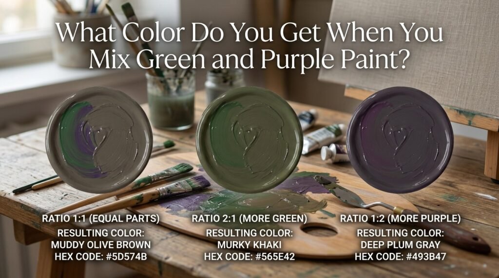
Because pigments work by absorbing light (subtractive mixing), combining green and purple pulls the mix toward a neutral, grayish-brown tone instead of creating a bright new hue.
Here’s how the ratio changes the result:
1:1 Ratio (Equal Parts)
- Resulting Color: Muddy Brown
- Hex Code: #5C5347
- Use Case: Shadow tones in landscape painting, tree bark, aged wood textures
2:1 Ratio (More Green)
- Resulting Color: Mossy Olive Brown
- Hex Code: #5A5A3E
- Use Case: Foliage shadows, camouflage patterns, rustic interior accents
1:2 Ratio (More Purple)
- Resulting Color: Deep Plum Gray
- Hex Code: #5B4A55
- Use Case: Moody backgrounds, twilight skies, gothic-style illustrations
Beginner Tip: Always start with more of the lighter color and add the darker one in small amounts. Purple is usually stronger than green, so a little goes a long way.
Full Mixing Chart: Green and Purple Pigment Combinations
If you’re wondering what color does green and purple make across different pigment types, this chart covers common combinations artists use.
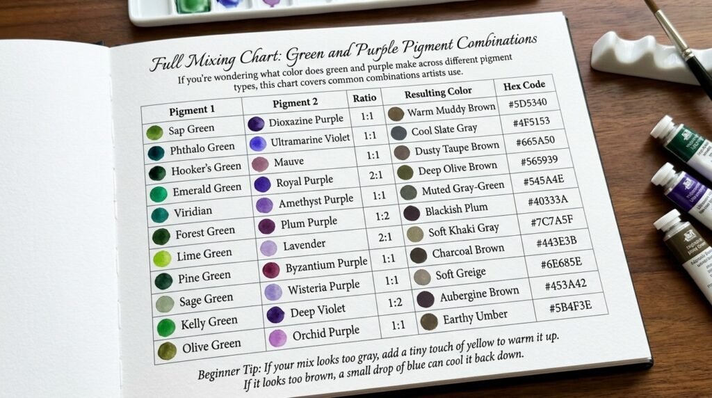
| Pigment 1 | Pigment 2 | Ratio | Resulting Color | Hex Code |
| Sap Green | Dioxazine Purple | 1:1 | Warm Muddy Brown | #5D5340 |
| Phthalo Green | Ultramarine Violet | 1:1 | Cool Slate Gray | #4F5153 |
| Hooker’s Green | Mauve | 1:1 | Dusty Taupe Brown | #665A50 |
| Emerald Green | Royal Purple | 2:1 | Deep Olive Brown | #565939 |
| Viridian | Amethyst Purple | 1:1 | Muted Gray-Green | #545A4E |
| Forest Green | Plum Purple | 1:2 | Blackish Plum | #40333A |
| Lime Green | Lavender | 2:1 | Soft Khaki Gray | #7C7A5F |
| Pine Green | Byzantium Purple | 1:1 | Charcoal Brown | #443E3B |
| Sage Green | Wisteria Purple | 1:1 | Soft Greige | #6E685E |
| Kelly Green | Deep Violet | 1:2 | Aubergine Brown | #453A42 |
| Olive Green | Orchid Purple | 1:1 | Earthy Umber | #5B4F3E |
Beginner Tip: If your mix looks too gray, add a tiny touch of yellow to warm it up. If it looks too brown, a small drop of blue can cool it back down.
What Color Does Green and Purple Light Make?
Paint and light behave completely differently, so green and purple make what color changes entirely when you’re working with digital screens instead of pigments.
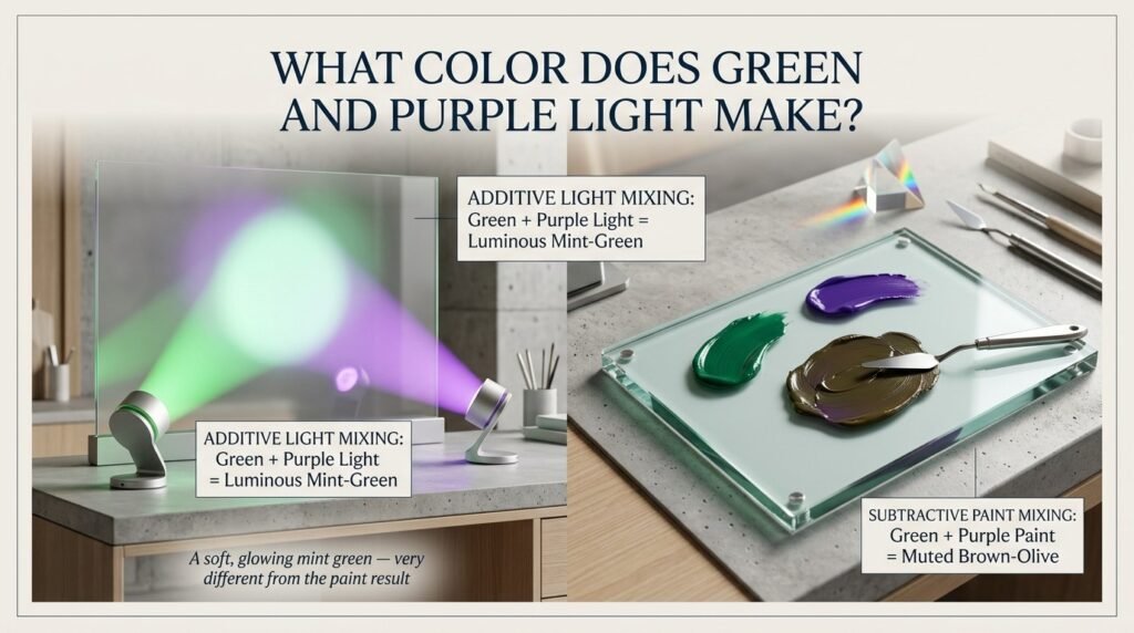
Light mixing is additive — colors combine by adding brightness, not by absorbing it.
- Green Light: RGB (0, 255, 0)
- Purple Light: RGB (128, 0, 128)
- Combined Result: RGB (128, 255, 128) — a soft, pale mint green
Unlike paint, this mix doesn’t turn muddy. Instead, it brightens into a light, minty green because the light values are being added together rather than absorbed.
Where this matters:
- Stage and theater lighting design
- LED displays and screen graphics
- Digital art and UI color blending
- Photography and video color grading
Subtractive vs. Additive Mixing: Side-by-Side Comparison
| Feature | Paint (Subtractive) | Light (Additive) |
| How it works | Absorbs light | Combines light |
| Green + Purple result | Muddy brown-gray | Pale mint green |
| Brightness effect | Gets darker | Gets lighter |
| Common medium | Paint, ink, pigment | Screens, LEDs, stage lights |
| Base colors | Red, yellow, blue | Red, green, blue (RGB) |
How Ratio Affects the Final Color
The exact answer to green and purple make what color shifts depending on how much of each you use.
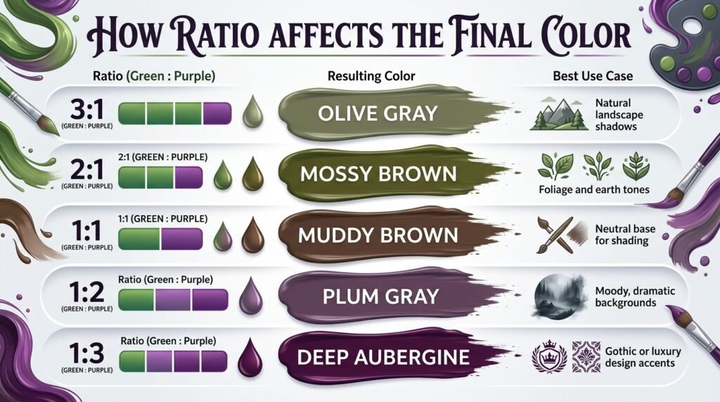
| Ratio (Green: Purple) | Resulting Color | Best Use Case |
| 3:1 | Olive Gray | Natural landscape shadows |
| 2:1 | Mossy Brown | Foliage and earth tones |
| 1:1 | Muddy Brown | Neutral base for shading |
| 1:2 | Plum Gray | Moody, dramatic backgrounds |
| 1:3 | Deep Aubergine | Gothic or luxury design accents |
Why Your Mix Looks Muddy — and How to Fix It
If your result looks murky instead of intentional, you’re not doing anything wrong — this is just how green and purple naturally behave together. Here’s why it happens and how to fix it.
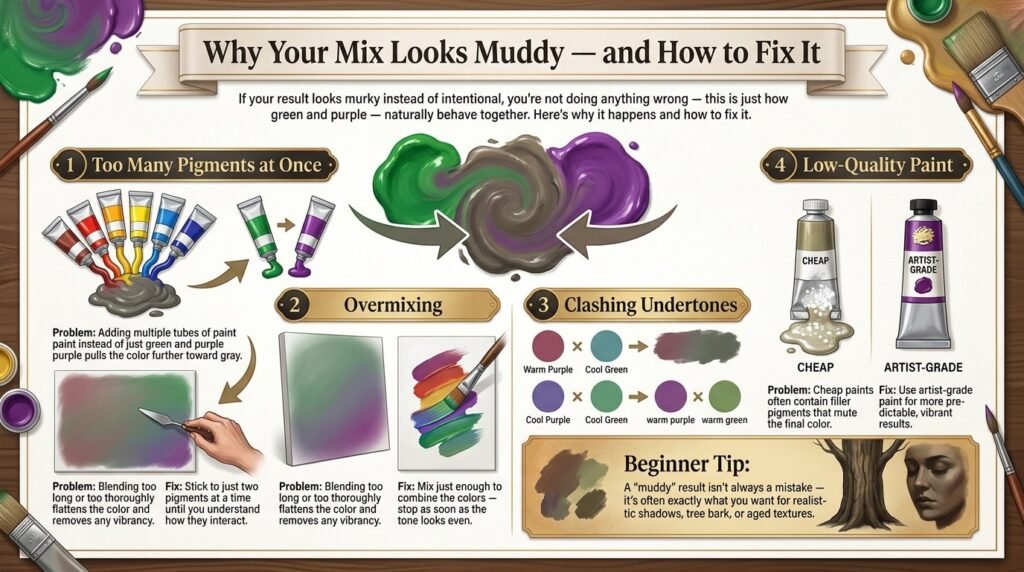
1. Too Many Pigments at Once
Problem: Adding multiple tubes of paint instead of just green and purple pulls the color further toward gray.
Fix: Stick to just two pigments at a time until you understand how they interact.
2. Overmixing
Problem: Blending too long or too thoroughly flattens the color and removes any vibrancy.
Fix: Mix just enough to combine the colors — stop as soon as the tone looks even.
3. Clashing Undertones
Problem: A warm purple (leaning red) mixed with a cool green (leaning blue) creates a duller result than expected.
Fix: Match undertones — pair a warm green with a warm purple, or a cool green with a cool purple, for a cleaner blend.
4. Low-Quality Paint
Problem: Cheap paints often contain filler pigments that mute the final color.
Fix: Use artist-grade paint for more predictable, vibrant results.
Beginner Tip: A “muddy” result isn’t always a mistake — it’s often exactly what you want for realistic shadows, tree bark, or aged textures.
Best Pigments to Mix for Clean Results
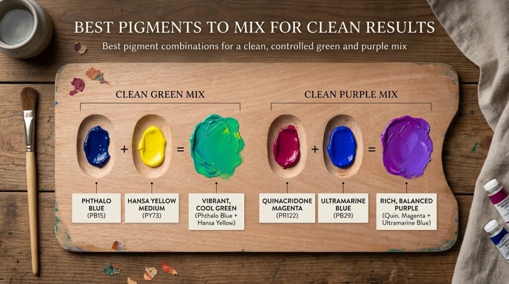
| Pigment Pair | Result Description |
| Sap Green + Dioxazine Purple | Balanced warm brown, great for skin shadows |
| Phthalo Green + Ultramarine Violet | Cool, slate-toned gray |
| Hooker’s Green + Mauve | Soft, dusty taupe |
| Viridian + Amethyst | Muted sage-gray, good for backgrounds |
| Olive Green + Orchid | Rich earthy umber |
Mixing tip: Add your purple gradually into the green rather than the reverse. Purple pigments tend to be more concentrated, so a small amount changes the mix quickly.
Real-Life Examples: Where This Mix Is Used
Understanding what color does green and purple make isn’t just theory — it shows up across creative industries.
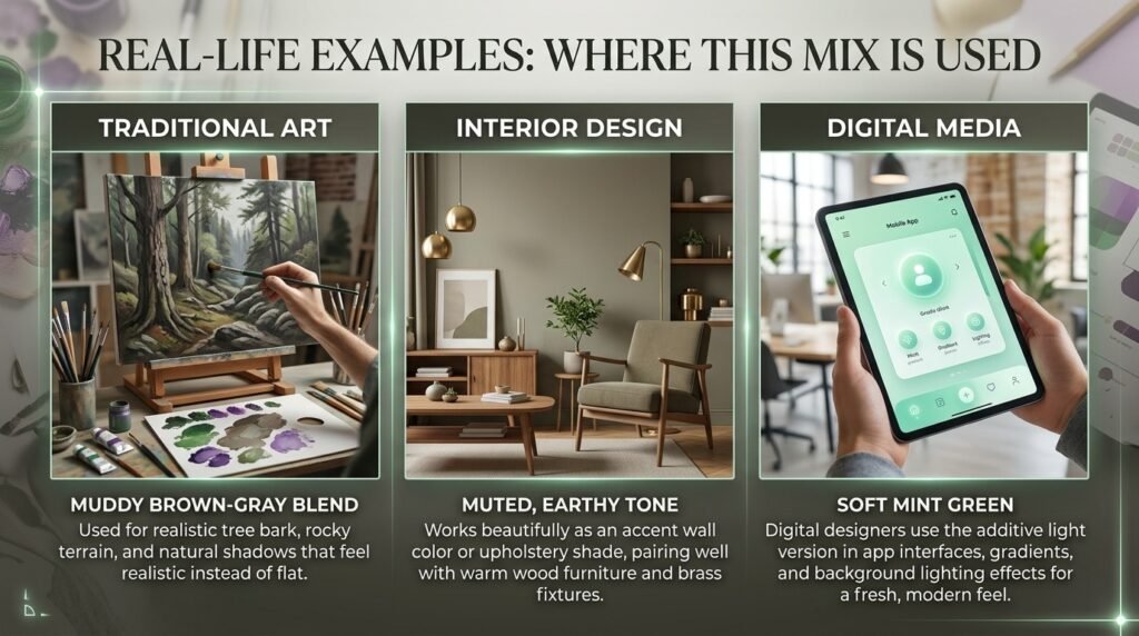
Traditional Art: Landscape painters use the muddy brown-gray blend for tree bark, rocky terrain, and natural shadow tones that feel realistic instead of flat.
Interior Design: The muted, earthy tone works beautifully as an accent wall color or upholstery shade, pairing well with warm wood furniture and brass fixtures.
Digital Media: Designers use the additive light version — that soft mint green — in app interfaces, gradients, and background lighting effects for a fresh, modern feel.
What Happens When You Add White, Yellow, or Black
Modifying your green-purple mix opens up even more variations.
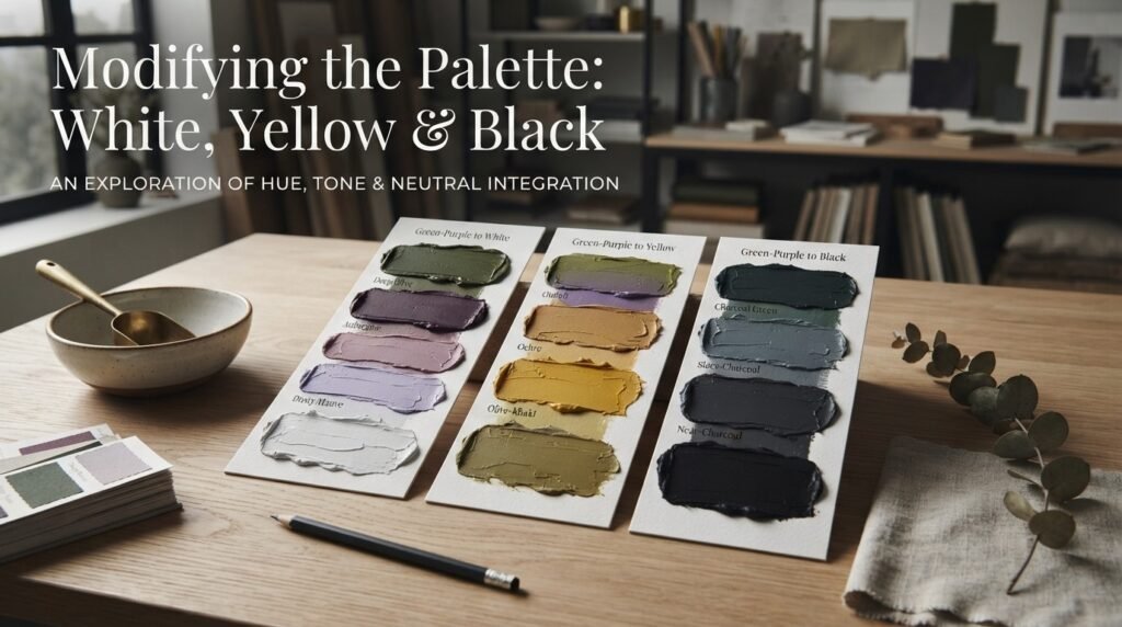
Adding White
Effect: Softens the mix into a dusty, muted mauve-gray.
Hex Code Example: #A89E96
Adding Yellow
Effect: Warms the mix into an olive or khaki-brown tone.
Hex Code Example: #746A45
Adding Black
Effect: Deepens the mix into a near-charcoal brown, useful for dramatic shading.
Hex Code Example: #2E2A28
Beginner Tip: Add modifiers a tiny amount at a time. Because green and purple already create a neutral tone, even small additions can shift the color noticeably.
Paint vs. Digital Media: A Closer Look
The green and purple make what color question always comes back to medium.
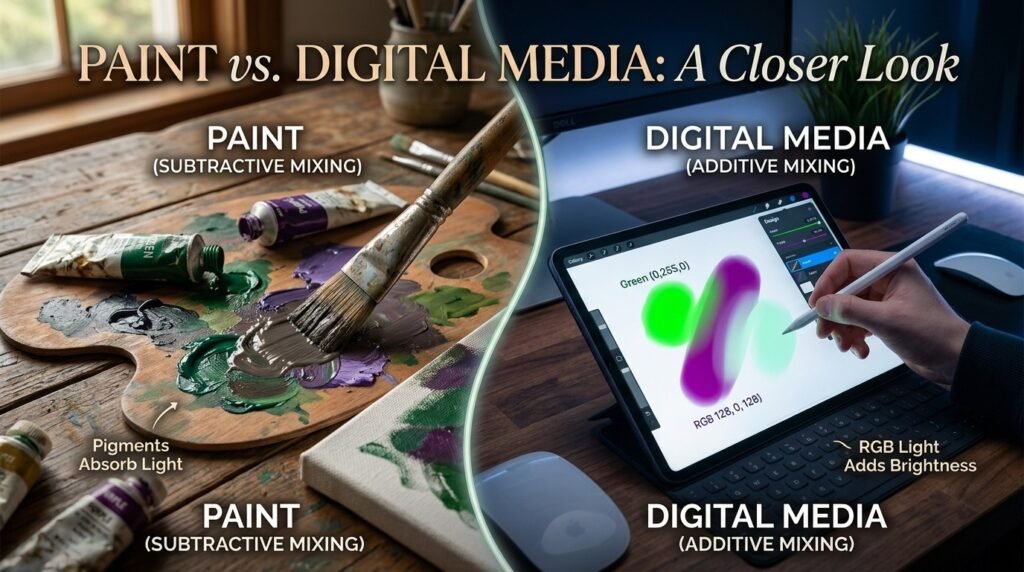
In paint (subtractive mixing), pigments absorb wavelengths of light, so combining green and purple pulls the result toward gray and brown — the more colors you add, the darker and duller it gets.
In digital media (additive mixing), RGB light values are added together. Green (0,255,0) and purple (128,0,128) combine into a lighter, minty tone rather than a darker one, because you’re adding brightness instead of removing it.
This is why the same two “colors” can produce opposite results depending on whether you’re holding a paintbrush or working in a design app.
Tips for Artists Mixing Green and Purple
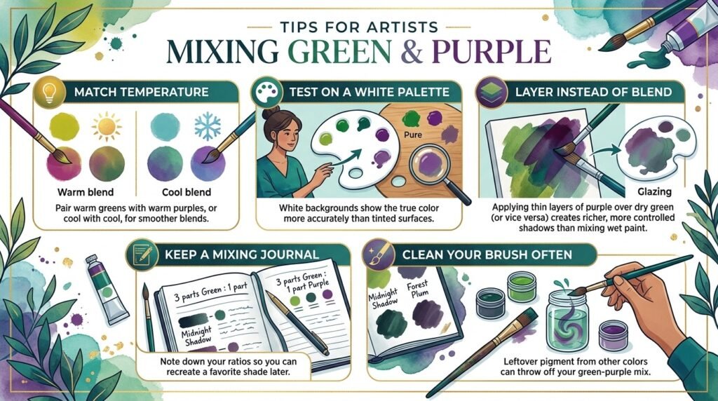
- Match temperature: Pair warm greens with warm purples, or cool with cool, for smoother blends
- Test on a white palette: White backgrounds show the true color more accurately than tinted surfaces.
- Layer instead of blend: Applying thin layers of purple over dry green (or vice versa) creates richer, more controlled shadows than mixing wet paint.t
- Keep a mixing journal: Note down your ratios so you can recreate a favorite shade later.r
- Clean your brush often: Leftover pigment from other colors can throw off your green-purple mix.
Muddy Brown-Gray in Fashion and Interior Design
The muted tone created when green and purple make what color designers call a “greige” or “olive taupe” has been trending in both fashion and home decor. It reads as sophisticated and grounded, pairing naturally with neutrals like cream, camel, and soft black.
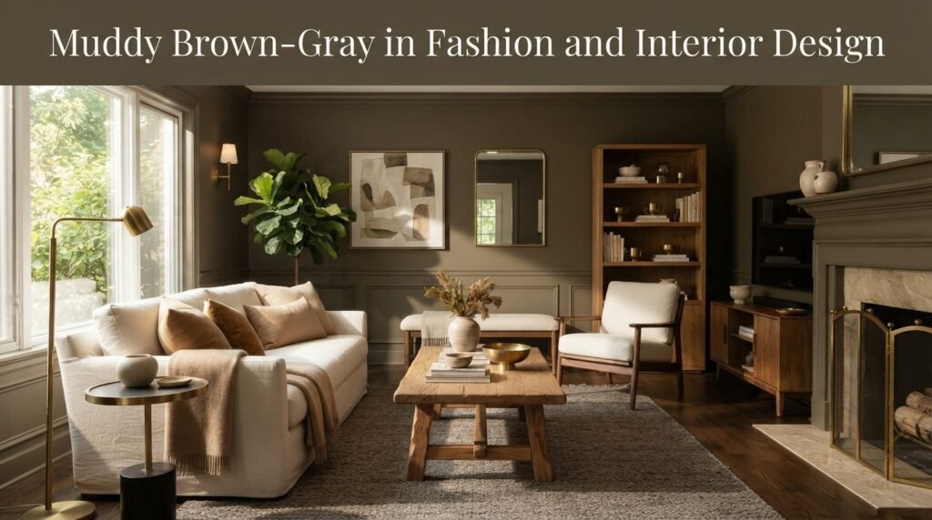
In fashion, this shade appears in outerwear, knitwear, and accessories for a quiet-luxury look. In interiors, it works as a wall color, textile choice, or cabinetry finish that feels warm without being loud.
If you’re planning a room refresh around this tone, browsing a curated color palette guide can help you pick complementary shades before you commit to paint.
Where This Color Sits on the Color Wheel
The resulting muddy brown-gray from mixing green and purple isn’t a primary, secondary, or tertiary color in the traditional sense — it’s a neutral, similar to what happens when you mix true complementary colors.
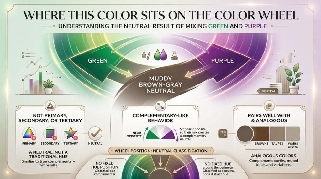
- Complementary pairing: Because green and purple sit near-opposite on the wheel, their mix behaves like a complementary neutral
- Analogous colors: Pairs well with browns, taupes, and warm grays
- Wheel position: Classified as a neutral, not a hue with a fixed wheel position
Conclusion
So, green and purple make what color? In paint, the answer is a muted, muddy brown-gray — a natural result of mixing two near-opposite hues. In digital light, the same two colors create something completely different: a soft, pale mint green.
Keep in mind that this mix can turn muddy quickly if you’re not careful with ratios, undertones, or paint quality — but that muddiness is often exactly what you need for realistic shadows and earthy design tones.
Whether you’re painting a landscape, designing an app, or picking a wall color, understanding how green and purple make what color in each medium gives you more control over your final result.
FAQs About Mixing Green and Purple
What color do green and purple make?
Green and purple make a muted, muddy brown-gray color when mixed as paint, due to how pigments absorb light.
What color does green and purple make when mixed in light?
In light (RGB), green and purple make a soft, pale mint green because light mixing adds brightness instead of removing it.
Why does mixing green and purple look muddy?
The mix looks muddy because green and purple pigments are close to complementary on the color wheel, so combining them neutralizes both hues.
What ratio of green and purple makes brown?
A roughly equal 1:1 ratio of green and purple typically produces a balanced muddy brown.
Can I fix a muddy green and purple mix?
Yes — adding a small amount of white, yellow, or a matching undertone pigment can adjust the tone and reduce muddiness.
Do green and purple make a good paint combination?
Yes, especially for realistic shadows, tree bark, and earthy interior tones, though it won’t create a bright or vibrant color.
What color does green and purple make in digital design?
In digital design, green and purple light combine into a soft mint-green tone, commonly used in gradients and UI backgrounds.