
How to Choose a Paint Colors: Expert Tips for Every Room
Choosing the right wall color can feel harder than picking furniture. You stand in the paint aisle, holding ten different swatches, and none of them look the way you imagined. That confusion is completely normal. If you don’t know how to choose a paint color, it can feel overwhelming fast. Paint color changes everything in a room. It shapes the mood, the light, and the way a space feels the moment you walk in.
This guide walks you through exactly how to choose a paint color for every room in your home. You will learn what to consider before buying a single can, how lighting changes a color, and which combinations work best for living rooms, bedrooms, kitchens, and more. By the end, you will feel confident standing in that paint aisle.
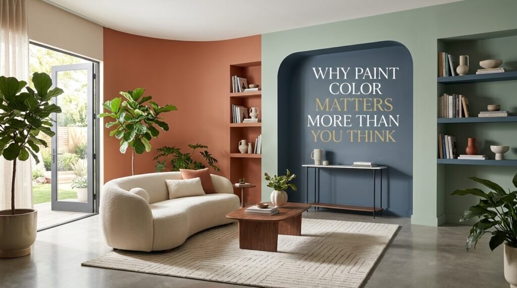
Why Paint Color Matters More Than You Think
A wall color is not just decoration. It affects how a room functions and how people feel inside it.
The Psychology Behind Color Choices
Colors trigger emotional responses before we even notice them. Warm tones like red, orange, and yellow tend to energize a space. Cool tones like blue, green, and gray tend to calm it down. This is why bedrooms often use soft, muted shades, while kitchens sometimes use brighter, warmer tones to feel inviting.
Knowing how to choose a paint color based on the mood you want is the first real step toward a home that feels intentional, not accidental.
Paint Color and Home Value
Real estate agents often mention paint as one of the cheapest ways to increase a home’s appeal. Knowing how to choose a paint color that appeals to a broad range of tastes matters most when selling. Neutral, well-chosen colors help potential buyers picture themselves in the space. A poorly chosen or overly bold color can actually work against you when it’s time to sell.
Step-by-Step: How to Choose a Paint Color
Before diving into specific rooms, it helps to understand the process. These steps apply no matter which room you are painting.
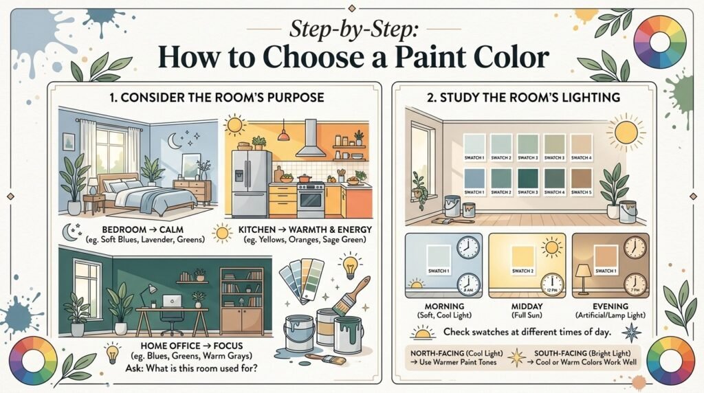
1. Consider the Room’s Purpose
A home office needs focus. A bedroom needs calm. A kitchen needs warmth and energy. Start by asking what the room is actually used for, then let that guide your color direction. This is often the very first question to ask when learning how to choose a paint color that truly fits a space.
2. Study the Room’s Lighting
Lighting changes everything, and it’s one of the most overlooked steps in choosing a paint color correctly. A color that looks soft and warm in a sunlit room can look dull or gray under artificial light. Always check your paint swatch at different times of day — morning, afternoon, and evening — before deciding.
North-facing rooms usually get cooler, softer light, so warmer paint tones balance them well. South-facing rooms get brighter, warmer light, which pairs nicely with both warm and cool colors.
3. Look at What’s Already in the Room
Your color choice should work with what you already own. Look at your flooring, furniture, and any fixed elements like tile or countertops. Pull colors from these existing pieces instead of starting from a blank slate.
4. Always Test Samples First
This step gets skipped the most, and it causes the most regret. Buy small sample pots and paint large swatches — at least two feet wide — directly on your wall. Look at them for a few days before committing to gallons of paint.
5. Use the 60-30-10 Rule
This simple design rule keeps a room balanced:
- 60% dominant color (usually walls)
- 30% secondary color (furniture, curtains, rugs)
- 10% accent color (pillows, art, small decor)
6. Factor in Room Size and Ceiling Height
Light colors make small rooms feel larger and airier. Darker colors add coziness but can shrink the visual space. For low ceilings, lighter shades on the ceiling itself help the room feel taller.
Best Paint Color Combinations for Every Room
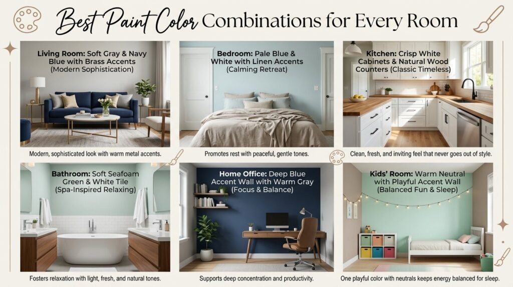
Now let’s get specific. Understanding how to choose a paint color for a specific room becomes much easier once you see real combinations in action. Here is how to approach color for each major room in your home.
Living Room Color Combinations
The living room is where most people gather, so it needs to feel warm and welcoming.
- Warm neutrals: Soft beige or greige walls paired with cream and rust-colored accents create a cozy, timeless look.
- Earthy tones: Olive green walls with warm wood furniture and terracotta accessories bring a natural, grounded feel.
- Classic combo: Soft gray walls with navy blue furniture and brass accents give a modern, sophisticated look.
Bedroom Color Combinations
Bedrooms should promote rest, not stimulation.
- Calming blues: Pale blue walls with white trim and linen-toned bedding create a peaceful retreat.
- Muted greens: Sage green pairs beautifully with warm wood tones and soft white accents.
- Soft neutrals: Warm taupe walls with blush or dusty pink accents feel gentle and relaxing.
Kitchen Color Combinations
Kitchens benefit from colors that feel clean but still inviting.
- Classic white and wood: Crisp white cabinets with natural wood counters and black hardware never go out of style.
- Warm yellow accents: Soft butter-yellow walls with white cabinetry bring energy without overwhelming the space.
- Sage and cream: A popular modern pairing that feels fresh, natural, and calming.
Bathroom Color Combinations
Bathrooms are usually smaller, so lighter, fresher tones tend to work best.
- Spa-inspired: Soft seafoam green with white tile and natural wood accents.
- Clean and bright: All-white or off-white walls paired with black fixtures for contrast.
- Warm neutrals: Light sand tones with brushed gold fixtures for a warm, hotel-like feel.
Home Office Color Combinations
An office needs to support focus and productivity.
- Deep blue accent wall: Paired with white or light gray on remaining walls to keep energy balanced.
- Soft green: Known to reduce eye strain and support concentration during long work hours.
- Warm gray: A neutral, distraction-free base that works with almost any furniture style.
Kids’ Room Color Combinations
Kids’ rooms can be more playful, but soft tones still help with sleep and calm.
- Soft pastels: Light yellow, mint, or lavender walls with white furniture keep the room bright but not overstimulating.
- Accent wall trick: One playful color on a single wall, with neutral tones everywhere else, balances fun and calm.
Common Mistakes to Avoid When Choosing Paint Colors
Even after learning how to choose a paint color the right way, it’s easy to slip into old habits. Avoid these common pitfalls that lead to paint regret:
- Skipping the sample stage and buying full gallons based on a tiny swatch card.
- Ignoring lighting changes throughout the day before finalizing a color.
- Choosing trendy colors without considering how long you want to keep them.
- Matching everything too perfectly, which can make a room feel flat instead of layered.
- Forgetting the finish, such as matte, eggshell, satin, or gloss. Finish affects how a color looks just as much as the shade itself.
- Painting without a plan for furniture and decor that will go in the room.
Helpful Tools and Resources
If you’re still unsure how to choose a paint color confidently, these resources can help narrow down your decision:
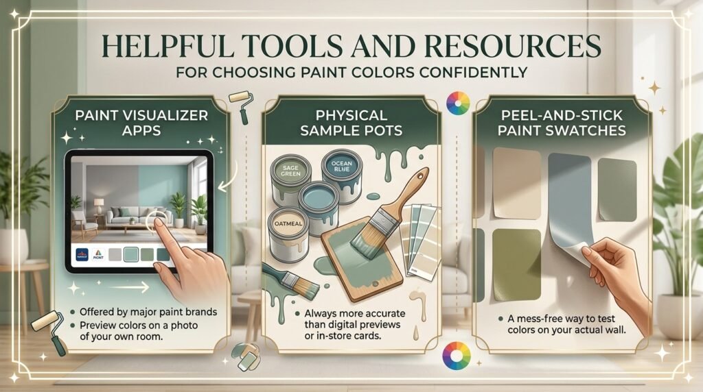
- Paint visualizer apps are offered by most major paint brands, which let you preview colors on a photo of your own room.
- Physical sample pots are always more accurate than digital previews or in-store cards.
- Peel-and-stick paint swatches, a mess-free way to test colors on your actual wall.
Frequently Asked Questions
How do I choose a paint color without seeing it in my room first?
Order physical paint swatches or peel-and-stick samples instead of relying only on in-store color cards. Lighting in a store rarely matches your home’s lighting.
What is the most popular neutral paint color right now?
Warm whites and soft greige tones remain the most widely used neutral choices because they adapt well to different lighting and decor styles.
Should walls be lighter or darker than the furniture?
There’s no fixed rule, but a common approach is to keep walls slightly lighter than large furniture pieces to avoid a heavy, closed-in feeling.
How many paint colors should one room have?
Most designers recommend sticking to two to three colors per room, following the 60-30-10 rule for balance.
Does paint finish affect how a color looks?
Yes. Glossy finishes reflect more light and can make a color appear brighter, while matte finishes absorb light and appear more muted.
Final Thoughts
Learning how to choose a paint color comes down to a few simple habits: understand your room’s purpose, study its lighting, test before committing, and follow a balanced color rule. Once you get these basics right, choosing colors for every room in your home becomes far less overwhelming — and a lot more fun.
Take your time, trust the testing process, and choose colors that feel like you, not just a passing trend.