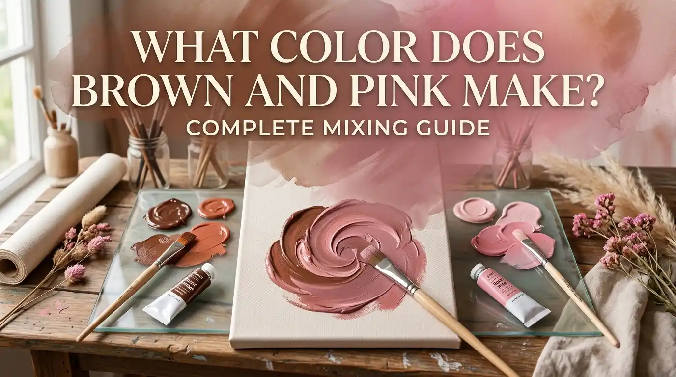
What Color Does Brown and Pink Make? Complete Mixing Guide
Main takeaway: If you’re asking what color does brown and pink make, the short answer is a warm, muted dusty rose. Brown and pink mixed always produce an earthy, softened pink, and the exact shade depends on the ratio and pigments you use.
Have you ever mixed brown and pink and ended up with a cozy, warm tone that felt both soft and grounded? It’s a common question for painters and designers alike. This guide answers what color does brown and pink make in full detail, with paint ratios, light mixing, pigment charts, and practical tips.
Main takeaway: Brown + Pink = Dusty Rose. The more brown you add, the more muted and earthy the pink becomes.
Understanding Brown and Pink as Colors
Before we answer what color brown and pink make in different situations, it helps to understand what these two colors actually are.
Brown is a tertiary color, typically made by mixing red, yellow, and blue, or by darkening orange with black. It’s warm, earthy, and grounding.
Pink is different. It’s a tint, created by adding white to red. It’s warm, soft, and often associated with gentleness and romance.
This is exactly why the pairing matters. Brown brings the earthy, muted warmth. Pink brings softness and light. Together, they create a family of cozy, muted tones, from dusty rose to warm terracotta-blush.
Think of pink as a fresh rose petal and brown as the soil it grew from — together they create a warm, grounded tone that feels both soft and natural.
What Color Do You Get When You Mix Brown and Pink Paint?
This is the part most people search for directly: what color does brown and pink make when mixed as paint? Below are three common ratios and what each one produces.
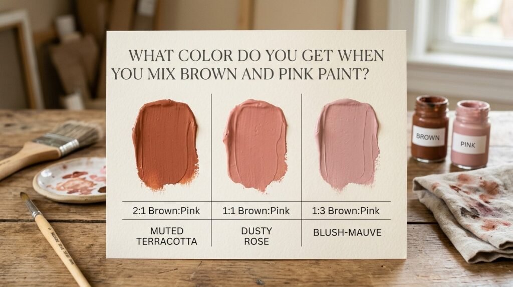
1:1 Ratio (Equal Parts Brown and Pink)
- Resulting color: Dusty Rose
- Hex code: #B08678
- Use case: Great for warm, cozy bedroom walls or vintage-style illustrations.
2:1 Ratio (More Brown Than Pink)
- Resulting color: Muted Terracotta
- Hex code: #A17361
- Use case: Works well for rustic branding or autumn-themed designs.
1:2 Ratio (More Pink Than Brown)
- Resulting color: Soft Blush-Mauve
- Hex code: #C69B8F
- Use case: Popular in nursery decor, wedding stationery, and soft branding palettes.
Beginner Tip: Always add brown to pink a little at a time, not the other way around. Brown can quickly dull a bright pink, so adding it slowly gives you much more control over the final shade.
Full Mixing Chart: Brown and Pink Pigment Combinations
Here’s a more detailed chart answering what color brown and pink make across different pigment brands and ratios.
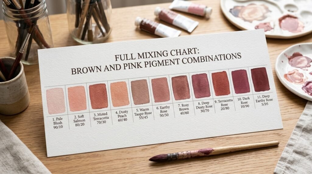
| Pigment A | Pigment B | Ratio | Resulting Color | Hex Code |
| Burnt Sienna | Quinacridone Pink | 1:1 | Dusty Rose | #B08678 |
| Raw Sienna | Rose Pink | 1:1 | Warm Terracotta-Pink | #B58273 |
| Burnt Umber | Quinacridone Pink | 1:2 | Soft Blush-Mauve | #C69B8F |
| Van Dyke Brown | Rose Pink | 1:1 | Muted Mahogany Rose | #9C6E63 |
| Burnt Sienna | Permanent Rose | 2:1 | Rich Clay Pink | #A9705F |
| Raw Umber | Quinacridone Pink | 1:2 | Faded Rosewood | #B8938A |
| Van Dyke Brown | Permanent Rose | 1:2 | Deep Dusty Mauve | #97675D |
| Burnt Sienna | Rose Pink | 1:3 | Pale Blush-Terracotta | #CBA599 |
| Raw Sienna | Permanent Rose | 1:1 | Soft Cinnamon Rose | #B27E6E |
| Van Dyke Brown | Quinacridone Pink | 2:1 | Deep Earthy Rose | #8C5F55 |
| Burnt Umber | Rose Pink | 1:1 | Muted Copper Rose | #A67669 |
What Color Does Brown and Pink Light Make?
So far, we’ve covered paint, but what color do brown and pink make in light rather than in pigment? The answer changes here, and it’s worth understanding why.
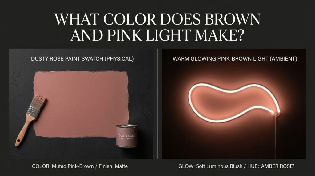
Paint mixing is subtractive. Each pigment you add absorbs more light and reflects less, which is why the mix gets progressively more muted.
Light mixing is additive. Since brown isn’t a pure light wavelength, combining it with pink light isn’t straightforward. Instead, designers simulate the look by dimming a warm amber light and blending it with pink, producing a soft, glowing dusty rose.
Common use cases for brown and pink in light-based design:
- Warm ambient lighting for cafes and cozy interiors
- LED accent lighting for autumn or romantic-themed events
- Stage and theater lighting for soft, intimate scenes
- Digital branding for wellness or beauty products
Subtractive vs. Additive Color Mixing: Side-by-Side
| Feature | Subtractive (Paint) | Additive (Light) |
| Base medium | Pigment | Light waves |
| Mixing brown + pink makes | Muted dusty rose | Simulated warm glowing rose |
| More brown added | Duller, earthier tone | Warmer, dimmer glow |
| Common tools | Paint, ink, dye | Screens, LEDs, stage lights |
| Example use | Wall paint, art | Ambient lighting, mood design |
How Ratio Affects the Final Color
Ratio is the biggest factor in what color brown and pink make. Here’s a quick reference table.
| Ratio (Brown: Pink) | Resulting Color | Best Use Case |
| 3:1 | Deep Earthy Rose | Bold, rustic branding |
| 2:1 | Muted Terracotta | Autumn and rustic themes |
| 1:1 | Dusty Rose | General-purpose warm tone |
| 1:2 | Blush-Mauve | Nursery, soft branding |
| 1:3 | Pale Blush-Terracotta | Wedding stationery, soft decor |
Beginner Tip: If your mix looks too flat, add a touch more pink rather than starting over. A small addition often brings back warmth and brightness without needing a full remix.
Why Your Mix Looks Muddy — and How to Fix It
Sometimes when people try to answer what color does brown and pink make for themselves, the result looks dull or gray instead of a warm dusty rose. Here’s why that happens.
Common causes:
- Undertones clashing: Some browns lean orange, others lean red or purple. Mixing the wrong undertone with a cool pink can create an unwanted grayish cast.
- Overmixing: Blending too long, especially with a dirty brush or palette, can introduce unwanted colors and flatten the mix.
- Cheap or chalky paint: Low-quality brown paint often contains fillers that dull a pink instead of warming it cleanly.
How to fix it:
- Use a clean palette and clean brush every time you mix.
- Choose a red-based brown to pair with pink for a truer, warmer rose tone.
- Test small batches before committing to a full mix.
“A muddy dusty rose is like a faded photograph — the color’s still there, just harder to see clearly.”
Best Pigments to Mix for Clean Results
| Pigment Pair | Result | Notes |
| Burnt Sienna + Quinacridone Pink | Classic Dusty Rose | Reliable, clean everyday tone |
| Raw Sienna + Rose Pink | Warm Terracotta-Pink | Great for rustic, vintage looks |
| Van Dyke Brown + Permanent Rose | Deep Dusty Mauve | Best for bold, moody results |
| Burnt Umber + Rose Pink | Muted Copper Rose | Softer, more subdued finish |
Mixing tips:
- Add brown gradually, testing on scrap paper or canvas as you go.
- Mix in natural light so you can see the true warmth of the tone, not one skewed by artificial lighting.
- Keep notes on your ratios so you can recreate a shade you like later.
Real-Life Examples of Brown and Pink Mixing
The answer to what color brown and pink make shows up everywhere once you start looking.
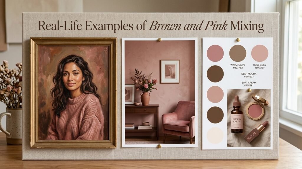
- Traditional art: Painters use brown-pink mixes for skin tones, autumn floral work, and warm sunset skies.
- Interior design: Dusty rose walls paired with warm wood tones have become a popular choice for cozy, modern bedrooms and living rooms.
- Digital media: Muted terracotta-pink tones frequently appear in beauty branding, wellness apps, and warm minimalist color palettes.
What Happens When You Add White, Yellow, or Black to Pink?
Once you understand what color does brown and pink make, it’s useful to see how other modifiers change the result.
- Adding more brown: Produces an earthier, more muted rose with less visible pink. Example: #A17361
- Adding white: Lightens the mix into a soft, pale blush-beige. Example: #DCC2B7
- Adding black: Deepens the mix into a rich, dark mahogany rose. Example: #5A3E36
Beginner Tip: Add modifiers one at a time and in tiny amounts. Brown already mutes a mix quickly, so small adjustments go a long way.
Paint vs. Digital Media: A Closer Look
To fully answer what color brown and pink make across mediums, it helps to compare paint and digital light directly.
In paint (subtractive mixing), brown and pink pigment physically combine, and the result depends on pigment quality, undertone, and ratio. A typical mix might land around #B08678.
In digital media (additive mixing), there’s no true “brown light,” so designers simulate the effect by blending a dimmed warm light with pink, often landing on values like #B58A7C for warm digital palettes.
This is why a “dusty rose” you see in a branding mockup can look slightly different from the same tone mixed with real paint.
Tips for Artists Mixing Brown and Pink
- Choose your brown carefully. Red-based browns create warmer, richer roses; orange-based browns can shift the mix toward a duller, more muted tone.
- Test on your actual palette first. Colors can look different once dry compared to wet.
- Layer instead of overmixing. For paintings, thin glazes of brown over pink can create smoother, warmer transitions than direct mixing.
- Keep a swatch journal. Recording ratios and results saves time on future projects.
Dusty Rose in Fashion and Interior Design
The dusty rose created when you mix brown and pink has become a favorite in both fashion and home decor. Warm terracotta-pink tones are common in autumn wardrobes, while dusty rose walls appear frequently in cozy, modern interiors.

In interior design, dusty rose paired with warm wood or brass accents has become a signature of the “modern boho” and “warm minimalist” aesthetics. If you’re planning a room refresh, testing a few brown-pink paint ratios on a sample board — like the ones covered earlier in this guide — is a simple way to find the right tone before committing to a full wall.
Where Dusty Rose Sits on the Color Wheel
Dusty rose, the result of mixing brown and pink, is technically a tertiary tone rather than a standalone wheel color, since it’s created by combining an earthy neutral (brown) with a tint of red (pink).
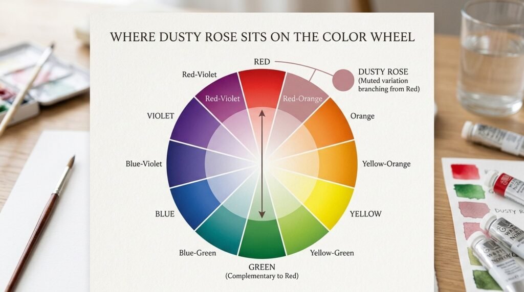
- Base color: Red (primary, via pink)
- Complementary color: Green (opposite red on the wheel)
- Analogous colors: Red-orange and red-violet
This means dusty rose pairs naturally with soft greens or sage for contrast, or with red-oranges and red-violets for a softer, more harmonious palette.
Conclusion
So, what does brown and pink make when mixed? In paint, it’s always a version of dusty rose, with the exact tone shaped by ratio, pigment quality, and undertone. In light, there’s no true brown to add, so designers simulate the look by dimming warm light and blending it with pink. Just remember: watch your ratios, keep your palette clean, and test small batches to avoid a muddy result. With a little practice, mixing brown and pink becomes one of the easiest ways to create warm, grounded tones for any project.
FAQs
What color does brown and pink make when mixed?
Brown and pink always make a warm, muted rose, typically ranging from terracotta-pink to deep earthy rose depending on the ratio used.
What color do brown and pink make in equal parts?
A 1:1 ratio of brown and pink typically produces a classic dusty rose, often close to hex code #B08678.
Does brown and pink make a different color in light versus paint?
Yes. In paint, brown and pink make a muted dusty rose through subtractive mixing. In light, there’s no true brown, so designers simulate a similar warm rose glow using dimmed light and pink.
What color does brown and pink make if you add more brown?
Adding more brown produces an earthier, more muted rose with less visible pink brightness.
Why does my brown and pink mix look muddy or gray instead of dusty rose?
This usually happens due to clashing undertones, overmixing, or low-quality brown paint. Using a red-based brown and a clean palette usually fixes it.
What is the hex code for brown and pink mixed?
A common dusty rose from a 1:1 brown-pink mix is around #B08678, though the exact hex code varies by pigment and ratio.
Is dusty rose a primary or secondary color?
Dusty rose isn’t a primary or secondary color on the traditional wheel — it’s a tertiary tone created by mixing brown with pink, a tint of the primary color red.