What Colors Do Purple and Pink Make? Shades, Results & Examples
Ever mixed a rich purple into a soft pink and wondered exactly what colors purple and pink make? Shades, results & examples vary more than you’d expect from two colors that already seem so close on the wheel.
Main takeaway: Mixing purple and pink together produces a vivid magenta or soft orchid tone, depending on your ratio — since pink is really just a lighter tint of red, and purple already contains red as one of its building blocks.
Purple and pink aren’t opposites — they’re close cousins, which is exactly why this mix behaves so smoothly compared to combinations that fight each other. Let’s break it down properly: what colors do purple and pink make, why the result stays so vibrant rather than turning muddy, and how ratio shifts the final shade.
Understanding Purple and Pink as Colors
Before mixing, it helps to know what each color actually brings to the table.
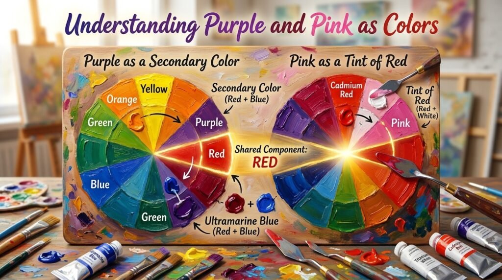
Purple is a secondary color in the RYB (red-yellow-blue) model most painters use, made by mixing red and blue. It’s typically considered a cool-leaning color, tied to luxury, creativity, and depth.
Pink, unlike purple, isn’t a hue with its own spot on the traditional color wheel — it’s a tint of red, created by adding white to red. It’s a warm, soft, playful color often associated with sweetness and calm energy.
Here’s why the pairing matters: since pink is essentially “red plus white,” and purple already contains red, combining the two doesn’t introduce any conflicting hue — it just shifts the balance of red, blue, and white already present. That’s why purple and pink make such a clean, vibrant result instead of a dull, muddy one.
Think of it like blending two milkshakes that both have strawberry as a base — even with different extra ingredients, that shared strawberry flavor comes through clearly in the final blend.
Beginner Tip: Add purple gradually into your pink rather than the reverse — purple has much stronger tinting power, and a small amount can quickly pull a light pink into a deep, saturated magenta faster than you’d expect.
What Color Do You Get When You Mix Purple and Pink Paint?
Here’s the central question: what colors do purple and pink make when mixed at different ratios? Here are three common combinations:
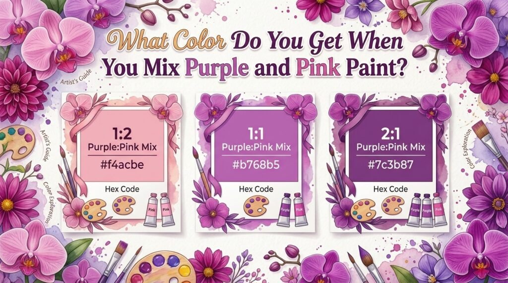
1:1 Ratio (equal parts purple and pink)
- Result: A balanced, vivid orchid-magenta
- Hex code: #b25a9c
- Use case: Great for floral illustrations, feminine branding, or soft-but-bold accent tones
2:1 Ratio (two parts purple, one part pink)
- Result: A deeper, more saturated magenta-violet
- Hex code: #8f3f8a
- Use case: Ideal for rich florals, evening-wear color palettes, or dramatic backgrounds
1:2 Ratio (one part purple, two parts pink)
- Result: A soft, light orchid-pink
- Hex code: #d688bf
- Use case: Perfect for pastel illustrations, soft interior accents, or gentle floral highlights
Full Mixing Chart: Purple + Pink Pigment Combinations
Different pigment brands and shades of purple and pink will shift your outcome. Here’s a mixing chart with real results to reference:
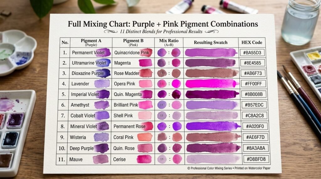
| Purple Shade | Pink Shade | Resulting Color | Hex Code |
| Dioxazine Purple | Quinacridone Pink | Vivid Magenta | #a13f96 |
| Ultramarine Violet | Rose Pink | Deep Orchid | #8f4a92 |
| Manganese Violet | Baby Pink | Soft Lilac-Pink | #c98fc0 |
| Cobalt Violet | Fuchsia Pink | Bright Magenta-Violet | #a83f9c |
| Permanent Violet | Blush Pink | Muted Mauve | #b46fa8 |
| Quinacridone Violet | Hot Pink | Bold Vivid Orchid | #b0409e |
| Dioxazine Purple | Pale Pink | Soft Dusty Orchid | #c284b8 |
| Ultramarine Violet | Magenta | Rich Berry-Violet | #8c3888 |
| Mauve Purple | Carnation Pink | Classic Orchid | #b56aa8 |
| Royal Purple | Bubblegum Pink | Vibrant Magenta | #9c3f9a |
| Amethyst Purple | Salmon Pink | Warm Mauve-Orchid | #b46888 |
What Color Does Purple and Pink Light Make?
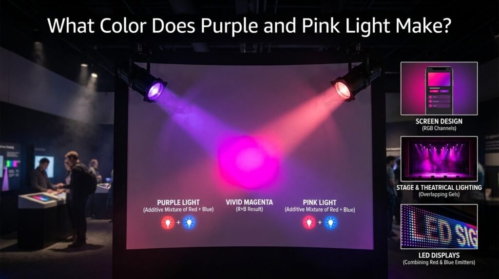
Paint and light behave differently. Paint mixing is subtractive — pigments absorb certain wavelengths and reflect others, so combining colors removes light and produces darker or duller results.
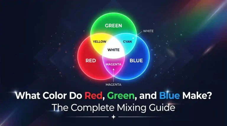
Light mixing, used in screens and stage lighting, is additive, based on the RGB (red-green-blue) model. Here, colors combine by adding wavelengths together, and mixtures get brighter. Purple light and pink light both lean heavily on red and blue wavelengths, so combining them produces a bright, vivid magenta — one of the actual secondary colors in the RGB model itself.
So when you ask what color purple and pink light make, the answer is refreshingly close to the paint result: a vivid magenta either way, since both mediums are drawing on the same red-blue relationship, just approached from opposite directions (subtractive vs. additive).
This matters for:
- Screen and monitor design, where magenta and hot-pink UI accents are built by boosting red and blue channels together
- Stage and theatrical lighting, where overlapping purple and pink gels create a vivid magenta wash
- LED displays and signage, where combining purple and pink LEDs produces one of the easier, more vibrant colors to render accurately
Subtractive vs. Additive Mixing: Side-by-Side Comparison
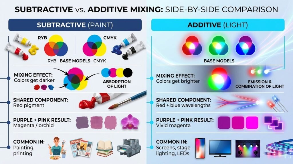
| Feature | Subtractive (Paint) | Additive (Light) |
| Base model | RYB / CMYK | RGB |
| Mixing effect | Colors get darker | Colors get brighter |
| Shared component | Red pigment | Red + blue wavelengths |
| Purple + Pink result | Magenta/orchid | Vivid magenta |
| Common in | Painting, printing | Screens, stage lighting, LEDs |
How Ratio Affects the Final Color
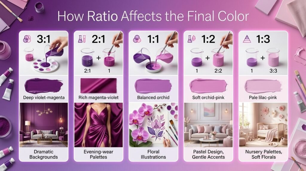
| Ratio (Purple: Pink) | Resulting Color | Best Use Case |
| 3:1 | Deep violet-magenta | Dramatic backgrounds |
| 2:1 | Rich magenta-violet | Evening-wear palettes |
| 1:1 | Balanced orchid | Floral illustrations |
| 1:2 | Soft orchid-pink | Pastel design, gentle accents |
| 1:3 | Pale lilac-pink | Nursery palettes, soft florals |
Why Your Mix Looks Muddy — and How to Fix It
Purple and pink rarely turn truly “muddy” the way opposing colors can, but a few issues can still dull the result:
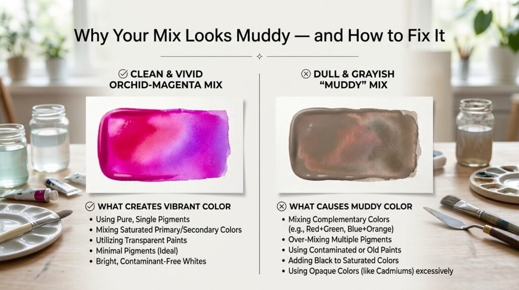
1. Clashing undertones. A cool, blue-heavy purple mixed with a very warm, orange-leaning pink can flatten the vibrancy slightly. Fix: Match cool purples with cooler, blue-toned pinks, and warm purples with warmer pinks.
2. Overmixing. Stirring too long can dull even a naturally vibrant combination like this one. Fix: Mix minimally and stop as soon as you reach the shade you want.
3. Cheap or chalky paint. Lower-quality pigments often contain fillers that mute the mix. Fix: Use artist-grade purples and pinks, since they carry more pigment and hold saturation better.
“Overmixing purple and pink is like over-stirring frosting with food coloring — go past the point of even blending and the color starts looking flat instead of vibrant.”
Best Pigments to Mix for Clean Results
| Pigment Pair | Result | Notes |
| Dioxazine Purple + Quinacridone Pink | Vivid, clean magenta | Great for beginners |
| Ultramarine Violet + Rose Pink | Deep, rich orchid | Strong tinting power |
| Cobalt Violet + Fuchsia Pink | Bright magenta-violet | Good for bold florals |
| Manganese Violet + Baby Pink | Soft, dusty lilac-pink | Ideal for pastels |
| Quinacridone Violet + Hot Pink | Bold vivid orchid | Excellent opacity |
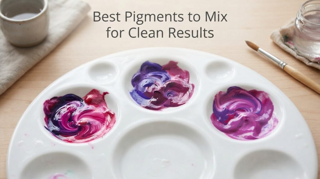
Mixing tip: Test your ratio on scrap paper and let it dry before committing — some purple-pink mixes shift slightly cooler once fully set, especially with acrylic paints.
Real-Life Examples of Purple and Pink Mixed
This color pairing shows up constantly across creative fields:
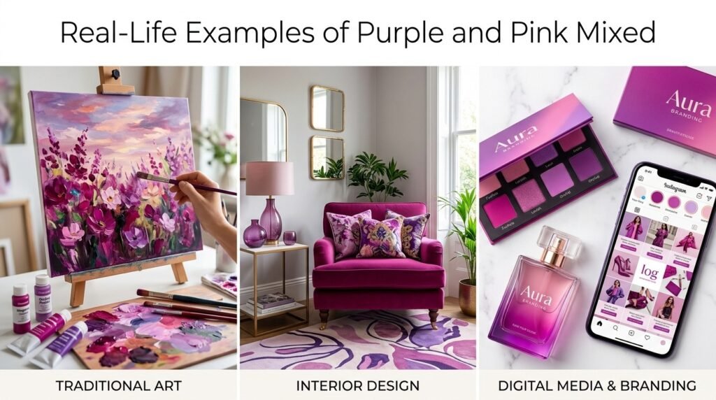
- Traditional art: Painters use orchid and magenta tones (born from this mix) for florals, sunsets, and vibrant abstract work.
- Interior design: Magenta and orchid accents are popular in bold, maximalist interiors, often paired with neutral walls to let the color pop.
- Digital media: Beauty, fashion, and lifestyle branding frequently uses this purple-pink family for a bold, feminine, energetic feel.
What Happens When You Add White, Blue, or Black?
Once you’ve settled on your base orchid-magenta, modifiers let you fine-tune it further:
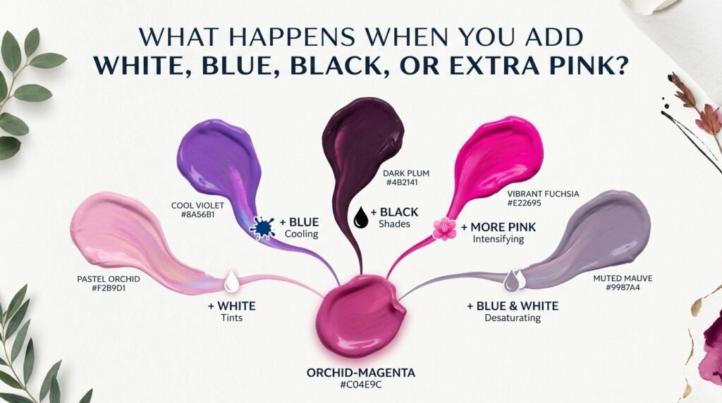
- Add white: Lightens the mix into a soft, pastel lilac-pink. Example hex: #e0b8d8
- Add blue: Cools the mix toward a deeper, more violet-leaning magenta. Example hex: #7a3f9c
- Add black: Deepens it into a rich, dark plum-magenta. Example hex: #4a1f45
- Add more pink: Brightens and warms the mix into a lighter, more playful magenta-pink. Example hex: #c95fae
Paint vs. Digital Media: A Concrete Comparison
If you’re painting traditionally, mixing Dioxazine Purple with Quinacridone Pink gives you a vivid magenta around #a13f96. If you’re designing digitally and want that same visual result, you’d simply select #a13f96 directly in RGB — no physical mixing required, since digital tools let you skip the subtractive process entirely and pick the endpoint color.
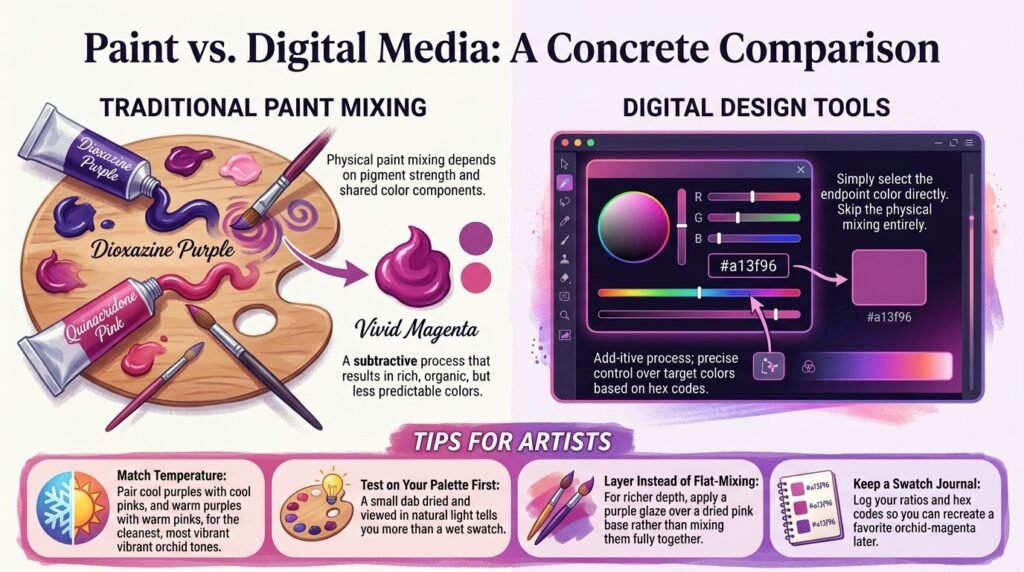
This is the key distinction for artists moving between mediums: physical paint mixing depends on pigment strength and shared color components, while digital tools only require knowing your target hex code.
Tips for Artists
- Match temperature: Pair cool purples with cool pinks, and warm purples with warm pinks, for the cleanest, most vibrant orchid tones.
- Test on your palette first: A small dab dried and viewed in natural light tells you more than a wet swatch.
- Layer instead of flat-mixing: For richer depth, apply a purple glaze over a dried pink base rather than mixing them fully together.
- Keep a swatch journal: Log your ratios and hex codes so you can recreate a favorite orchid-magenta later.
Orchid and Magenta in Fashion and Interior Design

The orchid and magenta family that comes from mixing purple and pink has become a design favorite across both fashion and interiors. In fashion, magenta and orchid tones show up constantly in statement pieces, accessories, and spring/summer collections, valued for feeling bold and confident without being as harsh as pure red. In interior design, magenta accent walls, orchid-toned textiles, and bold floral prints are popular for adding energy and personality to a space.
If you’re pulling this palette into a home or wardrobe project, it’s worth testing a few physical swatches against your existing colors and lighting first — a color-matching or paint-sample app can save a lot of trial and error before you commit.
Where This Result Sits on the Color Wheel
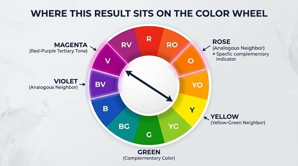
Magenta and orchid (the typical results of mixing purple and pink) sit as tertiary, red-leaning variants between red and purple on the color wheel — shades that draw from both hues rather than standing as pure wheel colors themselves. Their complementary color is a fresh green or chartreuse, and their closest analogous colors are violet, fuchsia, and rose. This is useful when building a full palette: pairing orchid-magenta with green creates striking contrast, while pairing it with violet or rose creates a cohesive, vibrant monochromatic look.
Conclusion
To sum it up: when mixing paint, what colors do purple and pink make? A vivid magenta or soft orchid, depending on your ratio, since pink’s underlying red pairs so smoothly with purple’s own red content. When working with light instead of paint, the additive RGB model lands on a very similar vivid magenta, since both mediums are drawing on the same shared red-blue relationship.
There’s little risk of true “muddy” results here, but matching cool-to-cool or warm-to-warm undertones and avoiding overmixing will keep your orchid-magenta looking crisp rather than flat. Whether you’re painting florals, designing a bold room, or just satisfying your curiosity, you now have a complete answer to what colors do purple and pink make — shades, results & examples included.
FAQs
What colors do purple and pink make when mixed?
Mixing purple and pink together typically produces a vivid magenta or softer orchid tone, depending on the ratio used.
Do purple and pink always make magenta?
The exact shade depends on your ratio and specific pigments, but the result is almost always somewhere in the magenta-to-orchid family, whether bold or soft.
What color does purple and pink make in digital design (RGB)?
In additive light mixing, purple and pink combine into a vivid magenta, since both rely on the same red-and-blue wavelength relationship.
Is orchid a primary, secondary, or tertiary color?
Orchid and magenta are generally considered tertiary tones — shades that sit between red and purple rather than standalone wheel colors.
Why does my purple and pink mix look dull instead of a vibrant orchid?
This usually happens from mismatched undertones (a cool purple with a very warm pink) or from overmixing past the point of a clean blend.
What’s the best pigment pairing for clean shades, results & examples of purple and pink mixed?
Dioxazine Purple mixed with Quinacridone Pink is one of the most reliable pairings for a bold, clean magenta.
Can I lighten a purple-and-pink mix without losing the color?
Yes — add small amounts of white gradually. This creates a soft, pastel lilac-pink rather than diluting the mix into gray.